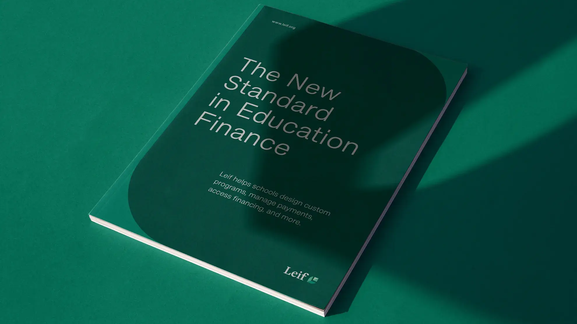
Nordic Reforestation Brand & Website
Nordic Reforestation purchases agricultural land and restores forests based on three fundamental principles: to reduce CO2 by planting new forests, to increase biodiversity by planting untouched forests, and to protect our drinking water by planting forests around groundwater wells. Last but not least, we look towards a warmer climate, ensuring that we plant trees that have high CO2 absorption and will thrive in a warmer Denmark. Read on to learn more about our partnership with Nordic Reforestation and how Granyon helped create a brand design and web presence that reflects their mission and values.

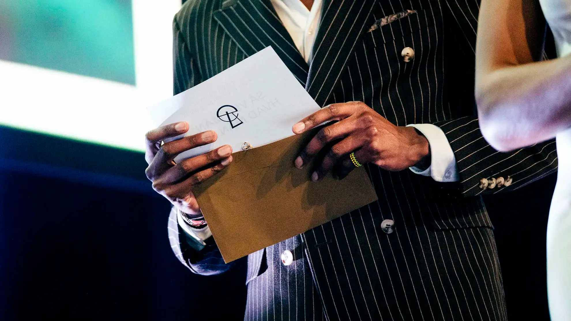
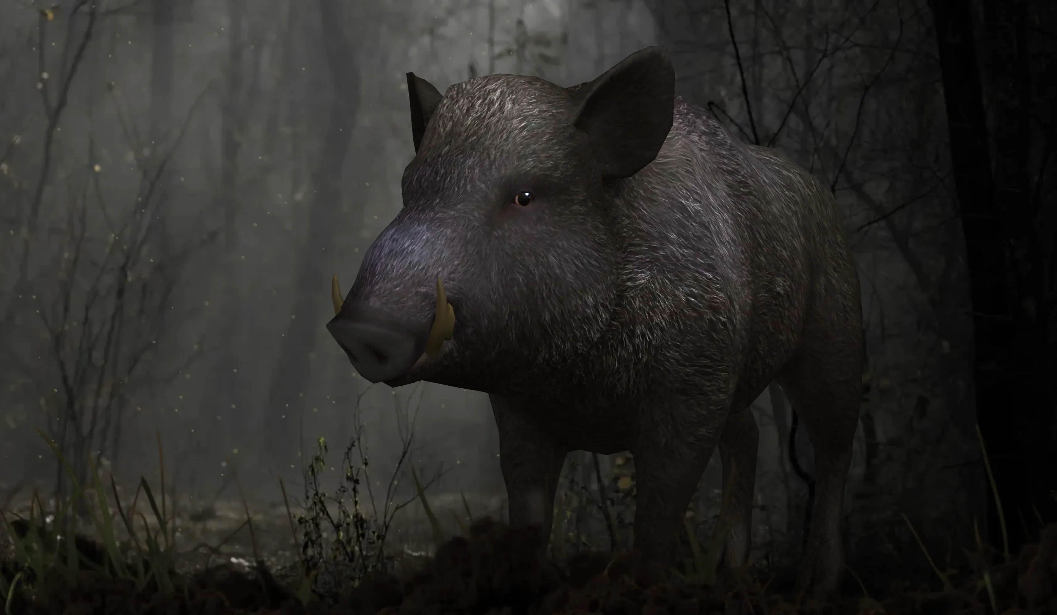
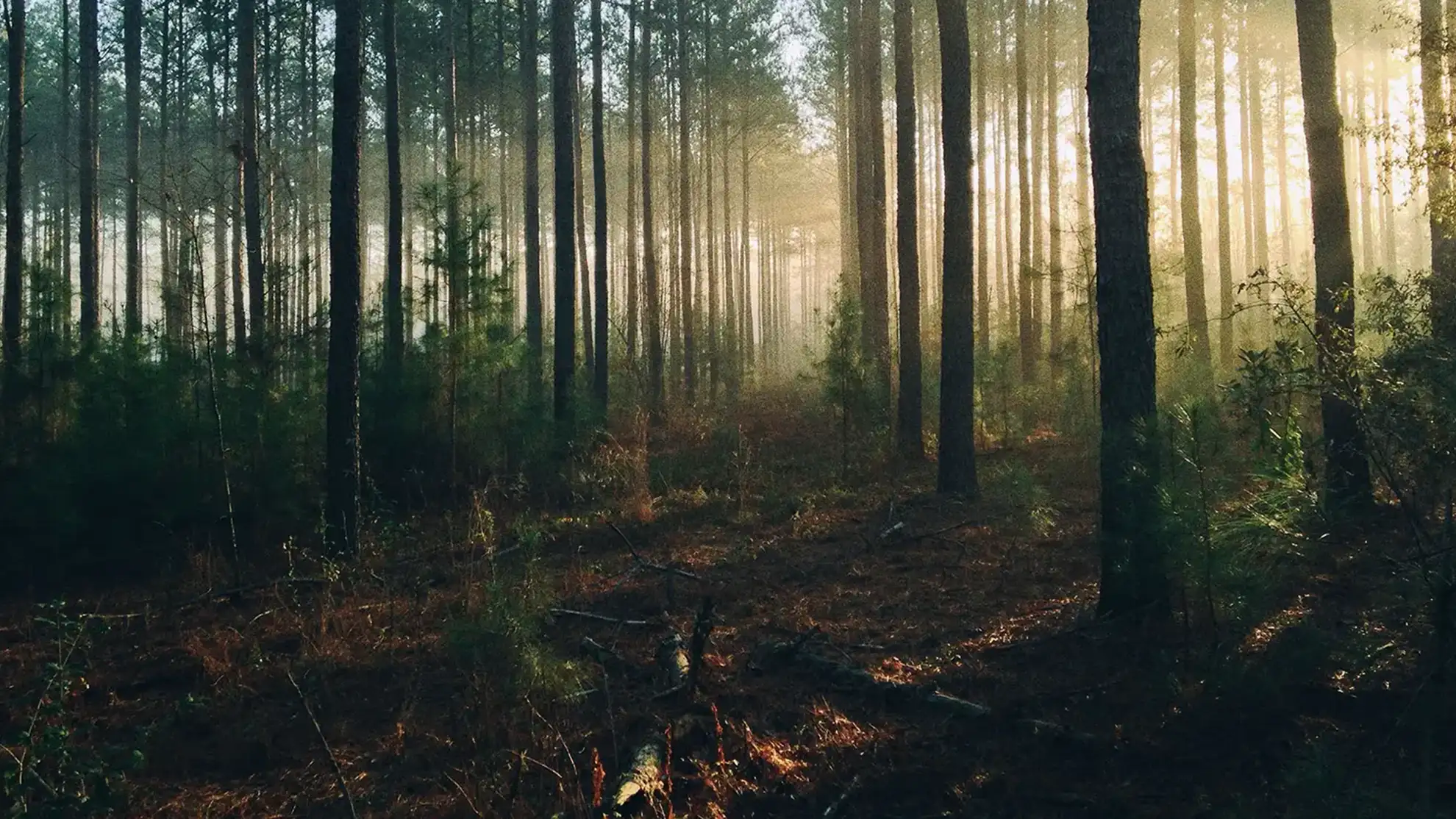
Bringing back the trees
Nordic Reforestation aims to make forestation a community project, not just a CO2 donation. That's why we not only ensure that donations are exclusively used to create new forests, but we also make it possible for everyone to track their donation - right down to the exact location where the tree or trees are planted. Granyon helped create a brand design and web presence that reflects these values.
Nordic Reforestation aims to make forestation a community project, not just a CO2 donation. That's why we not only ensure that donations are exclusively used to create new forests, but we also make it possible for everyone to track their donation - right down to the exact location where the tree or trees are planted. Granyon helped create a brand design and web presence that reflects these values.
Bringing back the trees
Nordic Reforestation aims to make forestation a community project, not just a CO2 donation. That's why we not only ensure that donations are exclusively used to create new forests, but we also make it possible for everyone to track their donation - right down to the exact location where the tree or trees are planted. Granyon helped create a brand design and web presence that reflects these values.
Nordic Reforestation aims to make forestation a community project, not just a CO2 donation. That's why we not only ensure that donations are exclusively used to create new forests, but we also make it possible for everyone to track their donation - right down to the exact location where the tree or trees are planted. Granyon helped create a brand design and web presence that reflects these values.
Nordic Reforestation aims to make forestation a community project, not just a CO2 donation. That's why we not only ensure that donations are exclusively used to create new forests, but we also make it possible for everyone to track their donation - right down to the exact location where the tree or trees are planted. Granyon helped create a brand design and web presence that reflects these values.
Bringing back the trees
Nordic Reforestation aims to make forestation a community project, not just a CO2 donation. That's why we not only ensure that donations are exclusively used to create new forests, but we also make it possible for everyone to track their donation - right down to the exact location where the tree or trees are planted. Granyon helped create a brand design and web presence that reflects these values.
Nordic Reforestation aims to make forestation a community project, not just a CO2 donation. That's why we not only ensure that donations are exclusively used to create new forests, but we also make it possible for everyone to track their donation - right down to the exact location where the tree or trees are planted. Granyon helped create a brand design and web presence that reflects these values.
Illustrations as key brand elements
In addition to designing a memorable logo, carefully selected colors, and typography, Granyon also created a series of illustrations to complement Nordic Reforestation's visual identity. These illustrations serve as a key element in strengthening the overall recognizability of the brand by providing a unique visual language that can be applied across various touchpoints. By using these illustrations, Nordic Reforestation is able to create a consistent and engaging brand experience that resonates with its audience and helps to communicate the company's mission of environmental sustainability in a visually compelling way.
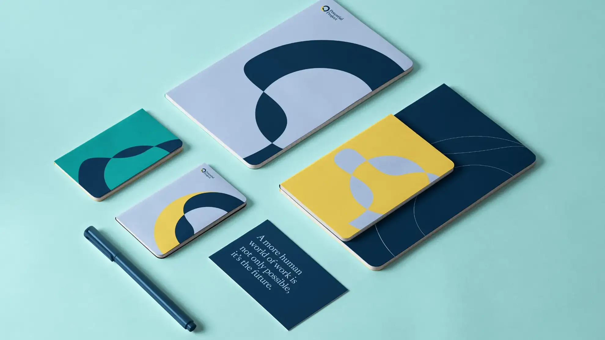
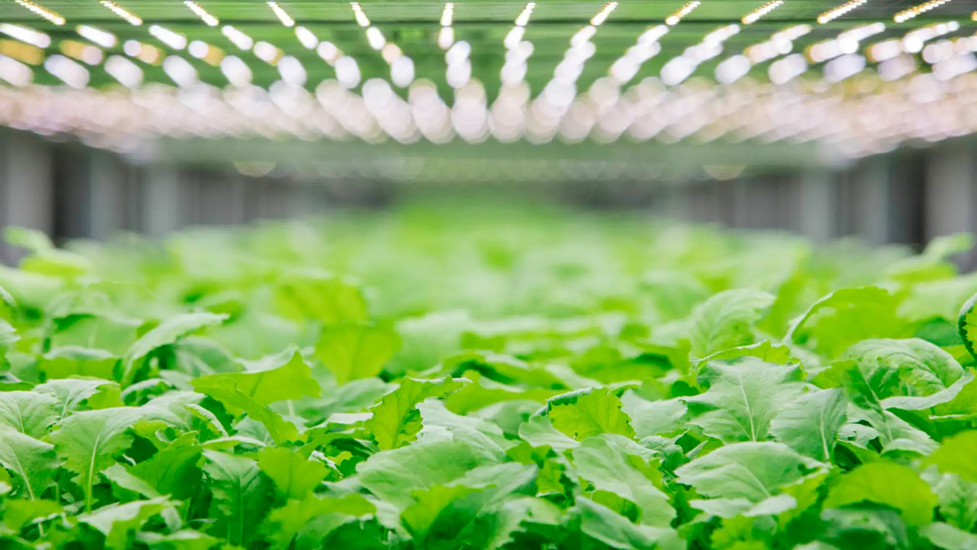
A green and earthy color palette
The brand identity needed to embody the company's mission of sustainability and environmental responsibility. To achieve this, we utilized a palette of green and earthy tones, which not only symbolize growth and nature, but also communicate a sense of groundedness and stability. The resulting brand identity not only looks beautiful, but also effectively conveys the company's commitment to reforestation and a greener future.
Simple and clear
The new logo for The Reforestation Foundation is clear and simple, accompanied by a pine tree mark. The pine tree symbolizes the organization's mission to recreate, preserve, and protect the natural environment. At the same time, the clear and straightforward typography ensures that the name is easily recognizable and memorable. Overall, the new logo captures The Reforestation Foundation's mission and values.
Adaptable and versatile
A brand's visual identity must be adaptable and versatile in order to effectively reach its audience. When designing the visual identity for Nordic Reforestation, we made sure that it was flexible enough to be applied to a variety of platforms and media, including digital, print, and social media. By creating a consistent and cohesive visual language that can be easily recognized and applied across all touchpoints, Nordic Reforestation is able to establish a strong brand presence and connect with its audience, no matter where they encounter the brand.
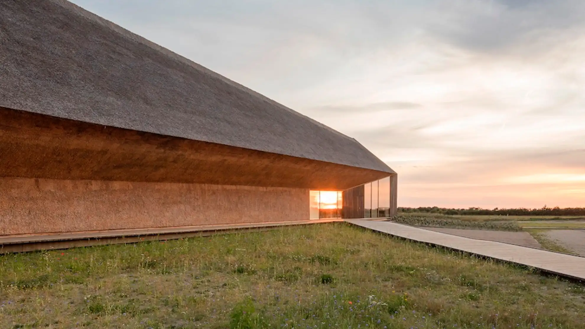
A website to support the mission
Granyon recently completed the design and development of Reforestation.com, a new website dedicated to supporting the mission of the Nordic Reforestation foundation. The primary objective of the initiative is to attract funding to help achieve the goal of restoring the Danish landscape by planting more forests. The website has been carefully crafted to highlight the foundation's work and to make it easy for visitors to donate and get involved in the cause. With its user-friendly interface and visually appealing design, Reforestation.com is sure to generate interest and support for the important work being done by the Nordic Reforestation foundation.
Curious about starting a design or digital project with Granyon? Get in touch! Rest asure we are the nice guys. No spamming or self-absorbed attitudes.
Curious about starting a design or digital project with Granyon? Get in touch! You can rest asure: we are the nice guys. No spamming or self-absorbed attitudes.