AQRisk Visuel identitet og hjemmeside
Bankverdenen forandrer sig hastigt. Nye forretningsmodeller, fintech-løsninger og teknologier opstår og stiller krav til, at finansielle institutioner kan identificere og tilpasse sig nye markeder og konkurrencevilkår.
AQRisk er en specialiseret fintech-virksomhed, der leverer innovative løsninger til finanssektoren og gør det nemt for banker at arbejde databaseret og optimere deres kerneforretning. Deres kunder tæller både store og mindre banker, som får adgang til dyb indsigt og værdiskabelse gennem avanceret dataudnyttelse.
I år tager AQRisk næste skridt og ønsker at bruge deres brand aktivt i en global markedsekspansion. Derfor havde de brug for en visuel identitet og en hjemmeside, der signalerer professionalisme, teknologisk styrke og fremdrift.
Granyon designede den visuelle identitet og hjemmesideoplevelsen i et no-code setup baseret på Webflow. Med det nye brand står AQRisk stærkt rustet til at indtage den globale banksektor. Vi glæder os til at følge rejsen.
A logo that supports the AQRisk global strategy
Bold, trustworthy, professional, human, and proactive were some of the values we had in our minds when we designed the new AQRisk logo. With a more robust and crisp. The logo is designed for multiple colors and made sure can be used across platforms and media. The logo is the cornerstone of the new visual identity that will help bring the AQRisk brand forward to become a global Fintech company.

A dynamic welcome
We used several animated graphical elements to give the visual identity edge and signal tech and data. On the website, the visitor is greeted by a wall-to-wall wave made in WebGL. Combining Webflow and code gives the website a dynamic look that fits a responsive setup. When visitors start scrolling, they will be met with a spinning globe to show that AQRisk is a global and ambitious company.

A dynamic product presentations
Instead of just listing the three product areas, we decided to bring the visitor a more positive scroll experience. Letting the user swipe through the product pages created a dynamic and playful interaction. This way, we get the potential customers to use more time on something that might otherwise get ignored.

Animations as a part of the brand identity
Combining animations with colors, font, and logo gives AQRisk a broad toolbox that will be used on the website, in presentations, in sales material, and on Social Media. Bringing animated graphical elements to the brand identity allows the AQRisk marketing team to put life into the many platforms and media where they will promote the company globally.

Trusted by ...
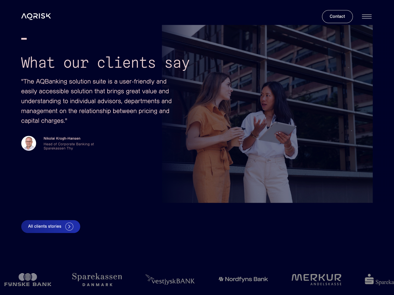
AQRisk is a company that brings value to banks by giving easier access to data and thereby making better decisions for both the bank and its customers. The result is a long list of happy clients. Customer quotes have a more evident role on the new site. By working with an easy-to-use taxonomy, we can show relevant quotes around the page where they support customers' decision-making.


Not just news
We identified several types of updates; News, Longreads, and announcement. We used the design to make it easy for the user to differentiate between the different types. And but creating different types in Webflow, the editor team can control where the articles and news is shown to support products and services.

Value from data insight
We didn't want just to create a typical list with all the benefits. Instead, we created a smooth scroll experience to make customers use more time on the section. The easy flow supports the overall brand perception and expectation of the software AQRisk sells. Instead of claiming the applications are easy and a joy to use, we chose to state it by designing a smooth and playful user experience.


Klar på at starte et design- eller digitalt projekt med Granyon? Tag fat i os. Du kan være helt rolig. Vi er de flinke. Ingen spam. Ingen selvfede bureauattituder.
Klar på at starte et design- eller digitalt projekt med Granyon? Tag fat i os. Du kan være helt rolig. Vi er de flinke. Ingen spam. Ingen selvfede bureauattituder.


