Gunnar T. Strøm Visuel identitet
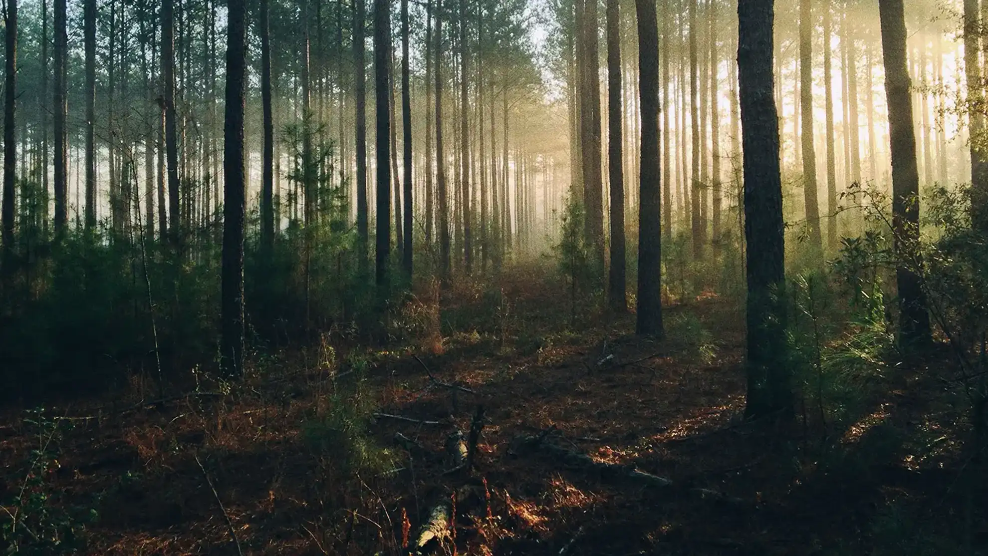
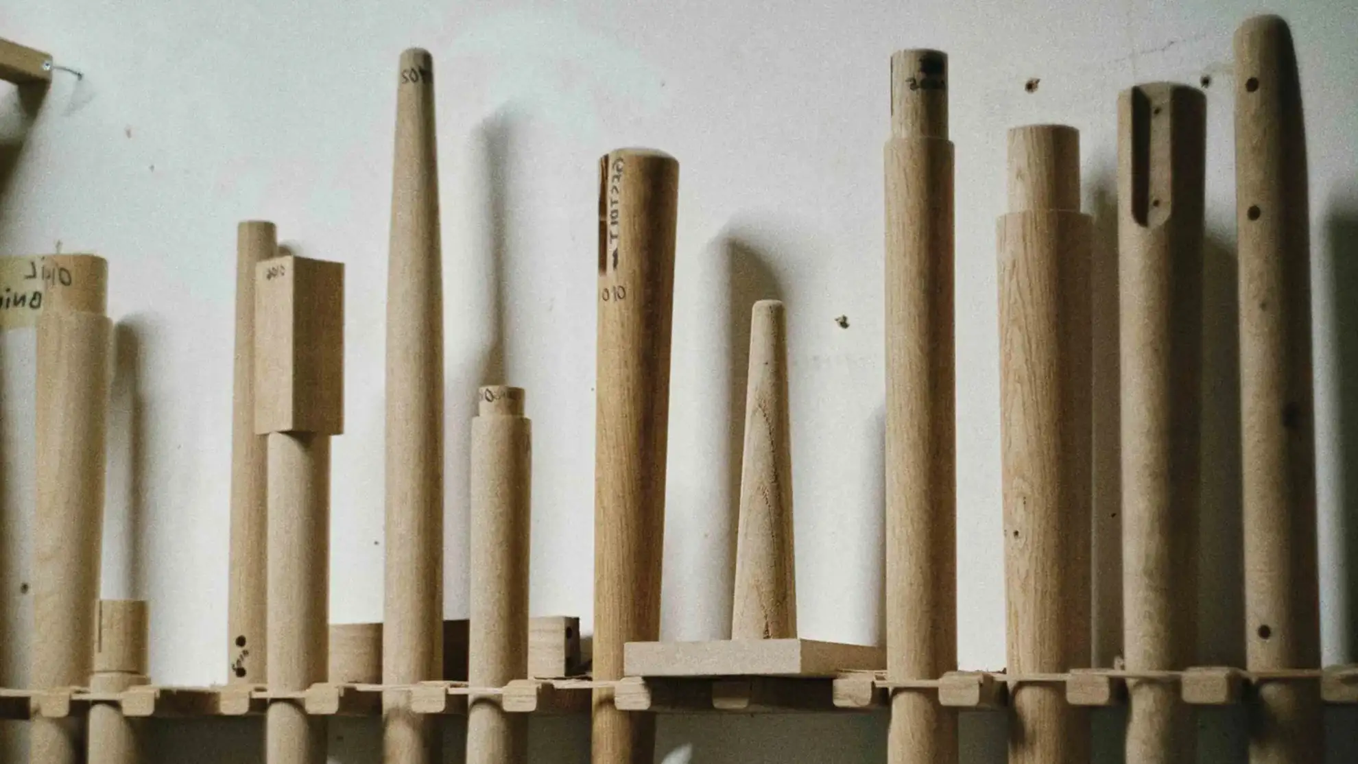
Gunnar T. Strøm har specialiseret sig i træproduktion og har siden 1960 handlet træ og træprodukter globalt fra deres base i Danmark. De hjælper samarbejdspartnere gennem hele produktionsprocessen, fra den første idé til det færdige produkt, med fokus på bæredygtighed, teknologi og høj kvalitet.
Kort sagt lever og ånder Gunnar T. Strøm for træ.
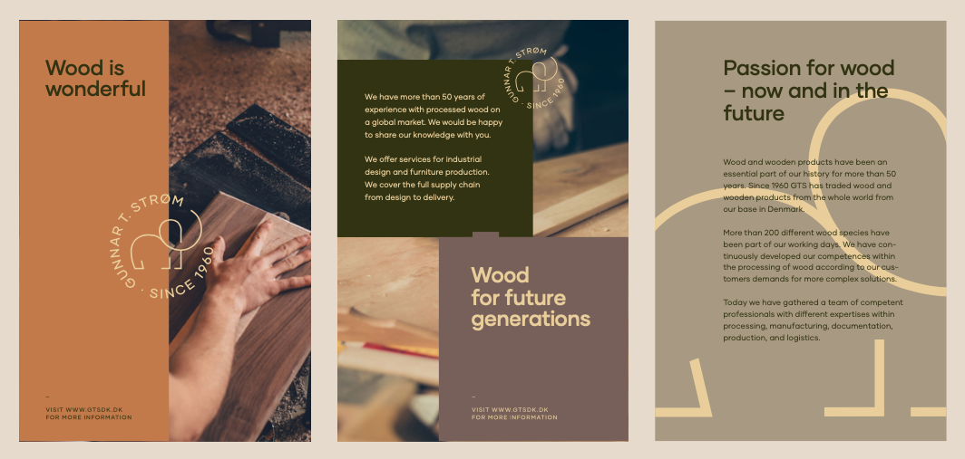
Gennem subtile visuelle greb trækker identiteten på træets naturlige skønhed og materialitet, samtidig med at den anerkender Gunnar T. Strøms historie og peger frem mod virksomhedens fremtid.


The logo
The elephant has been an integral part of the Gunnar T. Strøm logo since the founding of the company. It was updated to have a more clean and modern look. Combined with the circle stamp vector, the logo brings together the past and the present.

The logo
The elephant has been an integral part of the Gunnar T. Strøm logo since the founding of the company. It was updated to have a more clean and modern look. Combined with the circle stamp vector, the logo brings together the past and the present.
The logo
The elephant has been an integral part of the Gunnar T. Strøm logo since the founding of the company. It was updated to have a more clean and modern look. Combined with the circle stamp vector, the logo brings together the past and the present.
The logo
The elephant has been an integral part of the Gunnar T. Strøm logo since the founding of the company. It was updated to have a more clean and modern look. Combined with the circle stamp vector, the logo brings together the past and the present.
The logo
The elephant has been an integral part of the Gunnar T. Strøm logo since the founding of the company. It was updated to have a more clean and modern look. Combined with the circle stamp vector, the logo brings together the past and the present.
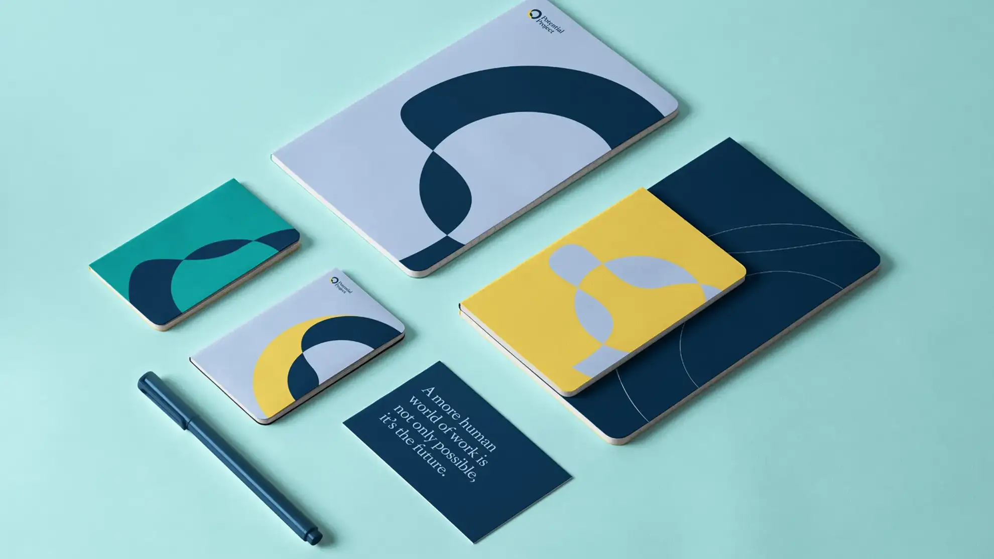
Natural color palette
The color palette is inspired by the colors found in nature. A blue color is added to give a corporate look to the identity. The colors can be combined in several ways depending on the situation and the message, Gunnar T. Strøm wishes to convey.
Natural color palette
The color palette is inspired by the colors found in nature. A blue color is added to give a corporate look to the identity. The colors can be combined in several ways depending on the situation and the message, Gunnar T. Strøm wishes to convey.
Natural color palette
The color palette is inspired by the colors found in nature. A blue color is added to give a corporate look to the identity. The colors can be combined in several ways depending on the situation and the message, Gunnar T. Strøm wishes to convey.
Natural color palette
The color palette is inspired by the colors found in nature. A blue color is added to give a corporate look to the identity. The colors can be combined in several ways depending on the situation and the message, Gunnar T. Strøm wishes to convey.
Natural color palette
The color palette is inspired by the colors found in nature. A blue color is added to give a corporate look to the identity. The colors can be combined in several ways depending on the situation and the message, Gunnar T. Strøm wishes to convey.
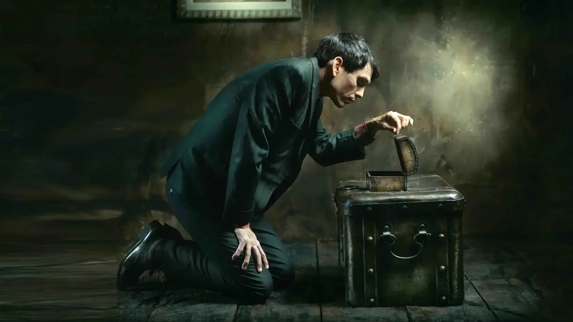
Discovering their purpose
Discovering their purpose
Discovering their purpose
Discovering their purpose
Discovering their purpose

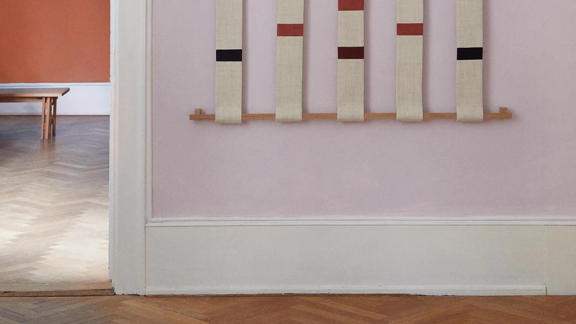
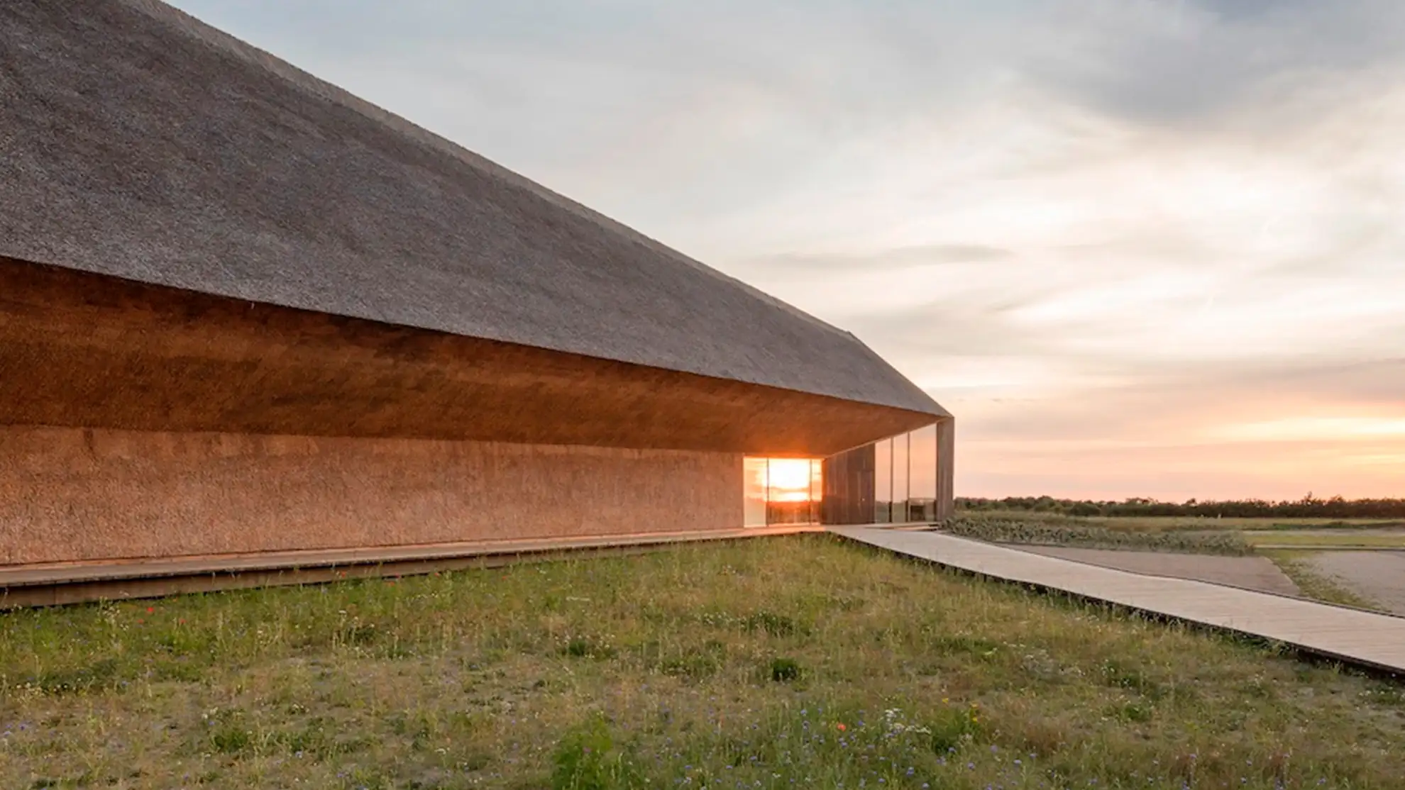
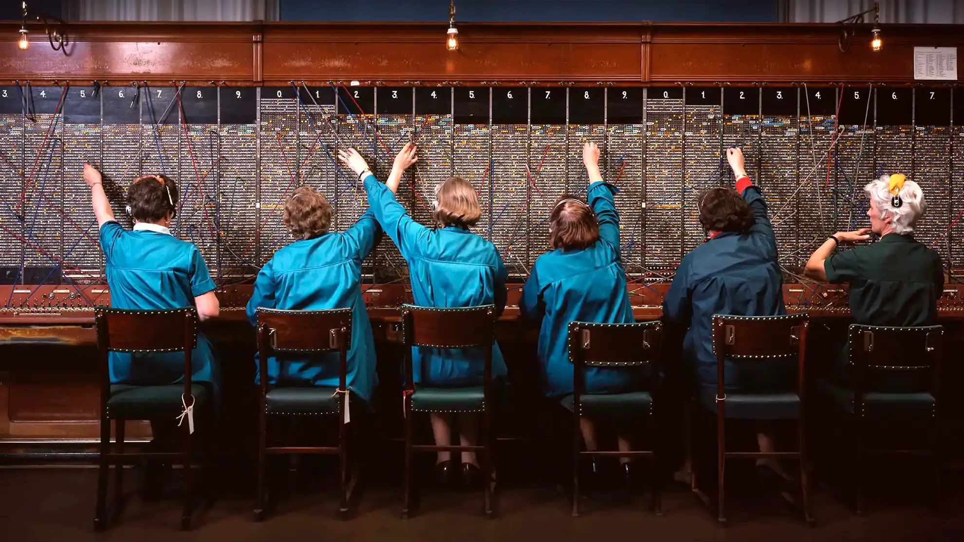
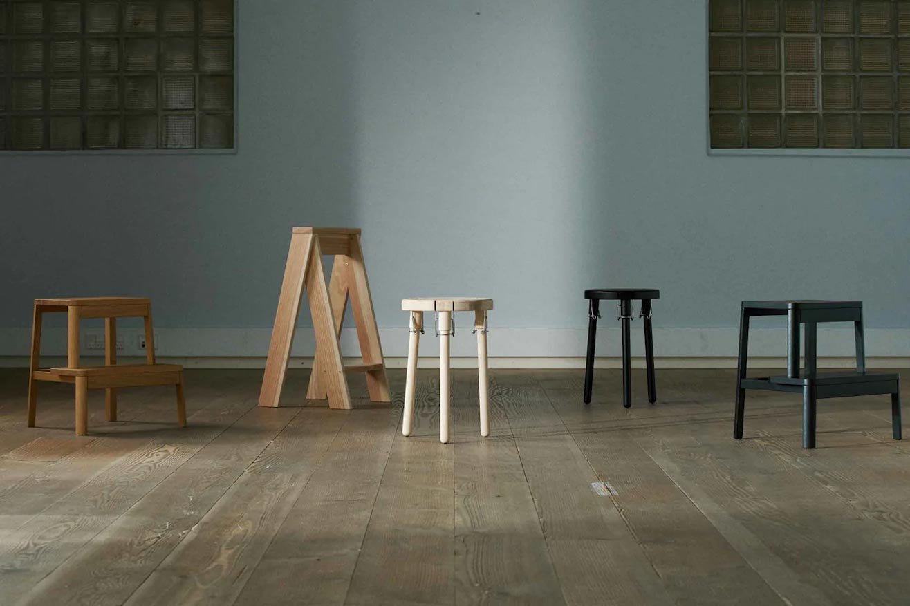
Wood joinery as graphic element
The visual identity toolbox consists of module surfaces that can be put on top of images. The surfaces are ‘joint’ together, giving associations to the wood joinery craft.
Wood joinery as graphic element
The visual identity toolbox consists of module surfaces that can be put on top of images. The surfaces are ‘joint’ together, giving associations to the wood joinery craft.
Wood joinery as graphic element
The visual identity toolbox consists of module surfaces that can be put on top of images. The surfaces are ‘joint’ together, giving associations to the wood joinery craft.
Wood joinery as graphic element
The visual identity toolbox consists of module surfaces that can be put on top of images. The surfaces are ‘joint’ together, giving associations to the wood joinery craft.
Wood joinery as graphic element
The visual identity toolbox consists of module surfaces that can be put on top of images. The surfaces are ‘joint’ together, giving associations to the wood joinery craft.
Gilmer Sans
We chose Gilmer as the primary GTS brand typography, used wherever possible. A characteristic and easy-to-read font working in both small and large sizes.

Gilmer Sans
We chose Gilmer as the primary GTS brand typography, used wherever possible. A characteristic and easy-to-read font working in both small and large sizes.
Gilmer Sans
We chose Gilmer as the primary GTS brand typography, used wherever possible. A characteristic and easy-to-read font working in both small and large sizes.
Gilmer Sans
We chose Gilmer as the primary GTS brand typography, used wherever possible. A characteristic and easy-to-read font working in both small and large sizes.
Gilmer Sans
We chose Gilmer as the primary GTS brand typography, used wherever possible. A characteristic and easy-to-read font working in both small and large sizes.
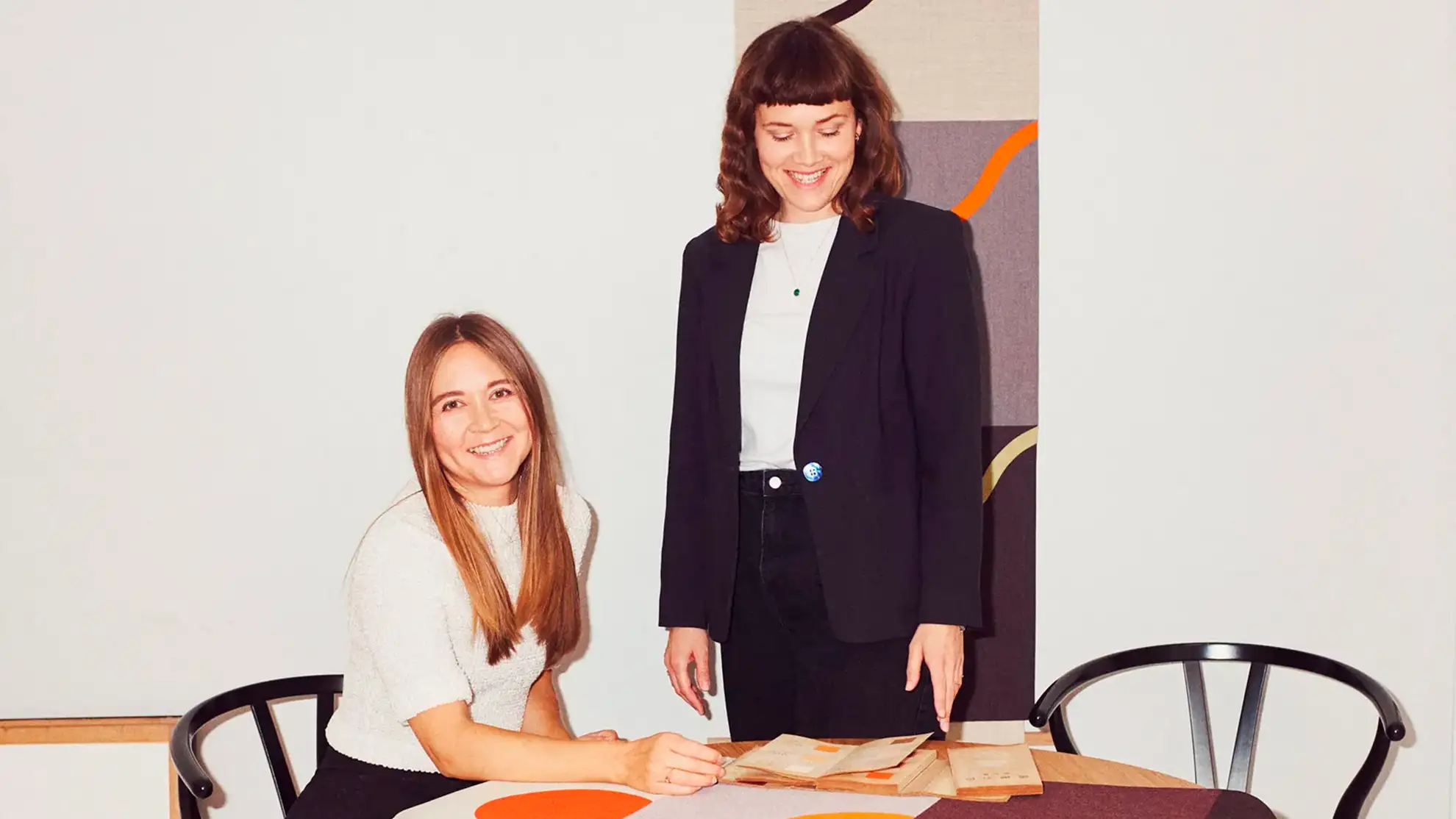
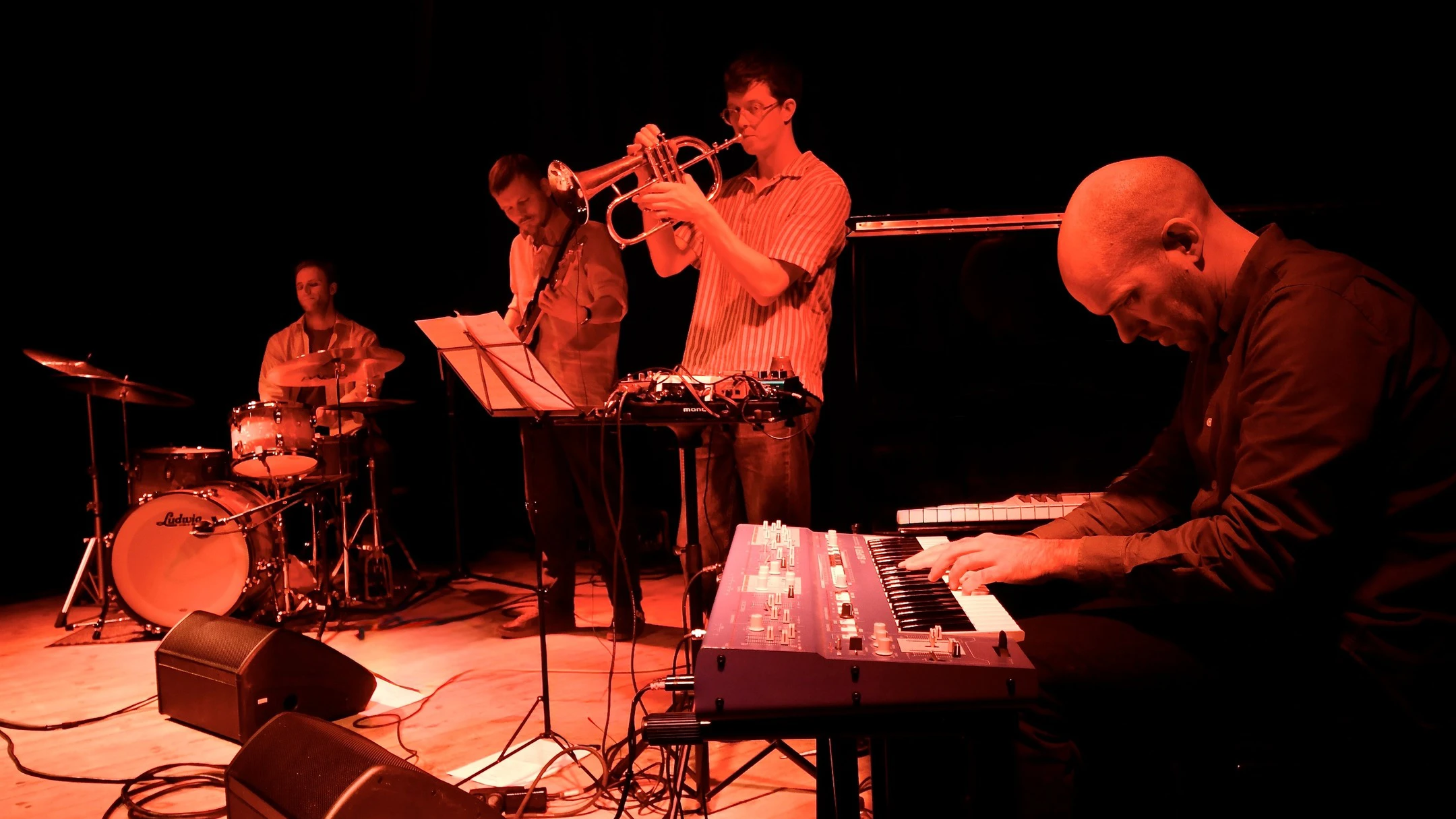
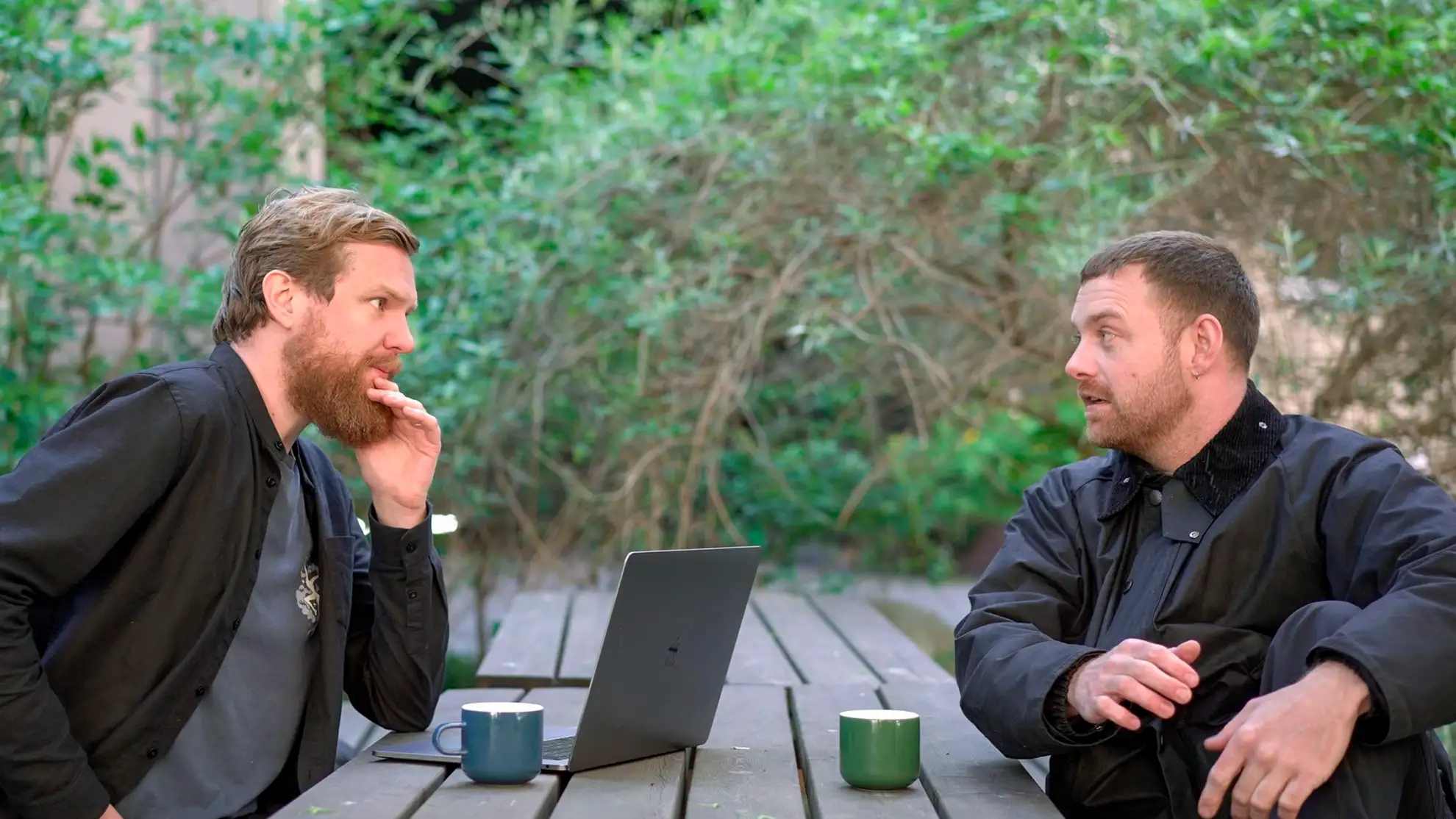
Understanding their purpose
To get to know Gunnar T. Strøm better, we performed workshops, looked at the brand’s strengths and weaknesses, and how they are perceived by their customers and employees. This resulted in a clearer understanding of the Gunnar T. Strøm purpose and ultimately led to the core story from which the visual identity was created.
Klar på at starte et design- eller digitalt projekt med Granyon? Tag fat i os. Du kan være helt rolig. Vi er de flinke. Ingen spam. Ingen selvfede bureauattituder.
Klar på at starte et design- eller digitalt projekt med Granyon? Tag fat i os. Du kan være helt rolig. Vi er de flinke. Ingen spam. Ingen selvfede bureauattituder.