FED UP Identitet og hjemmeside – Sharanda Jones
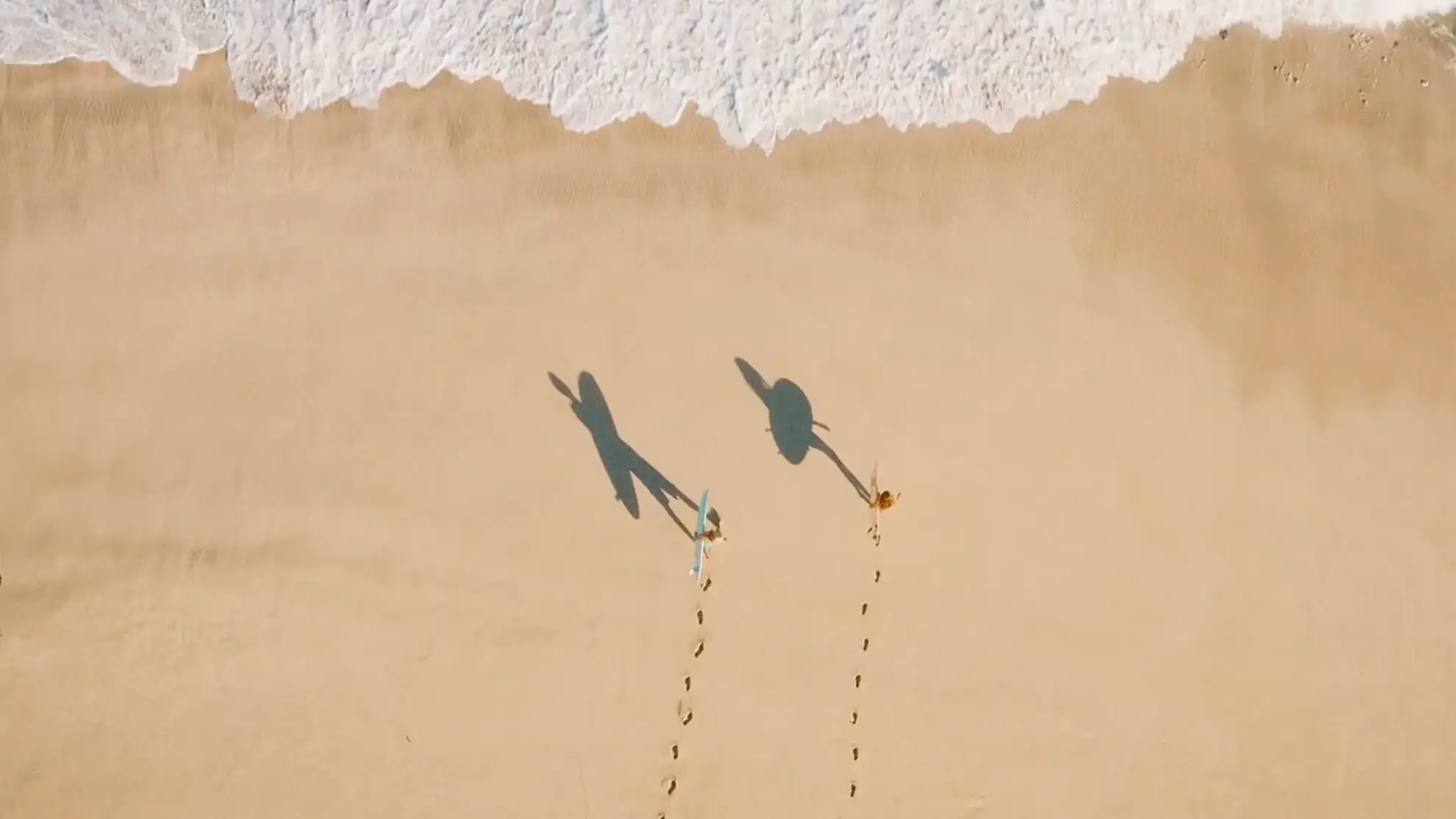
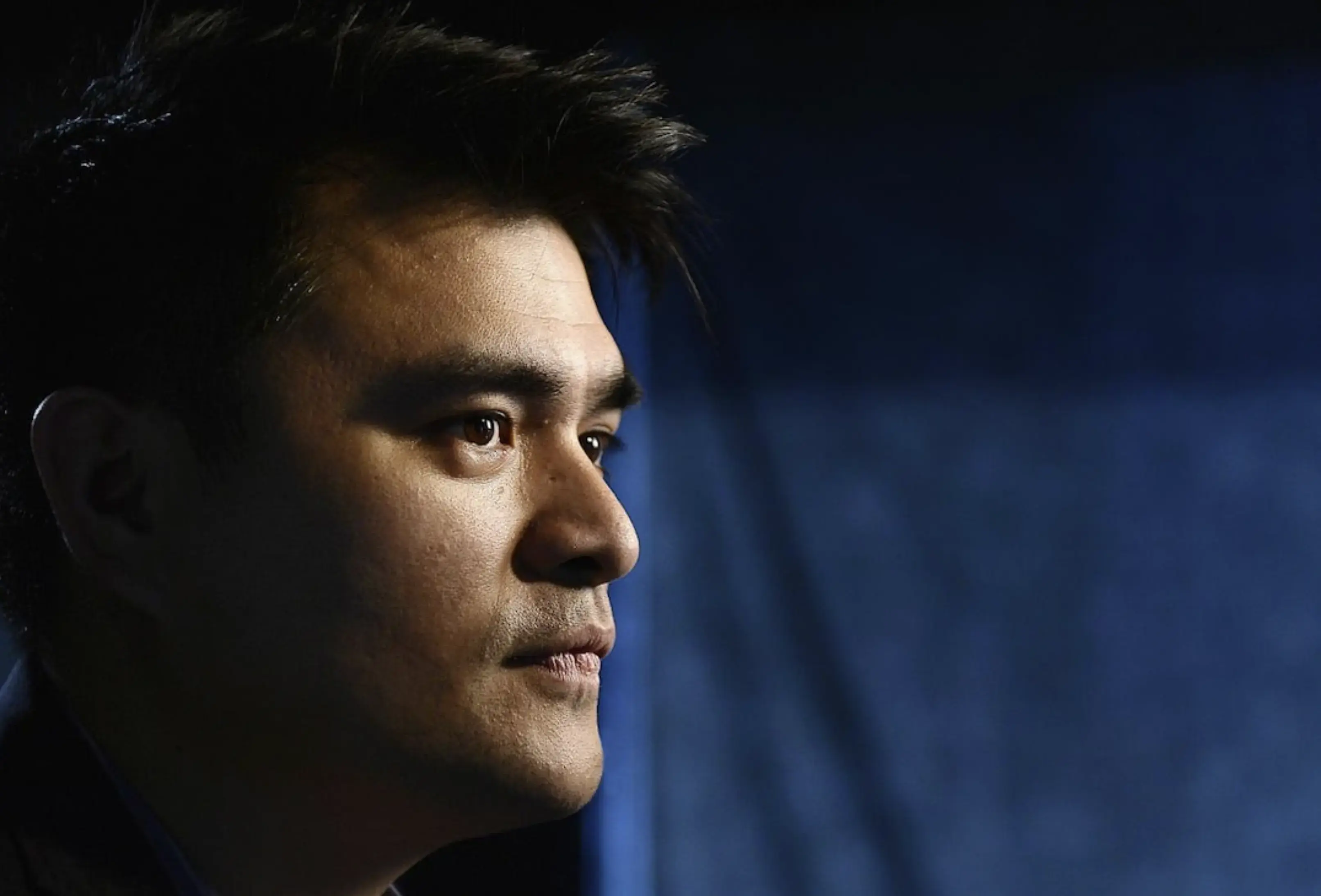
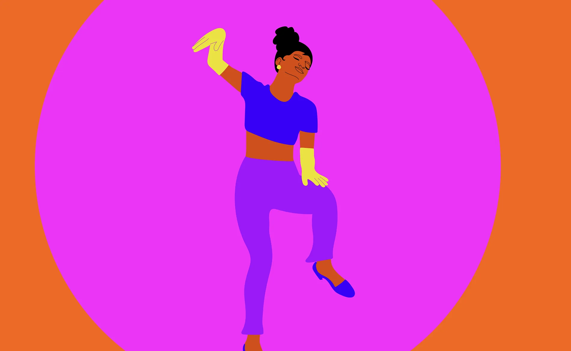
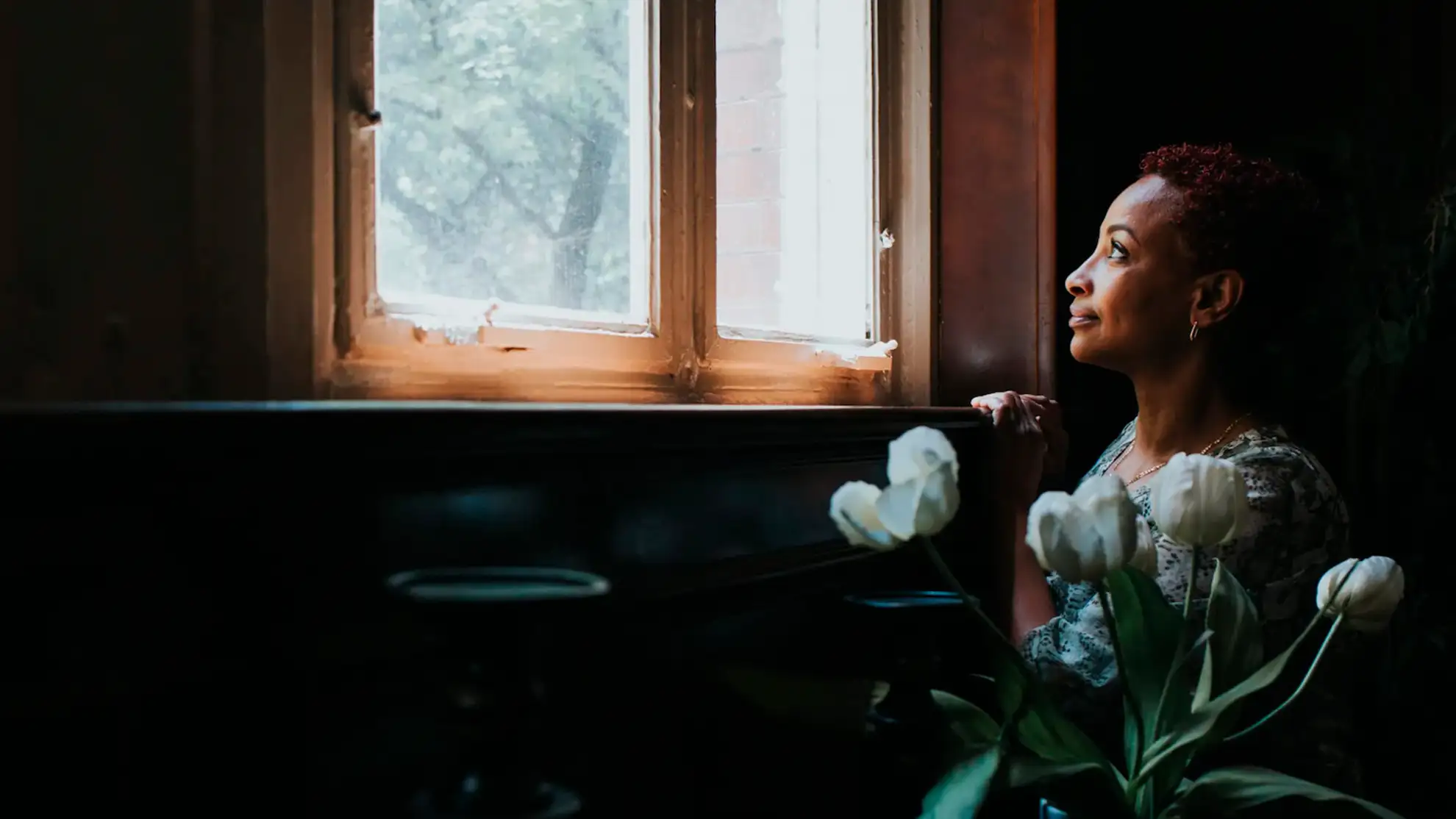
Sharandas historie er en fortælling om inspiration og modstandskraft. Fra et liv tilbragt i fængsel til at blive en succesfuld iværksætter i Dallas er hendes rejse præget af at overvinde enorme udfordringer og forfølge sin passion for mad.
Da vi fik opgaven med at udvikle en visuel identitet og en ny hjemmeside for hendes brand, ønskede vi at indfange essensen af Sharandas vision: hjemmelavet mad skabt med kærlighed og en varm, hjemlig stemning.

Find balancen
Navnet “FED UP” blev en reference til Sharandas stærke livshistorie og spiller på dobbeltheden mellem at blive mæt og at være træt af retssystemet. Gennem workshops og research samarbejdede vi tæt med Sharanda om at finde den rette balance for hendes nye brand. Foodtruck-universet gav os en kreativ ramme at arbejde indenfor, og vi kunne herfra guide den kreative retning mod en visuel identitet, der afspejler Sharandas personlige fortælling og kulinariske stil. Samlet set indfanger resultatet den varme og autenticitet, som er kernen i Sharandas brand.
Based on history
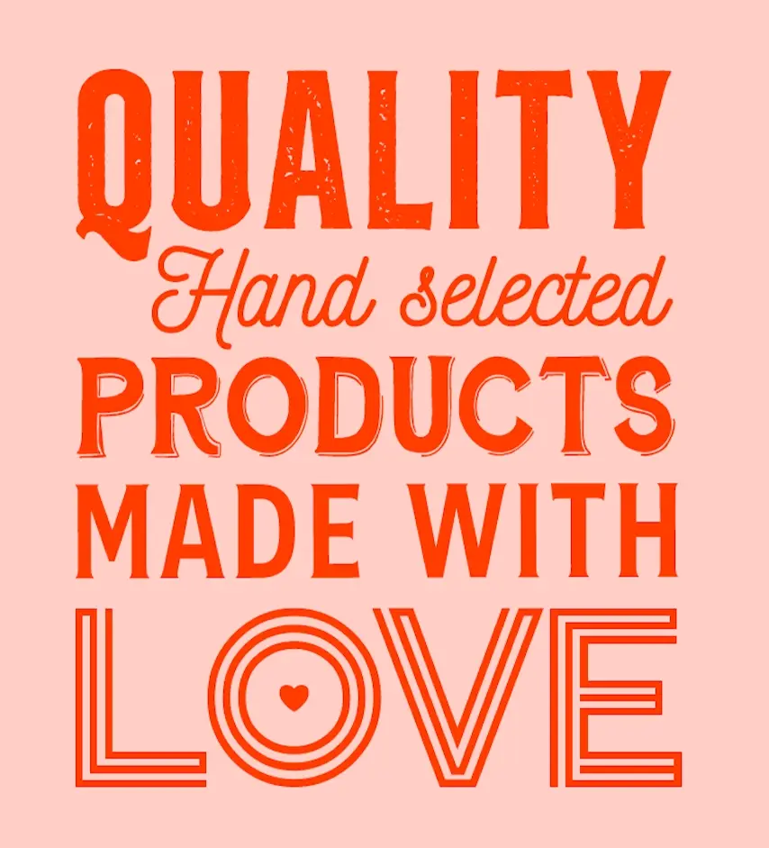
The inspiration for the new logo font draws from the classic styles seen on old US signs, evoking a sense of nostalgia and history. By using this style, the logo aims to convey a local and homey feeling, emphasizing Sharanda's passion for creating delicious, comforting meals that are made with love and a unique attitude. We wanted to create a design that immediately communicates the warmth and authenticity of her brand, with a timeless appeal that resonates with customers. The font choice reflects this sentiment and helps to establish a connection with customers, encouraging them to feel at home and welcome when enjoying Sharanda's food.

Based on history
The inspiration for the new logo font draws from the classic styles seen on old US signs, evoking a sense of nostalgia and history. By using this style, the logo aims to convey a local and homey feeling, emphasizing Sharanda's passion for creating delicious, comforting meals that are made with love and a unique attitude. We wanted to create a design that immediately communicates the warmth and authenticity of her brand, with a timeless appeal that resonates with customers. The font choice reflects this sentiment and helps to establish a connection with customers, encouraging them to feel at home and welcome when enjoying Sharanda's food.
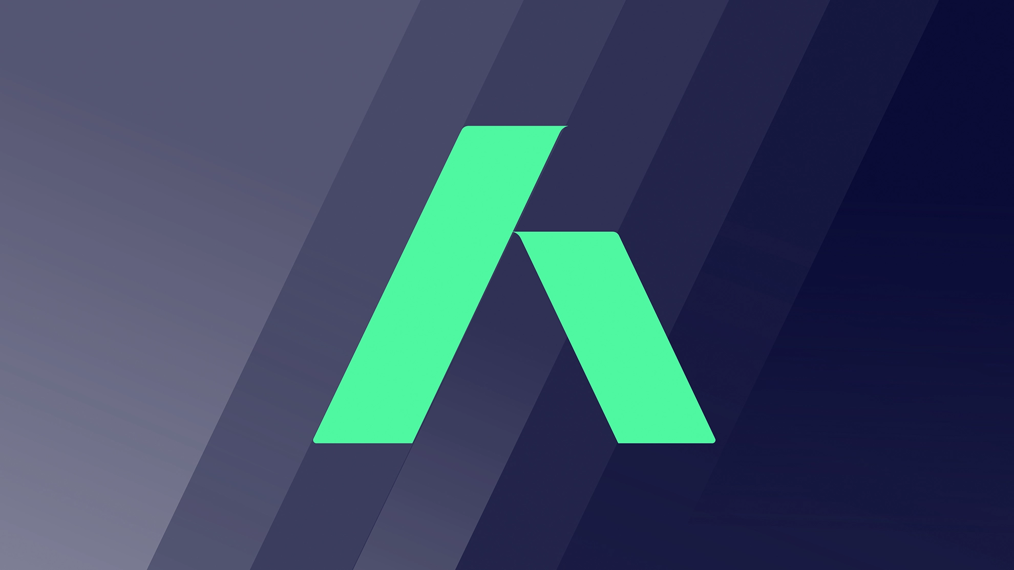
The new logo
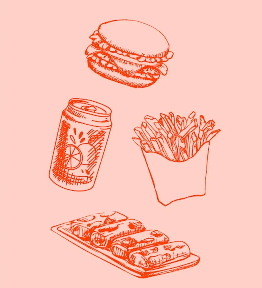
The new logo for Sharanda's brand FED UP was designed with versatility in mind, ensuring that it can be utilized across a range of different platforms and mediums. From the website and social media to burger wraps and even the food truck itself, the logo needs to work seamlessly in any situation. The final logo design features bold, clean lines that are easy to read and recognize, with a unique font that draws on vintage US sign styles to convey a sense of nostalgia and authenticity. The logo's color scheme, which features warm, earthy tones, further emphasizes the brand's emphasis on home-cooked meals made with love and care.
The new logo
The new logo for Sharanda's brand FED UP was designed with versatility in mind, ensuring that it can be utilized across a range of different platforms and mediums. From the website and social media to burger wraps and even the food truck itself, the logo needs to work seamlessly in any situation. The final logo design features bold, clean lines that are easy to read and recognize, with a unique font that draws on vintage US sign styles to convey a sense of nostalgia and authenticity. The logo's color scheme, which features warm, earthy tones, further emphasizes the brand's emphasis on home-cooked meals made with love and care.
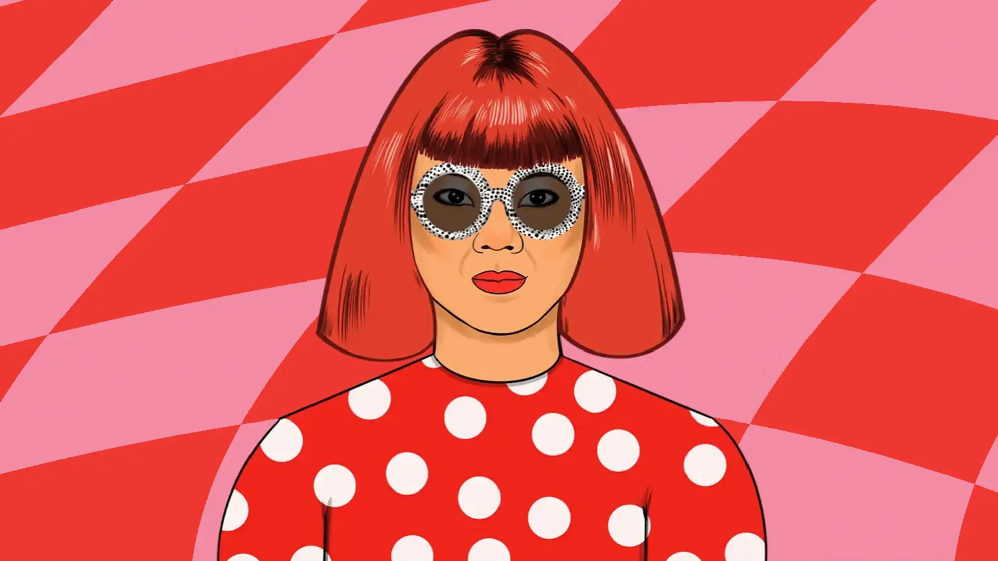
A visually appealing identity
By designing a logo that is both functional and visually appealing, we have created a strong visual identity that can effectively represent Sharanda's brand across all types of media. Whether customers encounter FED UP online, on the street, or in the restaurant, they will immediately recognize and connect with the brand's unique personality and message.
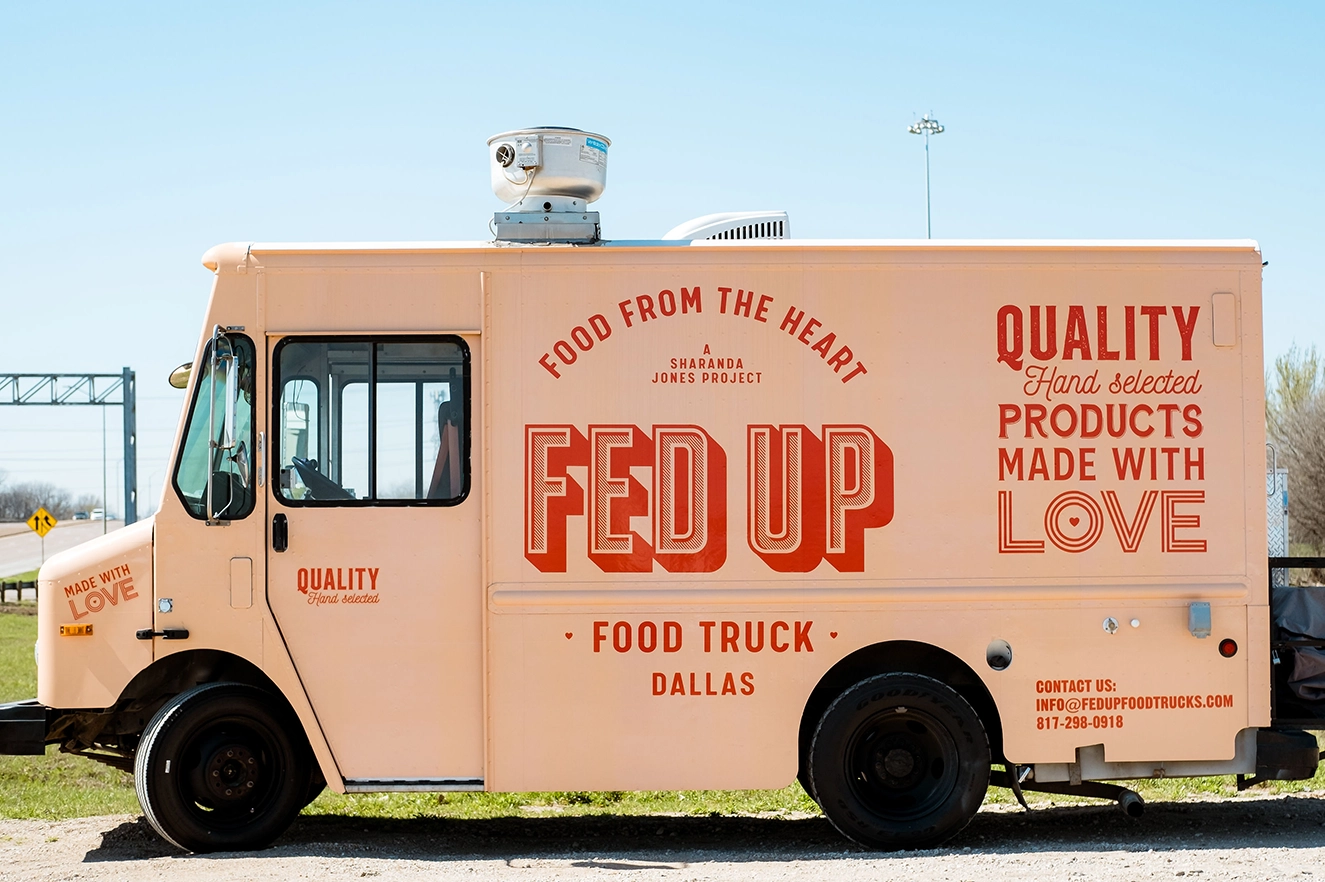
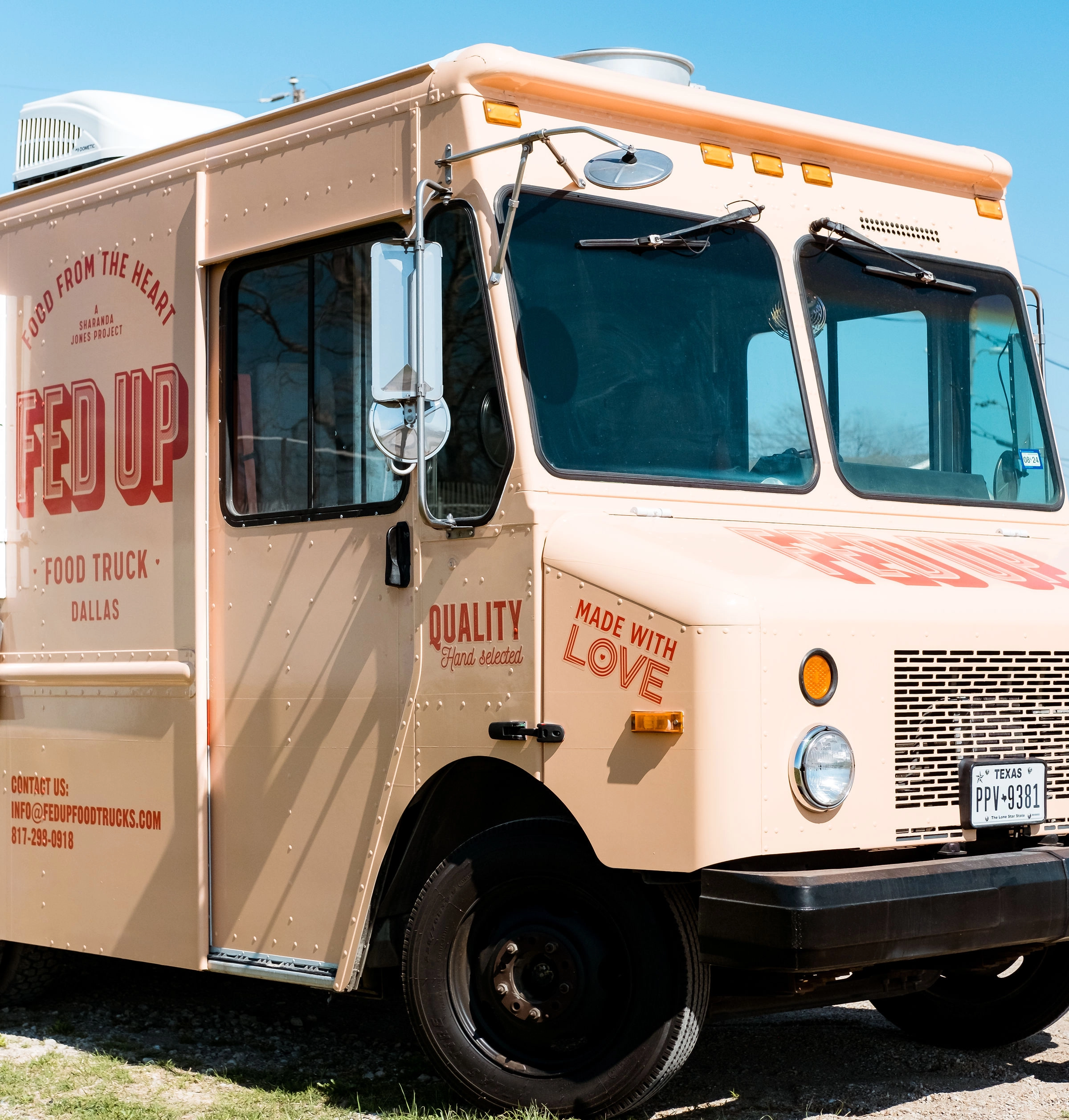
The Food Truck
Designing the food truck for Sharanda's brand was a new challenge for the Granyon team. It was a significant responsibility to create a design that not only effectively represented the brand's visual identity but also ensured the truck was appealing from all sides. However, this task was also fun and inspiring for the team, as they were able to translate the brand's personality into a moving, eye-catching vehicle. The team worked closely with Sharanda to ensure the food truck design aligned with the overall visual identity of the brand.
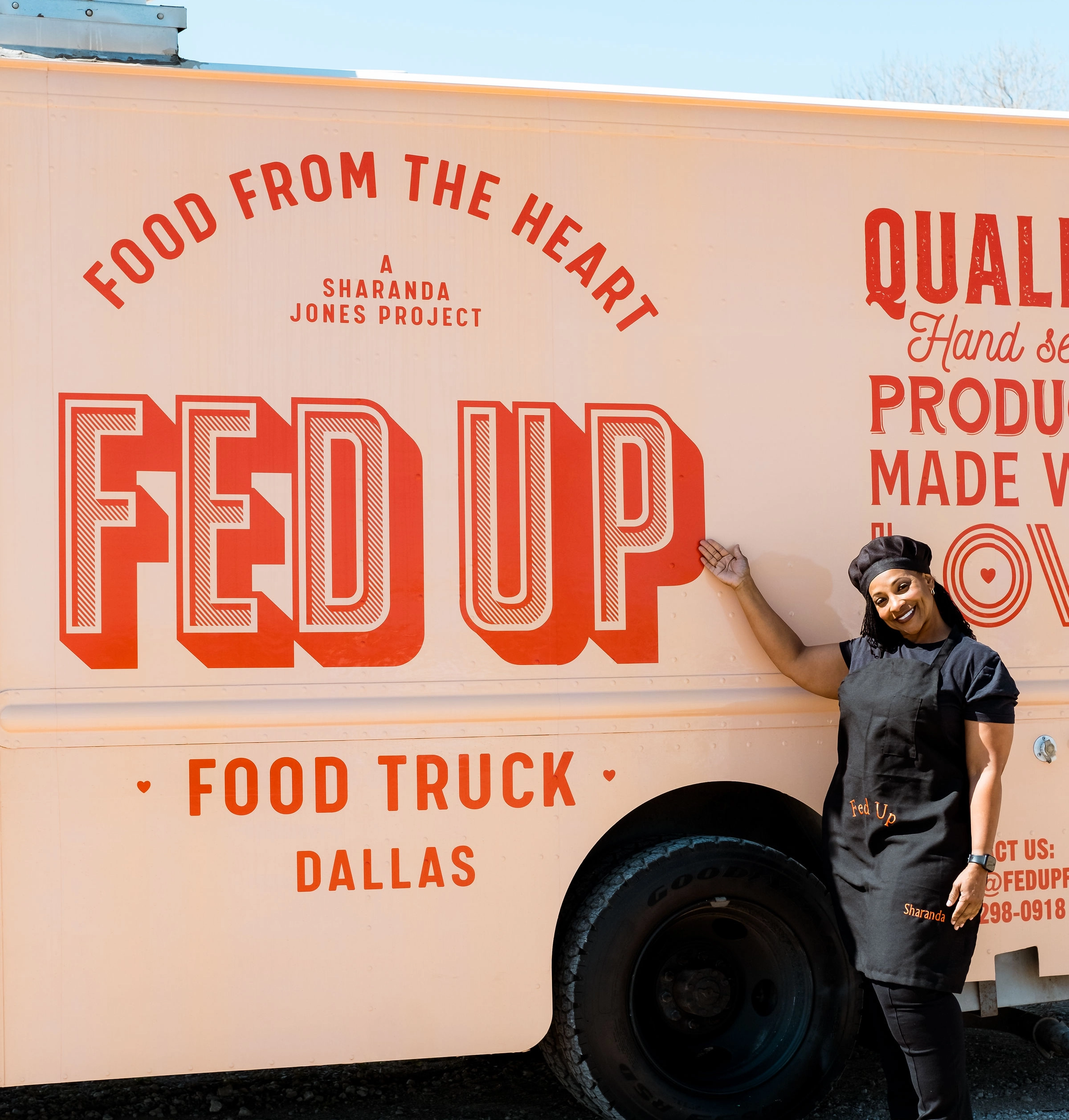
Thank you Sharanda and Brittany
The Granyon team was overwhelmed with pride upon receiving pictures of the truck adorned with our design from Brittany and Sharanda. It was a pivotal moment for us, realizing the tangible impact we had in providing Sharande with the optimal foundation for her business to flourish. We are deeply grateful for the opportunity to be a part of this project. Thank you!
A unique online experience
To enhance the FED UP Foodtruck brand, we developed an interactive concept that showcases the truck's new design as the centerpiece of the website. As customers scroll down the page, they are taken on a playful journey that tells the story behind the company. Using Webflow and WebGL technology, we've created a unique online experience that engages and excites customers. To ensure that customers can easily identify the FED UP Foodtruck, we've made the design a prominent feature of the website. The truck itself is even animated, moving down the page to reveal the menu by opening its hatch. Additionally, we've incorporated a dynamic map that Sharanda can update easily, allowing customers to track the truck's location in real-time.By highlighting the truck's mobility, we're emphasizing the unique experience of enjoying delicious burgers and rolls made with love on the streets of Dallas. Overall, our design aims to capture the essence of FED UP Foodtruck and convey its commitment to quality, flavor, and fun.
“Jeres bidrag til Fed Up foodtrucken har været fuldstændig transformerende. Jeres dygtige og hjertevarme arbejde med at udvikle en brandidentitet for Sharanda gav os ikke blot et design, men en fortælling og en sjæl, som alle kan mærke, når de møder brandet. Billederne yder næsten ikke arbejdet retfærdighed i forhold til den effekt, det har haft. Taknemmelig dækker slet ikke. Tak til hele Granyon-teamet for at være en afgørende del af denne rejse fyldt med håb og forandring og for at støtte Sharandas drøm.”

Klar på at starte et design- eller digitalt projekt med Granyon? Tag fat i os. Du kan være helt rolig. Vi er de flinke. Ingen spam. Ingen selvfede bureauattituder.
Klar på at starte et design- eller digitalt projekt med Granyon? Tag fat i os. Du kan være helt rolig. Vi er de flinke. Ingen spam. Ingen selvfede bureauattituder.