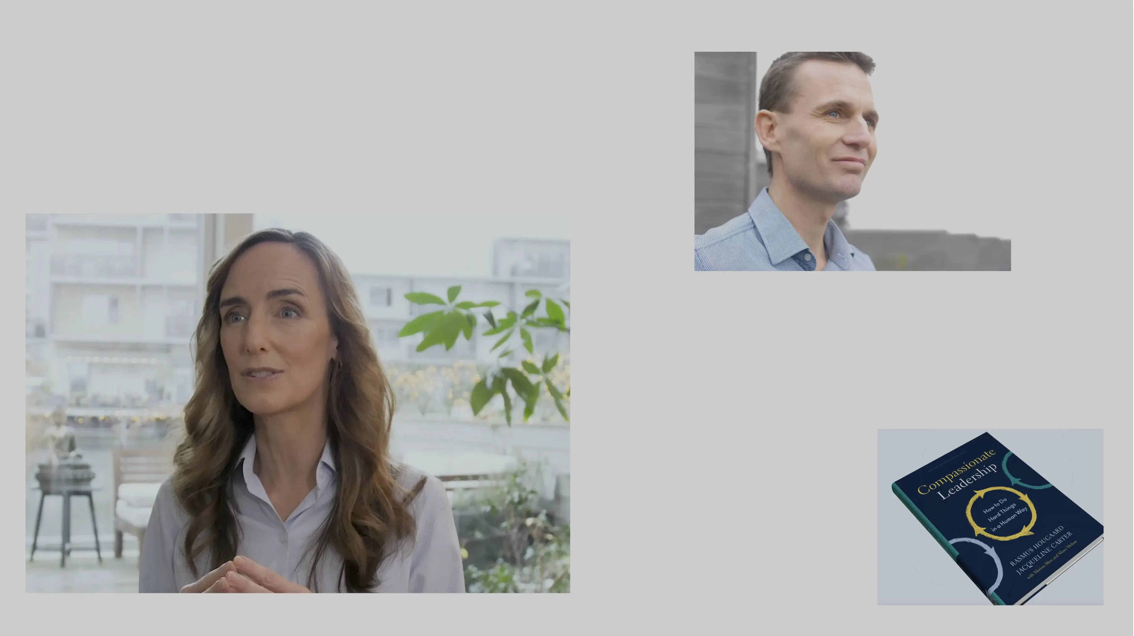
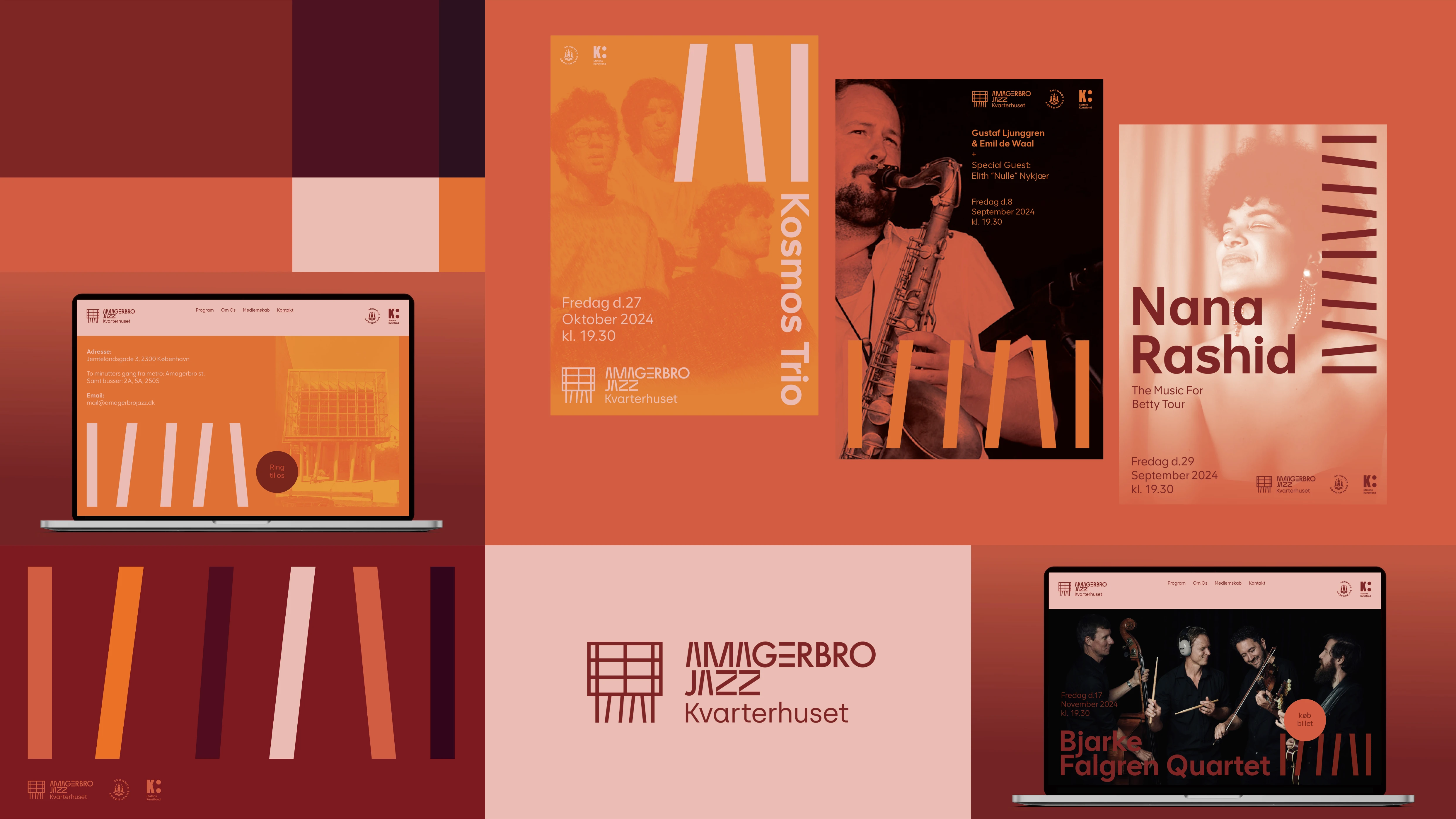
Amagerbro Jazz Visuel identitet
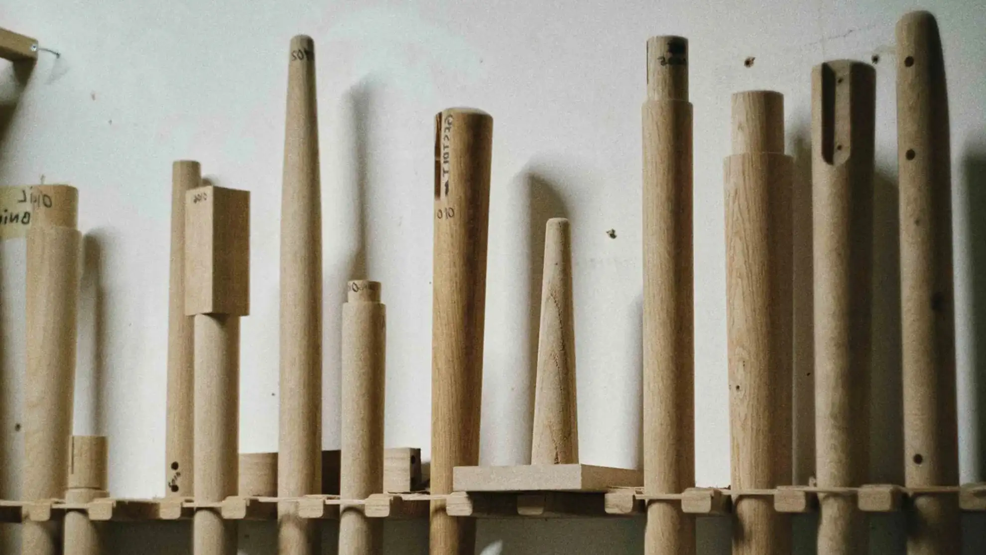
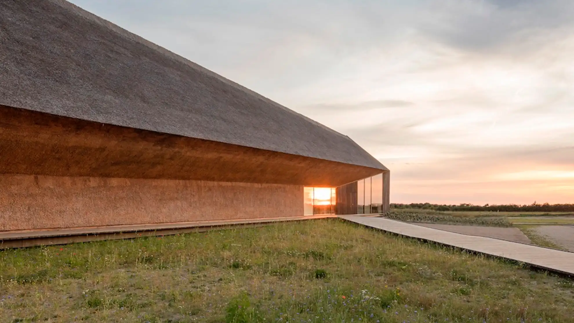
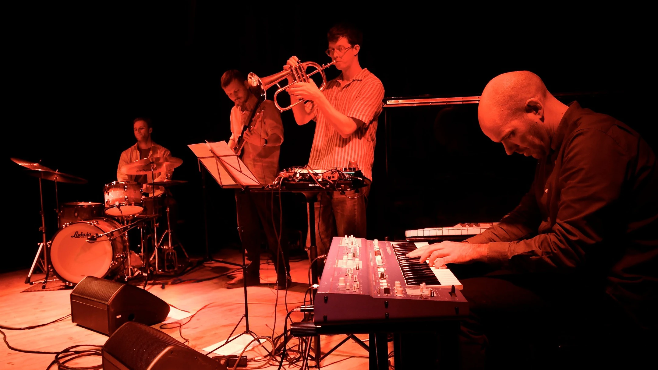
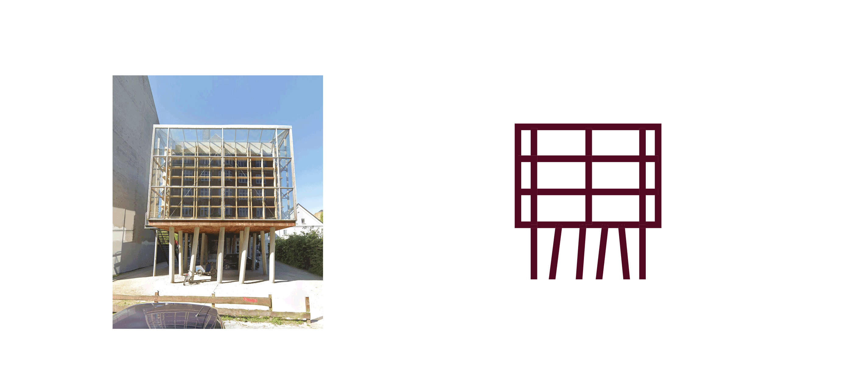
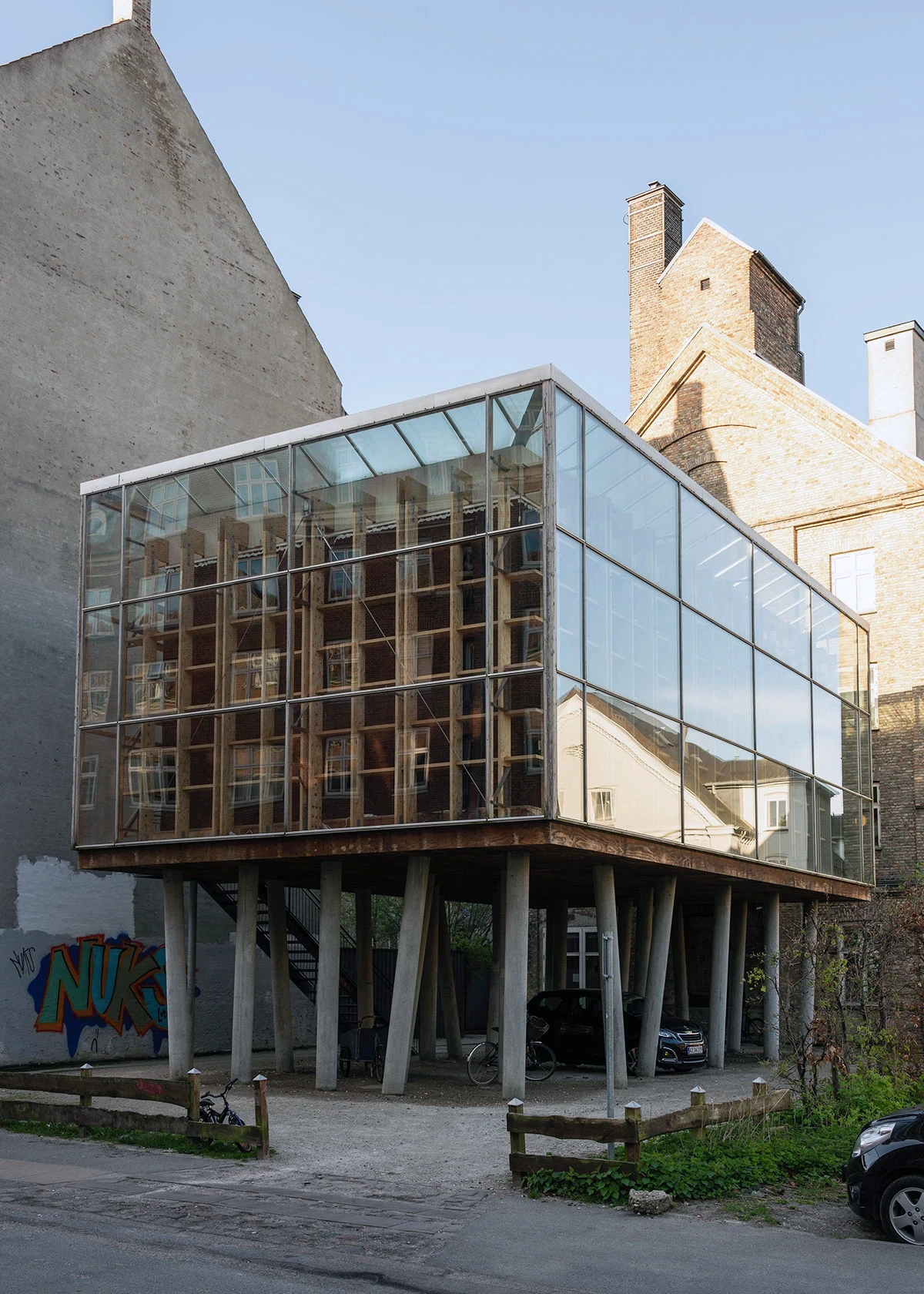
Amagerbro Jazz er født ud af lokal passion for jazz af høj kvalitet og tilbyder et varmt, afslappet rum for alle - fra jazznykommere til erfarne fans. Det nye logo og branding henter inspiration fra Dorte Mandrups unikke arkitektur.
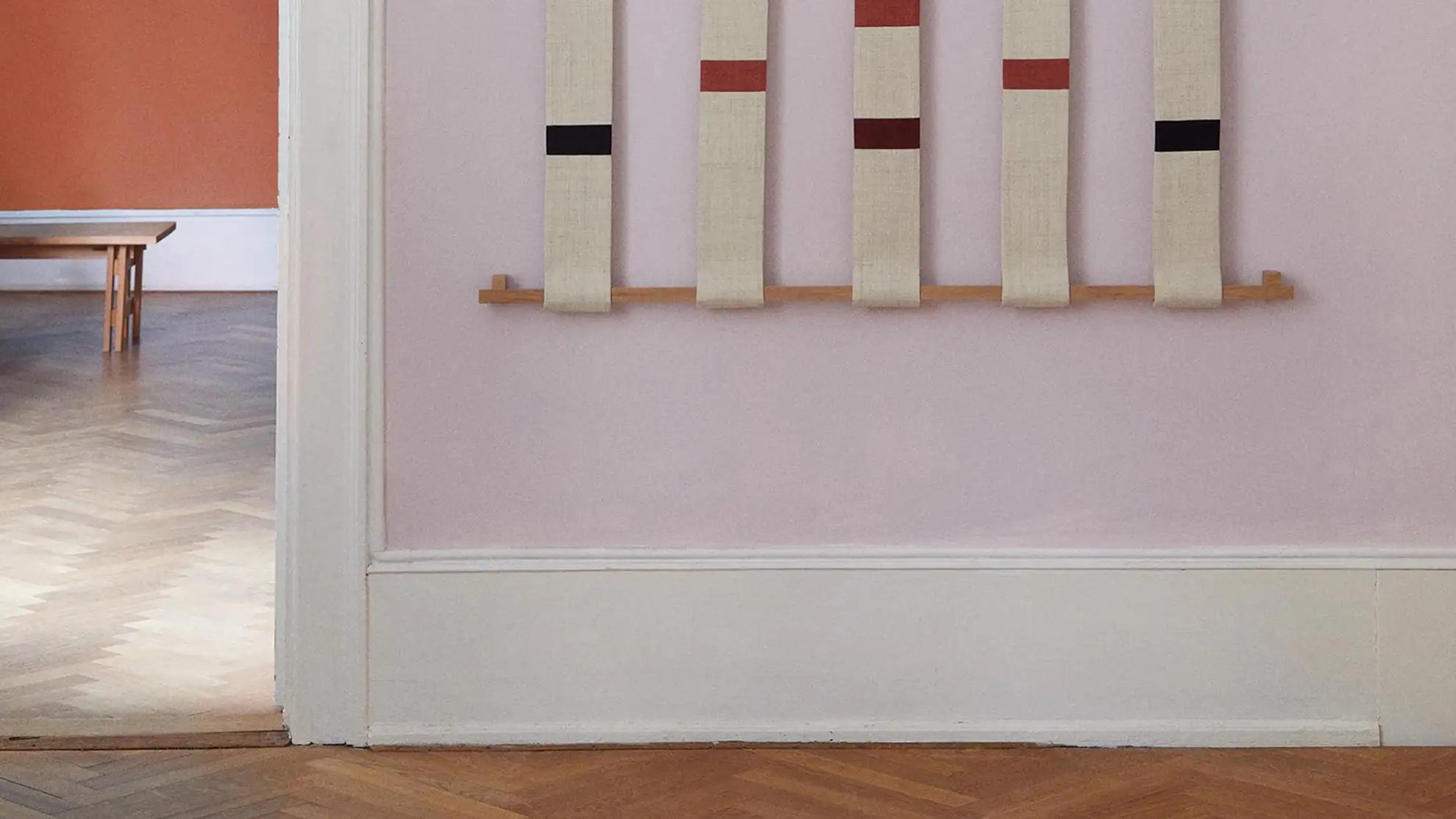
Ligesom et træhus er musikhallen hævet på første sal, understøttet af en „skov“ af vinklede betonsøjler og omgivet af vægge af glas og træ. Det luftige, lyse og rytmeinspirerede design afspejles nu i den nye visuelle identitet.


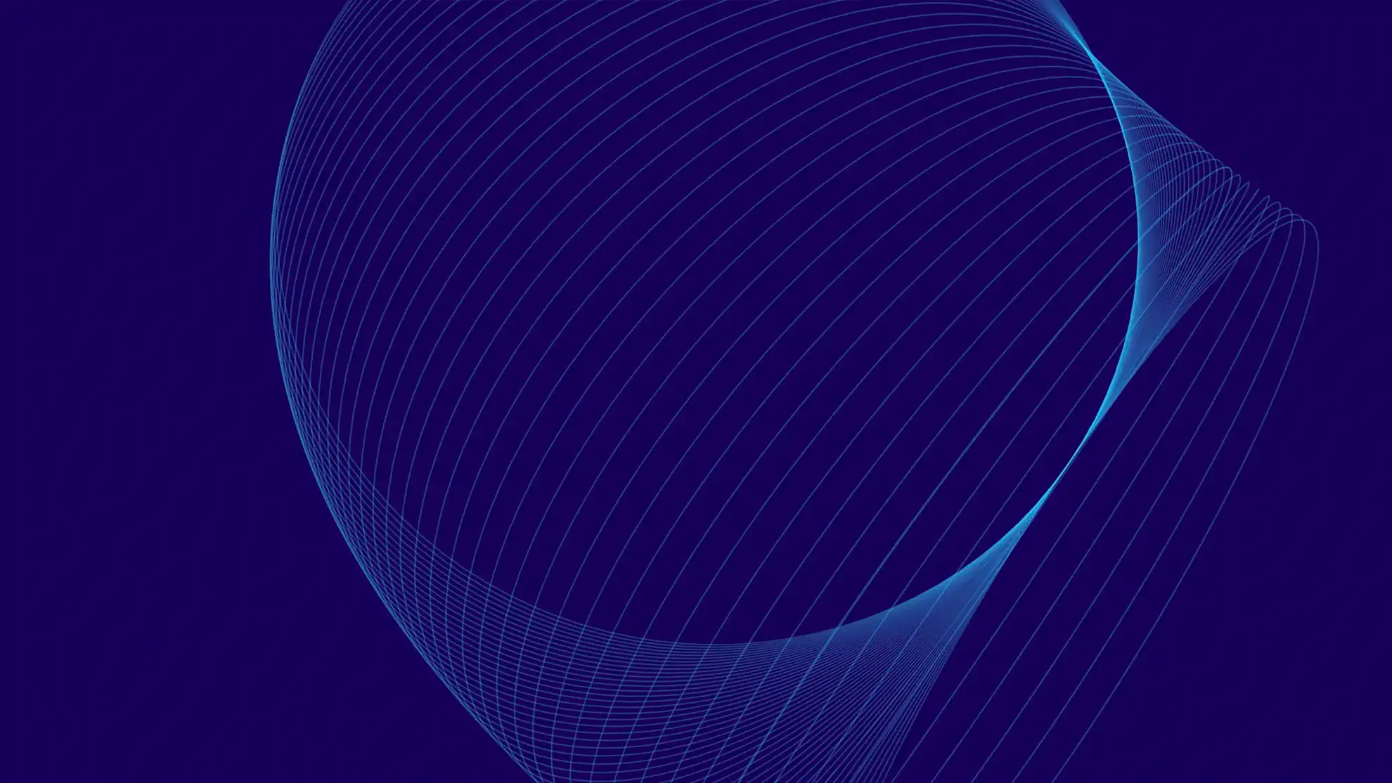
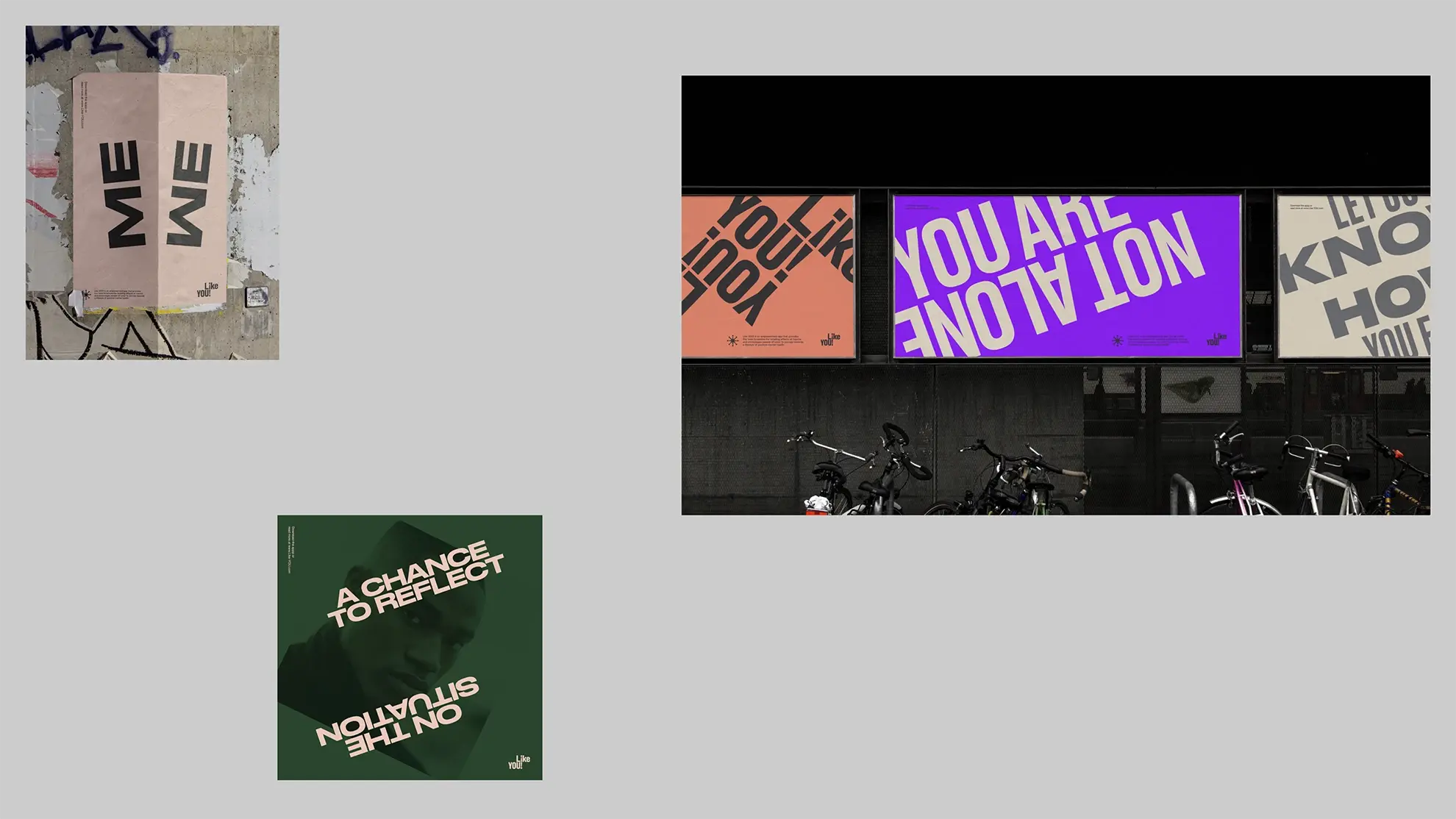
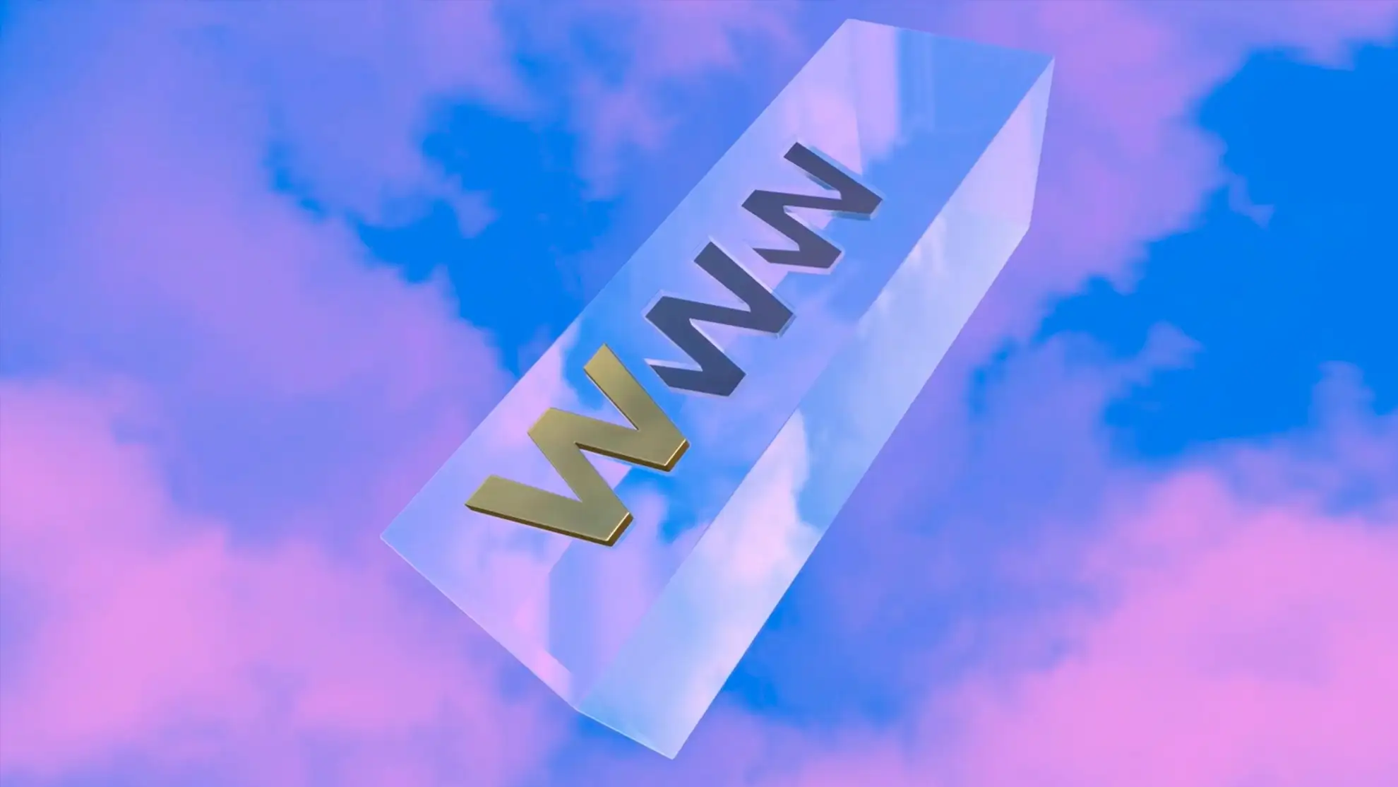
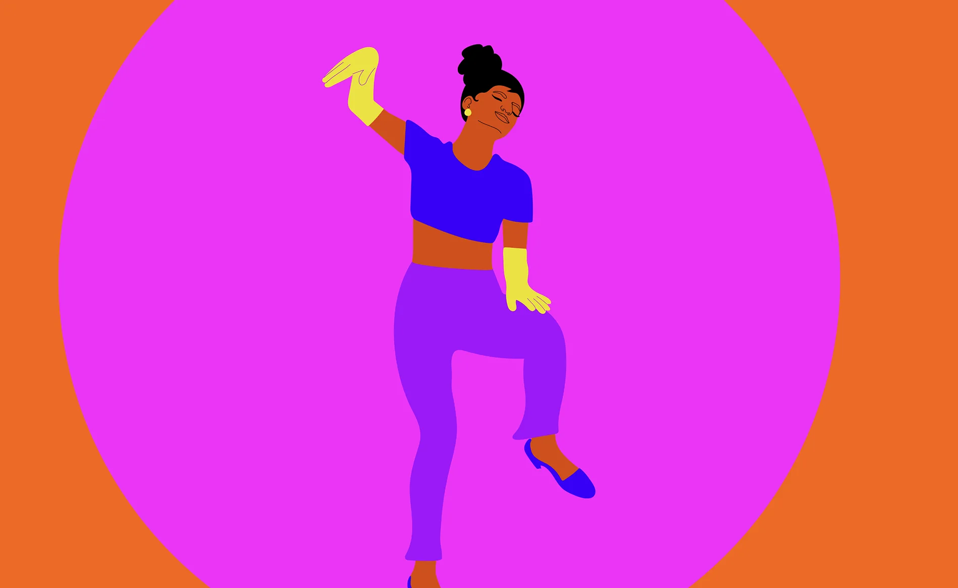
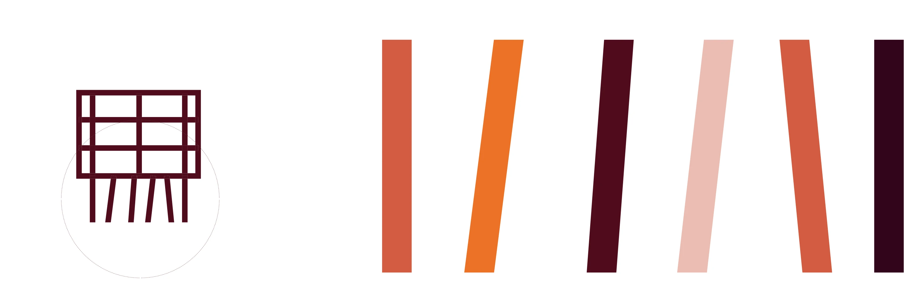
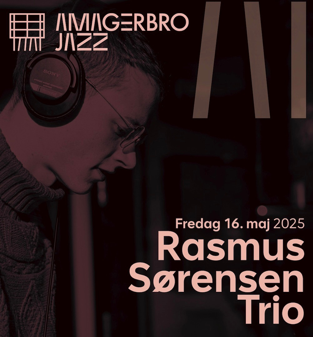
Et legende og dansende element
Det legende og dansende element fra bygningens søjler blev oversat til det visuelle formsprog, og hele idéen var at skabe et agilt system, der kunne anvendes på tværs af jazzklubbens forskellige kanaler og give den et unikt og dynamisk “musikalsk” udtryk. Med en så arkitektonisk markant lokation som ramme for musikken gav det perfekt mening at lade netop dette være omdrejningspunktet for den nye visuelle identitet.
Det legende og dansende element fra bygningens søjler blev oversat til det visuelle formsprog, og hele idéen var at skabe et agilt system, der kunne anvendes på tværs af jazzklubbens forskellige kanaler og give den et unikt og dynamisk “musikalsk” udtryk.
Med en så arkitektonisk markant lokation som ramme for musikken gav det perfekt mening at lade netop dette være omdrejningspunktet for den nye visuelle identitet.
Et legende og dansende element
Det legende og dansende element fra bygningens søjler blev oversat til det visuelle formsprog, og hele idéen var at skabe et agilt system, der kunne anvendes på tværs af jazzklubbens forskellige kanaler og give den et unikt og dynamisk “musikalsk” udtryk.
Med en så arkitektonisk markant lokation som ramme for musikken gav det perfekt mening at lade netop dette være omdrejningspunktet for den nye visuelle identitet.
Det legende og dansende element fra bygningens søjler blev oversat til det visuelle formsprog, og hele idéen var at skabe et agilt system, der kunne anvendes på tværs af jazzklubbens forskellige kanaler og give den et unikt og dynamisk “musikalsk” udtryk. Med en så arkitektonisk markant lokation som ramme for musikken gav det perfekt mening at lade netop dette være omdrejningspunktet for den nye visuelle identitet.
Et legende og dansende element
Det legende og dansende element fra bygningens søjler blev oversat til det visuelle formsprog, og hele idéen var at skabe et agilt system, der kunne anvendes på tværs af jazzklubbens forskellige kanaler og give den et unikt og dynamisk “musikalsk” udtryk.
Med en så arkitektonisk markant lokation som ramme for musikken gav det perfekt mening at lade netop dette være omdrejningspunktet for den nye visuelle identitet.
Det legende og dansende element fra bygningens søjler blev oversat til det visuelle formsprog, og hele idéen var at skabe et agilt system, der kunne anvendes på tværs af jazzklubbens forskellige kanaler og give den et unikt og dynamisk “musikalsk” udtryk. Med en så arkitektonisk markant lokation som ramme for musikken gav det perfekt mening at lade netop dette være omdrejningspunktet for den nye visuelle identitet.
Det legende og dansende element fra bygningens søjler blev oversat til det visuelle formsprog, og hele idéen var at skabe et agilt system, der kunne anvendes på tværs af jazzklubbens forskellige kanaler og give den et unikt og dynamisk “musikalsk” udtryk.
Med en så arkitektonisk markant lokation som ramme for musikken gav det perfekt mening at lade netop dette være omdrejningspunktet for den nye visuelle identitet.
Et legende og dansende element
Det legende og dansende element fra bygningens søjler blev oversat til det visuelle formsprog, og hele idéen var at skabe et agilt system, der kunne anvendes på tværs af jazzklubbens forskellige kanaler og give den et unikt og dynamisk “musikalsk” udtryk. Med en så arkitektonisk markant lokation som ramme for musikken gav det perfekt mening at lade netop dette være omdrejningspunktet for den nye visuelle identitet.
Det legende og dansende element fra bygningens søjler blev oversat til det visuelle formsprog, og hele idéen var at skabe et agilt system, der kunne anvendes på tværs af jazzklubbens forskellige kanaler og give den et unikt og dynamisk “musikalsk” udtryk.
Med en så arkitektonisk markant lokation som ramme for musikken gav det perfekt mening at lade netop dette være omdrejningspunktet for den nye visuelle identitet.
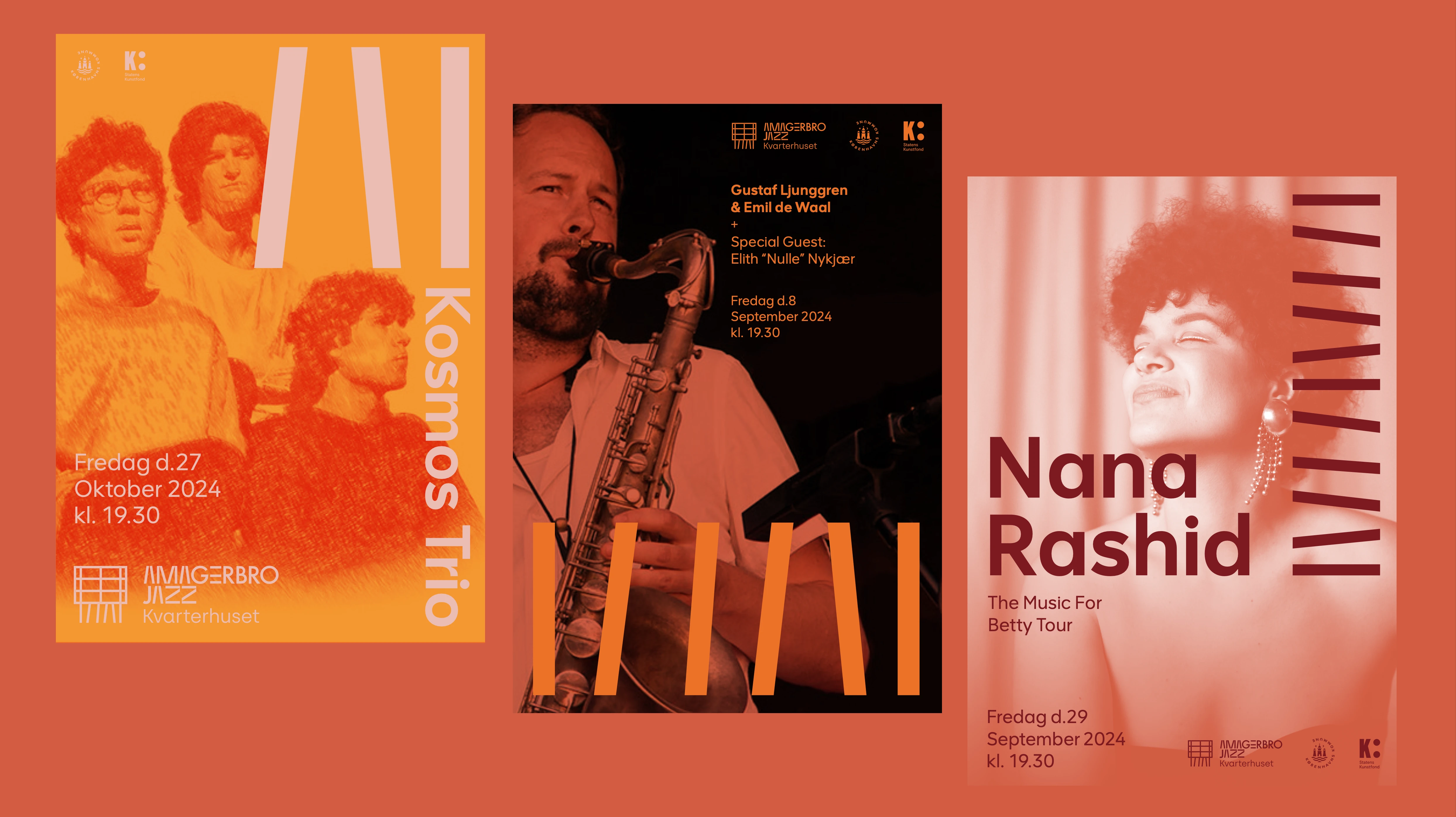
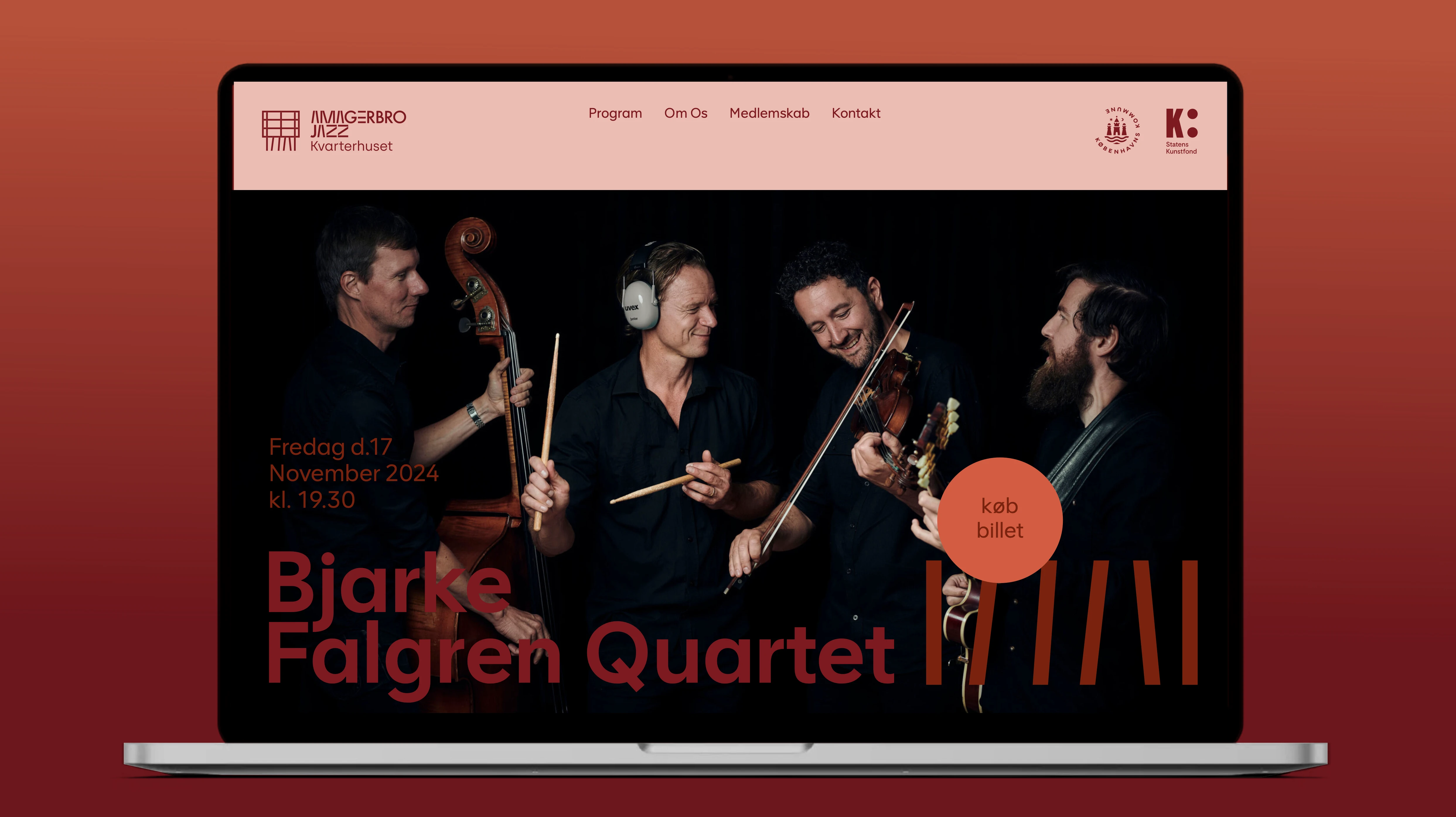
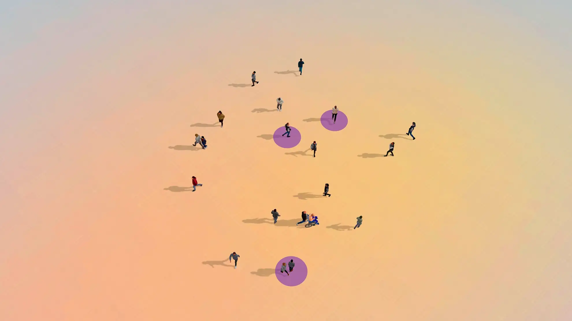
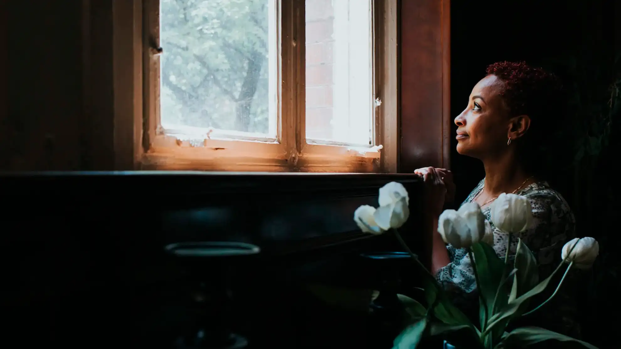
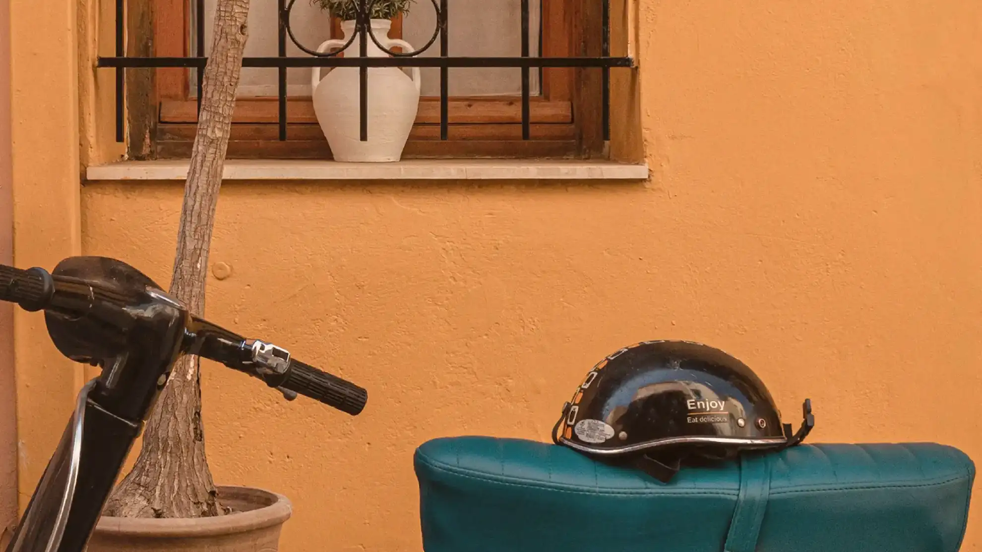
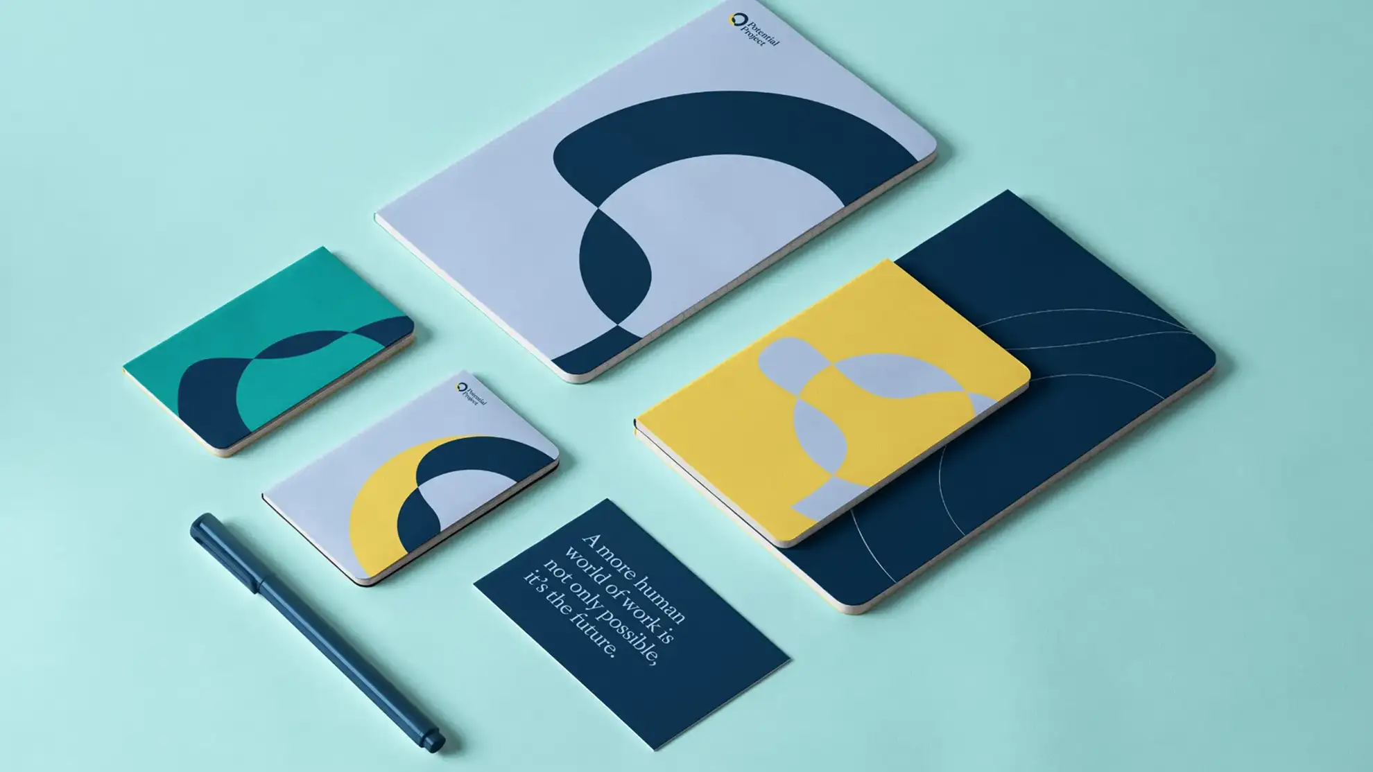
En rolig, varm og gennemført visuel identitet
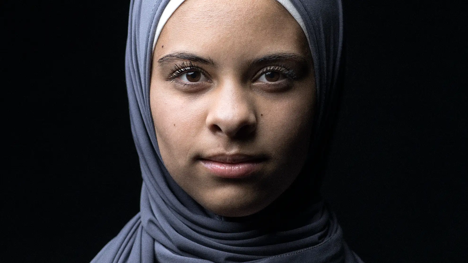
Ved at adoptere den enkle og geometriske AA Smart som jazzklubbens nye typografi – og kombinere den med forskellige farvefiltre lagt over deres kunstnerfotos – blev der skabt en rolig, sammenhængende og øjeblikkeligt genkendelig visuel identitet. Denne tilgang gav ikke blot klubbens materialer et gennemarbejdet og professionelt udtryk, men etablerede også et fleksibelt system, som de løbende kan anvende og tilpasse på tværs af deres hjemmeside, sociale medier og øvrige kommunikation. Det sikrer en konsistent og karakterfuld tilstedeværelse, der afspejler klubbens ånd.
Ved at adoptere den enkle og geometriske AA Smart som jazzklubbens nye typografi – og kombinere den med forskellige farvefiltre lagt over deres kunstnerfotos – blev der skabt en rolig, sammenhængende og øjeblikkeligt genkendelig visuel identitet.
Denne tilgang gav ikke blot klubbens materialer et gennemarbejdet og professionelt udtryk, men etablerede også et fleksibelt system, som de løbende kan anvende og tilpasse på tværs af deres hjemmeside, sociale medier og øvrige kommunikation. Det sikrer en konsistent og karakterfuld tilstedeværelse, der afspejler klubbens ånd.
En rolig, varm og gennemført visuel identitet
Ved at adoptere den enkle og geometriske AA Smart som jazzklubbens nye typografi – og kombinere den med forskellige farvefiltre lagt over deres kunstnerfotos – blev der skabt en rolig, sammenhængende og øjeblikkeligt genkendelig visuel identitet.
Denne tilgang gav ikke blot klubbens materialer et gennemarbejdet og professionelt udtryk, men etablerede også et fleksibelt system, som de løbende kan anvende og tilpasse på tværs af deres hjemmeside, sociale medier og øvrige kommunikation. Det sikrer en konsistent og karakterfuld tilstedeværelse, der afspejler klubbens ånd.
Ved at adoptere den enkle og geometriske AA Smart som jazzklubbens nye typografi – og kombinere den med forskellige farvefiltre lagt over deres kunstnerfotos – blev der skabt en rolig, sammenhængende og øjeblikkeligt genkendelig visuel identitet. Denne tilgang gav ikke blot klubbens materialer et gennemarbejdet og professionelt udtryk, men etablerede også et fleksibelt system, som de løbende kan anvende og tilpasse på tværs af deres hjemmeside, sociale medier og øvrige kommunikation. Det sikrer en konsistent og karakterfuld tilstedeværelse, der afspejler klubbens ånd.
En rolig, varm og gennemført visuel identitet
Ved at adoptere den enkle og geometriske AA Smart som jazzklubbens nye typografi – og kombinere den med forskellige farvefiltre lagt over deres kunstnerfotos – blev der skabt en rolig, sammenhængende og øjeblikkeligt genkendelig visuel identitet.
Denne tilgang gav ikke blot klubbens materialer et gennemarbejdet og professionelt udtryk, men etablerede også et fleksibelt system, som de løbende kan anvende og tilpasse på tværs af deres hjemmeside, sociale medier og øvrige kommunikation. Det sikrer en konsistent og karakterfuld tilstedeværelse, der afspejler klubbens ånd.
Ved at adoptere den enkle og geometriske AA Smart som jazzklubbens nye typografi – og kombinere den med forskellige farvefiltre lagt over deres kunstnerfotos – blev der skabt en rolig, sammenhængende og øjeblikkeligt genkendelig visuel identitet. Denne tilgang gav ikke blot klubbens materialer et gennemarbejdet og professionelt udtryk, men etablerede også et fleksibelt system, som de løbende kan anvende og tilpasse på tværs af deres hjemmeside, sociale medier og øvrige kommunikation. Det sikrer en konsistent og karakterfuld tilstedeværelse, der afspejler klubbens ånd.
Ved at adoptere den enkle og geometriske AA Smart som jazzklubbens nye typografi – og kombinere den med forskellige farvefiltre lagt over deres kunstnerfotos – blev der skabt en rolig, sammenhængende og øjeblikkeligt genkendelig visuel identitet.
Denne tilgang gav ikke blot klubbens materialer et gennemarbejdet og professionelt udtryk, men etablerede også et fleksibelt system, som de løbende kan anvende og tilpasse på tværs af deres hjemmeside, sociale medier og øvrige kommunikation. Det sikrer en konsistent og karakterfuld tilstedeværelse, der afspejler klubbens ånd.
En rolig, varm og gennemført visuel identitet
Ved at adoptere den enkle og geometriske AA Smart som jazzklubbens nye typografi – og kombinere den med forskellige farvefiltre lagt over deres kunstnerfotos – blev der skabt en rolig, sammenhængende og øjeblikkeligt genkendelig visuel identitet. Denne tilgang gav ikke blot klubbens materialer et gennemarbejdet og professionelt udtryk, men etablerede også et fleksibelt system, som de løbende kan anvende og tilpasse på tværs af deres hjemmeside, sociale medier og øvrige kommunikation. Det sikrer en konsistent og karakterfuld tilstedeværelse, der afspejler klubbens ånd.
Ved at adoptere den enkle og geometriske AA Smart som jazzklubbens nye typografi – og kombinere den med forskellige farvefiltre lagt over deres kunstnerfotos – blev der skabt en rolig, sammenhængende og øjeblikkeligt genkendelig visuel identitet.
Denne tilgang gav ikke blot klubbens materialer et gennemarbejdet og professionelt udtryk, men etablerede også et fleksibelt system, som de løbende kan anvende og tilpasse på tværs af deres hjemmeside, sociale medier og øvrige kommunikation. Det sikrer en konsistent og karakterfuld tilstedeværelse, der afspejler klubbens ånd.
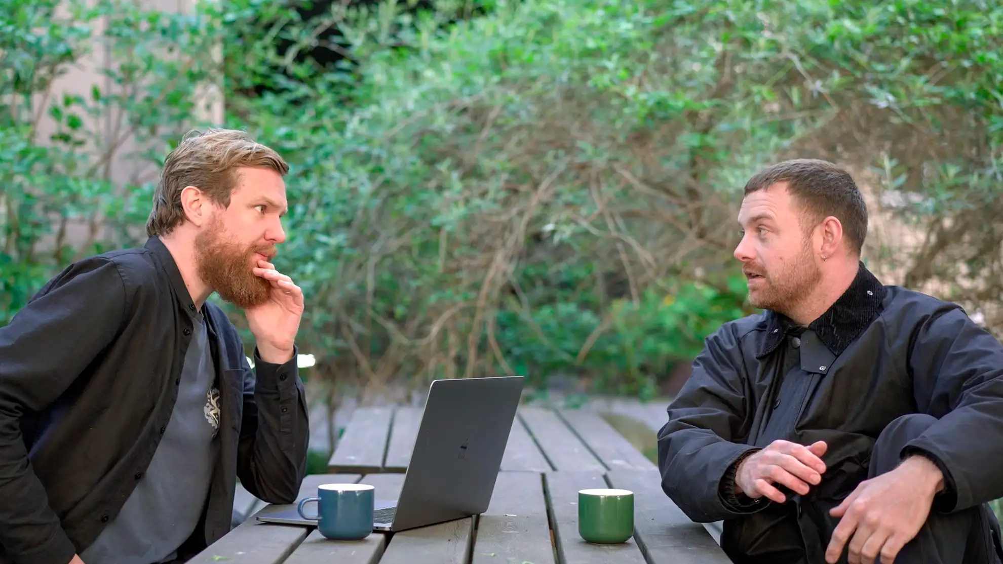
Intet mindre end strålende! Amagerbro Jazz takker jer

Klar på at starte et design- eller digitalt projekt med Granyon? Tag fat i os. Du kan være helt rolig. Vi er de flinke. Ingen spam. Ingen selvfede bureauattituder.
Klar på at starte et design- eller digitalt projekt med Granyon? Tag fat i os. Du kan være helt rolig. Vi er de flinke. Ingen spam. Ingen selvfede bureauattituder.