Start OPP Hjemmeside
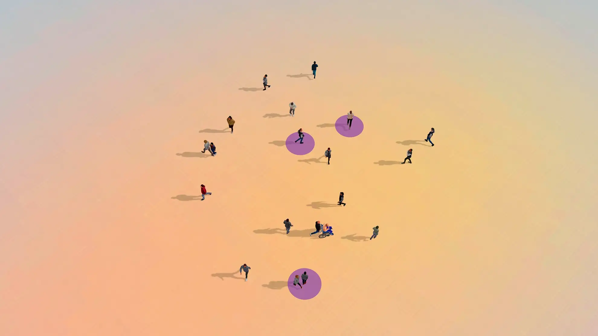
Hvert år vender over 600.000 mennesker tilbage fra fængsler til lokalsamfund i USA. Hele 33 % er fortsat arbejdsløse i fire år eller mere efter løsladelse, og næsten 50 % bliver genindsat inden for tre år. At finde og fastholde et job er en af de største barrierer for en succesfuld tilbagevenden til samfundet.
START-OPP giver tidligere indsatte redskaberne til at lykkes i deres “next chapter” gennem træning, beskæftigelse, mentorordninger og reintegrationsforløb, der understøtter en varig tilknytning til arbejdsmarkedet og lokalsamfundet. Organisationen klæder samtidig arbejdsgivere på til at støtte deltagerne og hjælpe dem med at blive succesfulde medarbejdere.
Den nye hjemmeside formidler organisationens mission og vigtige arbejde og skaber et stærkt fundament for at nå endnu flere mennesker og skabe endnu større positiv forandring i årene frem.


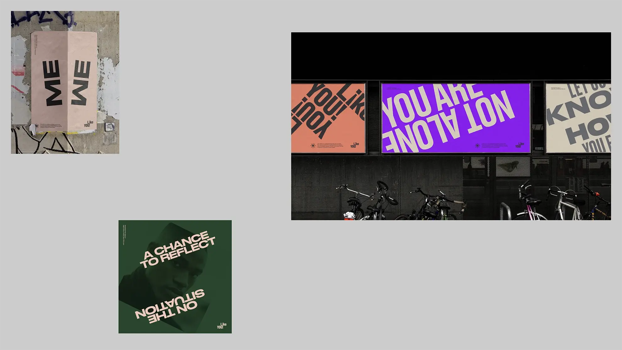
Elements reinforcing the message
The website layout consists of square elements in a black, grey, and yellow color scheme. Together with broken letters, they create a modern and bold visual style that helps to reinforce the START-OPP message, which emphasizes the importance of providing individuals who have been incarcerated with the resources and support they need to successfully transition back into society.
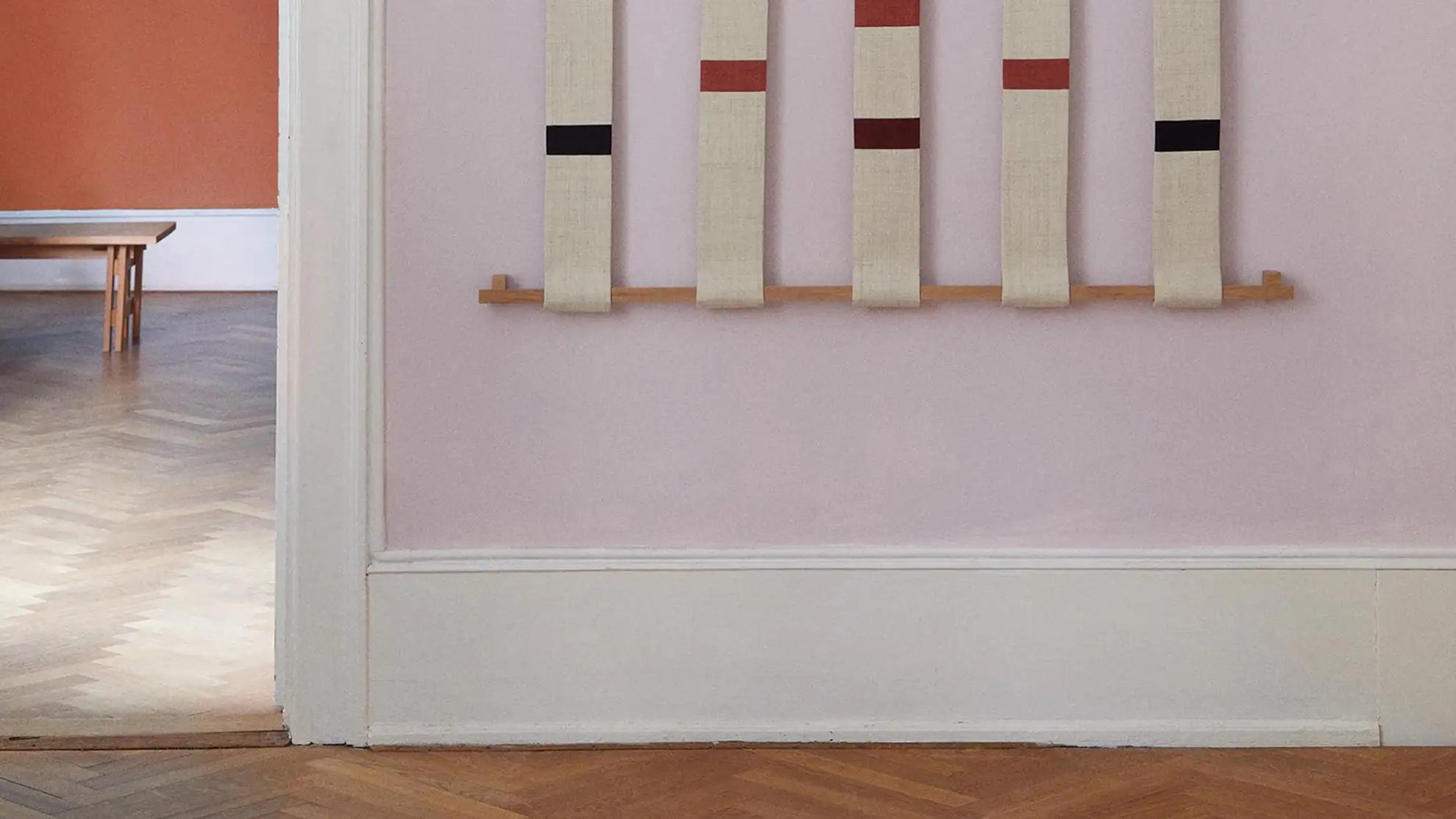
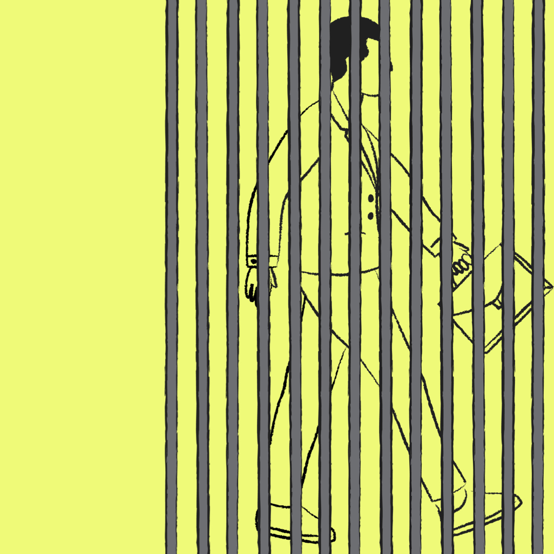
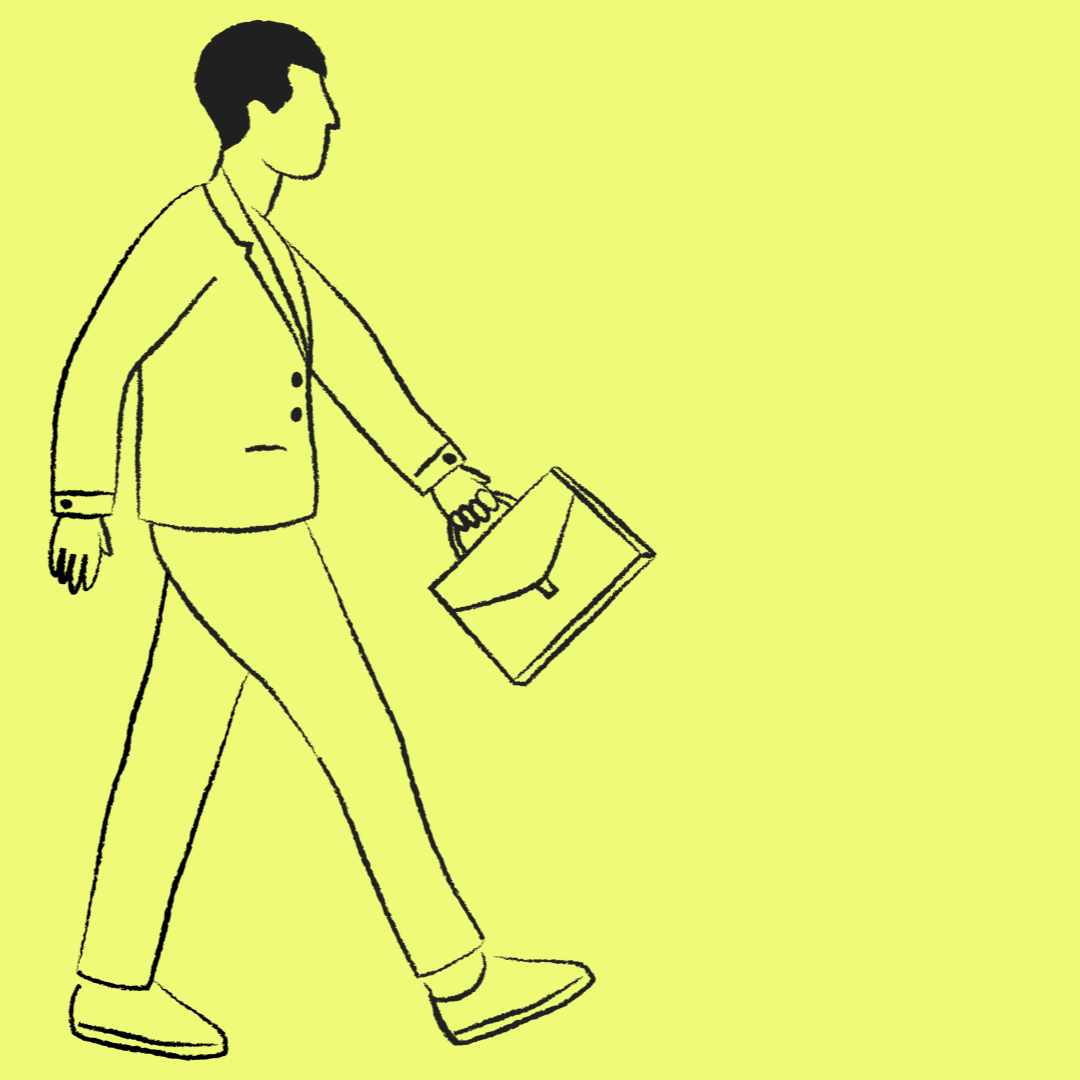
Bars turned into books
The bars in the logo are animated to transform into a pile of books, symbolizing the transition from incarceration to education. Parts of the letters in the logo are repeated as graphic elements throughout the website layout.
Bars turned into books
The bars in the logo are animated to transform into a pile of books, symbolizing the transition from incarceration to education. Parts of the letters in the logo are repeated as graphic elements throughout the website layout.
Bars turned into books
The bars in the logo are animated to transform into a pile of books, symbolizing the transition from incarceration to education. Parts of the letters in the logo are repeated as graphic elements throughout the website layout.
Bars turned into books
The bars in the logo are animated to transform into a pile of books, symbolizing the transition from incarceration to education. Parts of the letters in the logo are repeated as graphic elements throughout the website layout.
Bars turned into books
The bars in the logo are animated to transform into a pile of books, symbolizing the transition from incarceration to education. Parts of the letters in the logo are repeated as graphic elements throughout the website layout.

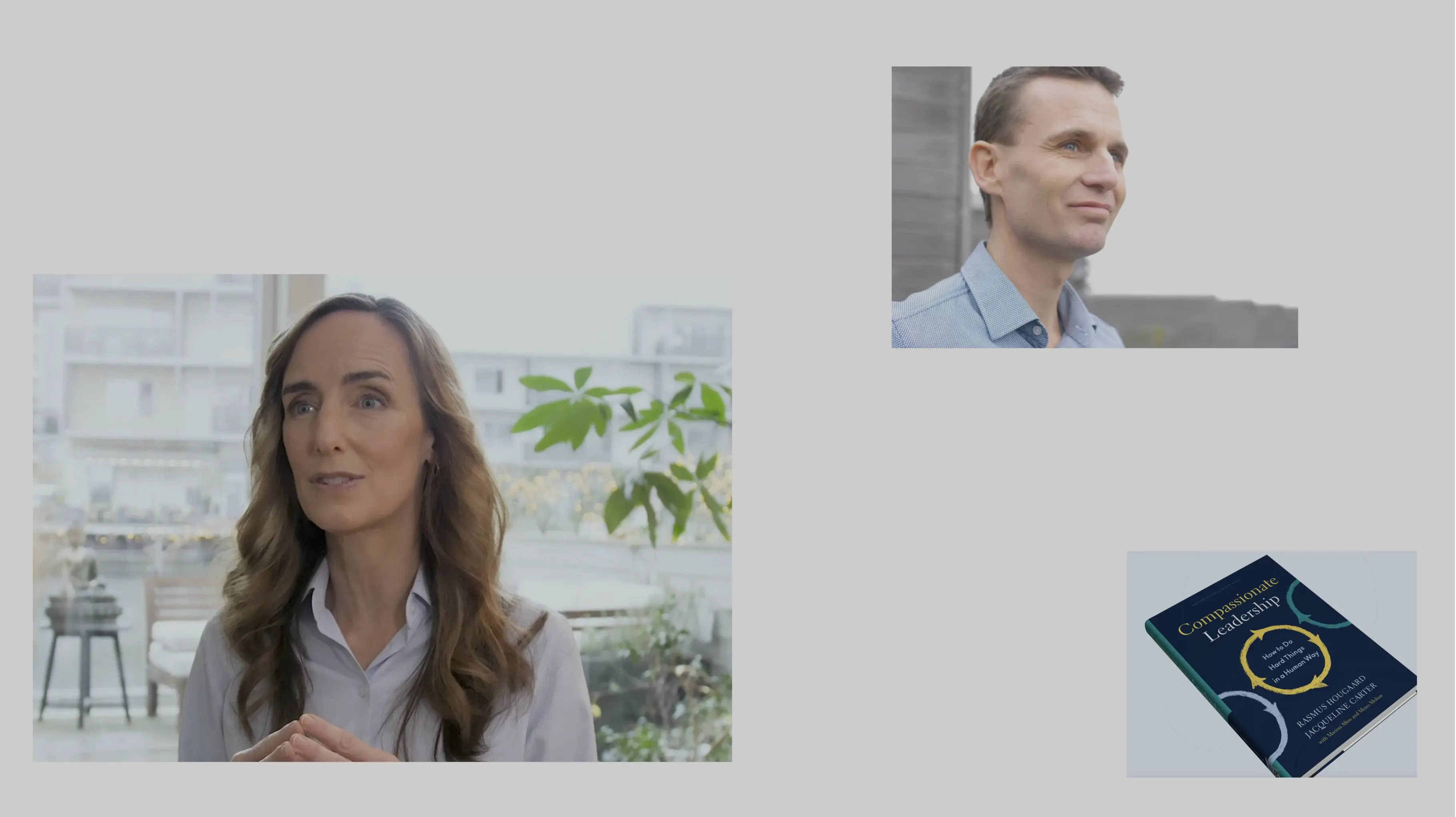
“Jeg er meget taknemmelig for samarbejdet med Granyon. Deres arbejde er den mest elegante formidling af en tydelig, intuitiv forståelse for, hvad hvert brand rummer, og hvad det har behov for at kommunikere.”

Klar på at starte et design- eller digitalt projekt med Granyon? Tag fat i os. Du kan være helt rolig. Vi er de flinke. Ingen spam. Ingen selvfede bureauattituder.
Klar på at starte et design- eller digitalt projekt med Granyon? Tag fat i os. Du kan være helt rolig. Vi er de flinke. Ingen spam. Ingen selvfede bureauattituder.