Amagerbro Jazz Brand
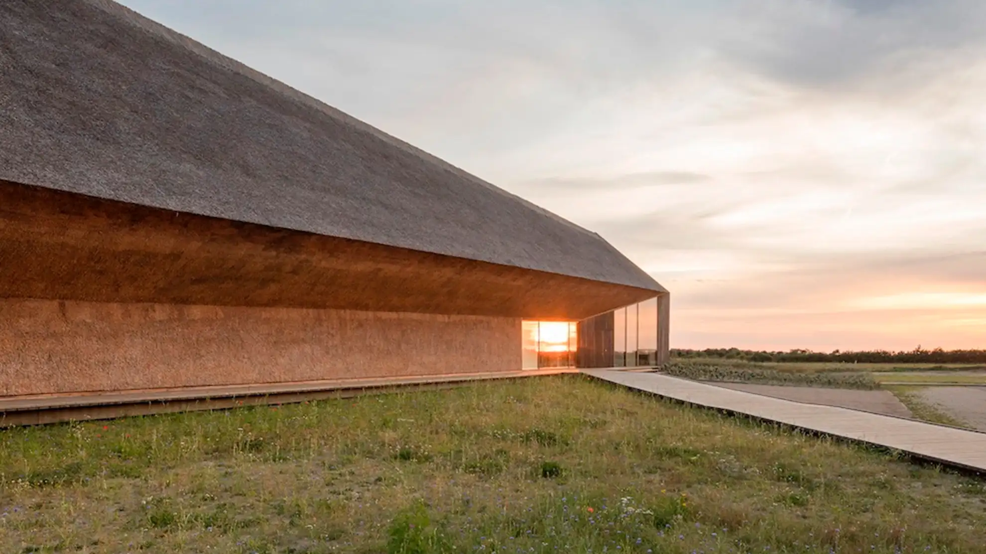
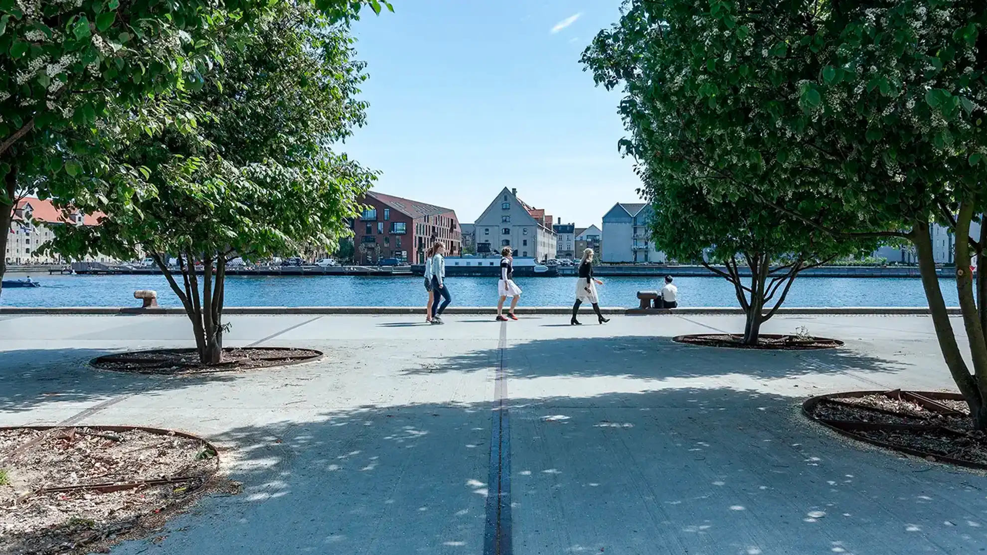
Born from local passion for high-quality jazz, Amagerbro Jazz offers a warm, relaxed space for everyone—from jazz newcomers to seasoned fans. Our new logo and branding draw inspiration from the unique architecture by Dorte Mandrup.
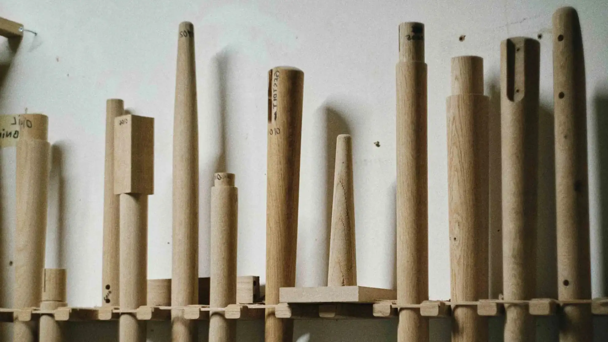
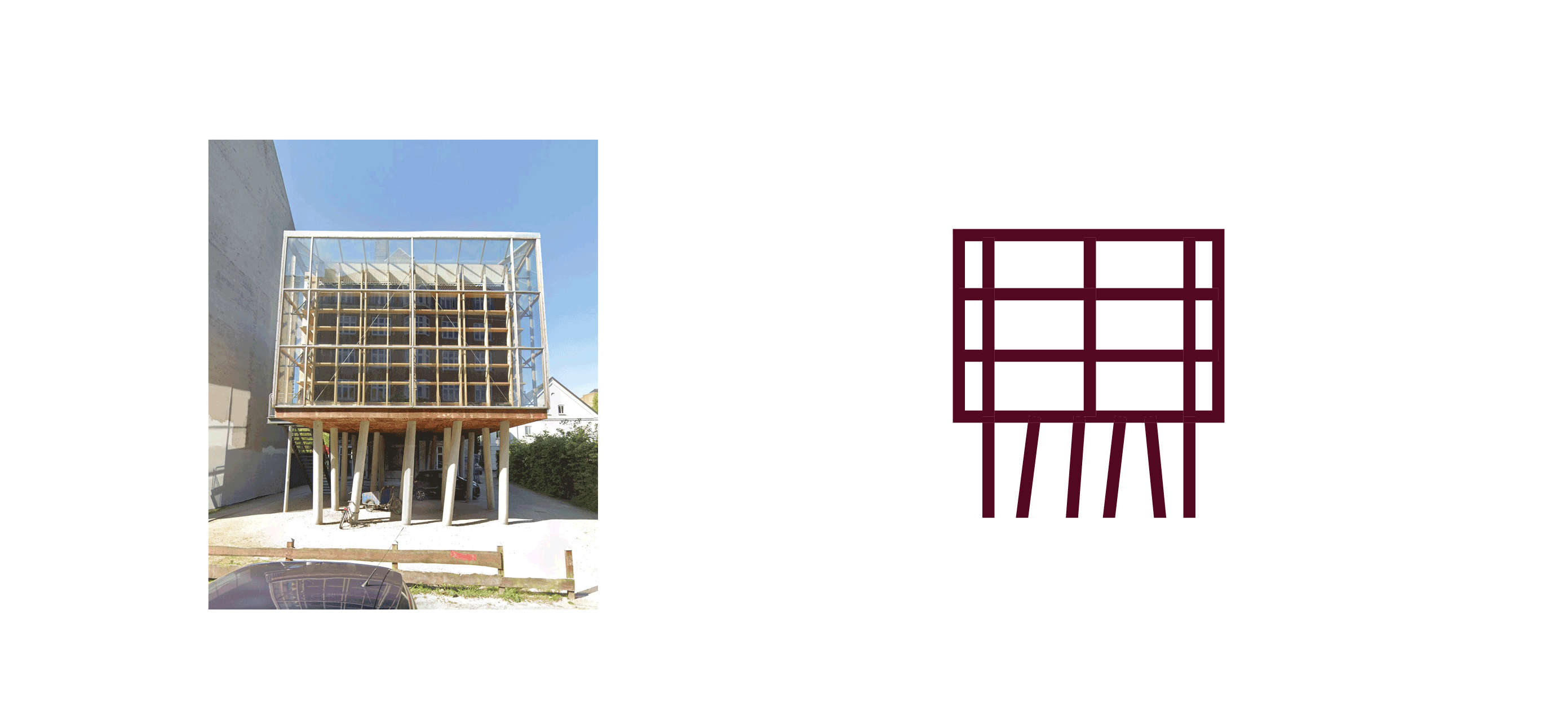
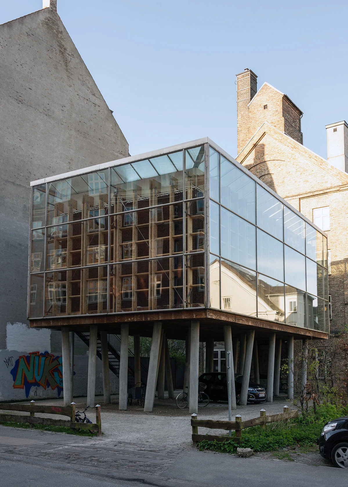
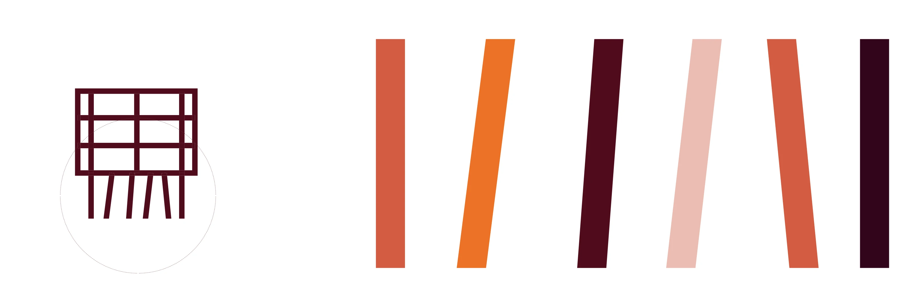
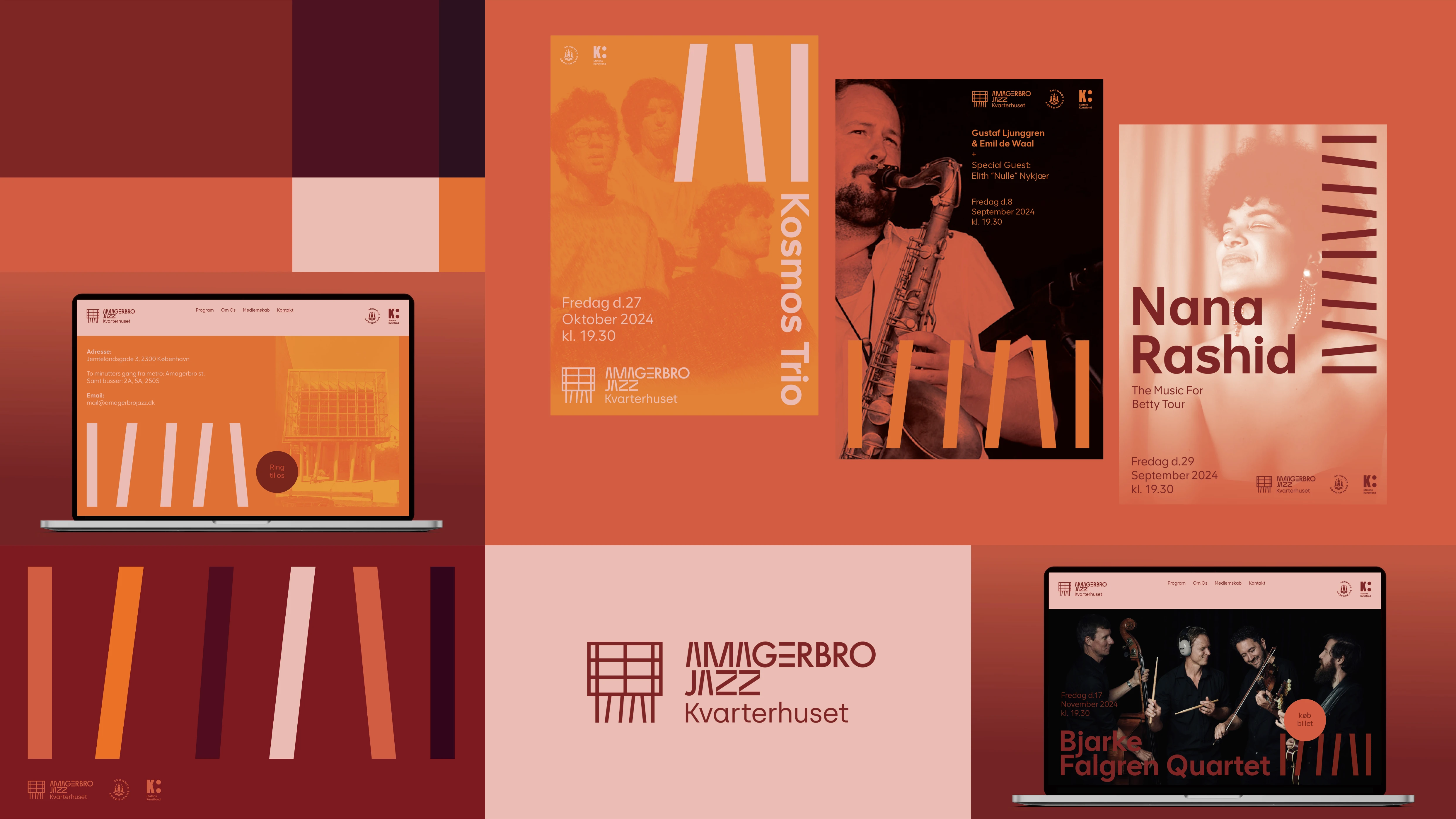
Just like a treehouse, the music hall is elevated on the first floor, supported by a “forest” of angled concrete columns and surrounded by walls of glass and timber. This airy, light-filled and rhythm-inspired design is now reflected in the new visual identity.


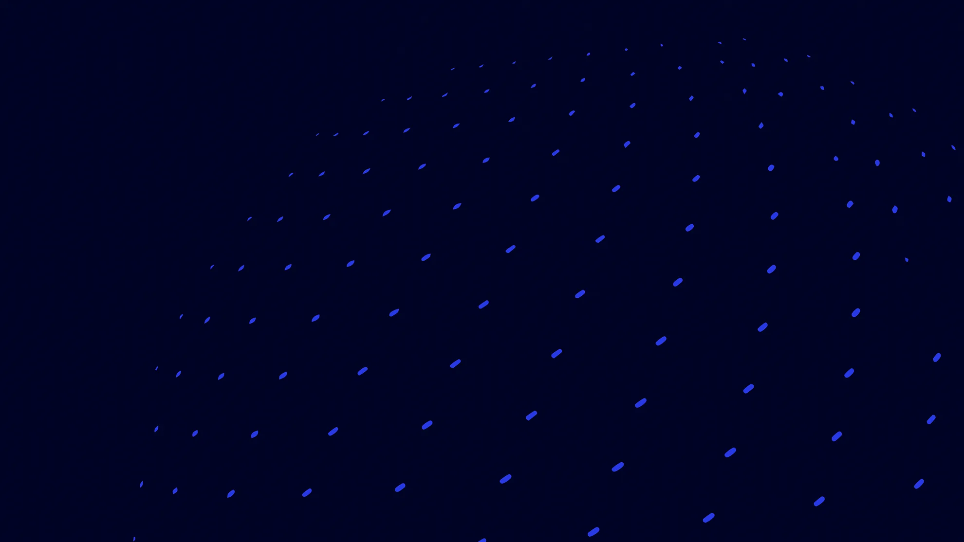
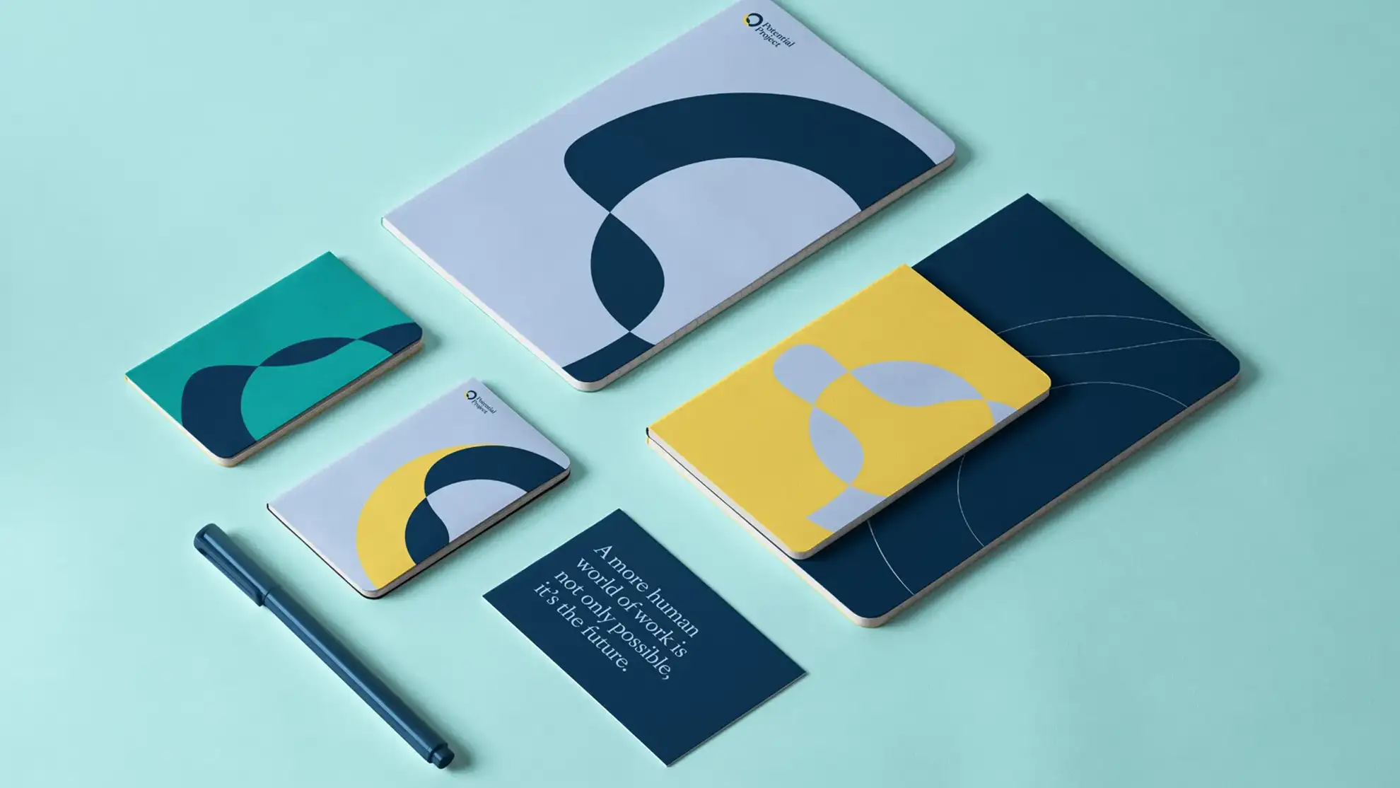
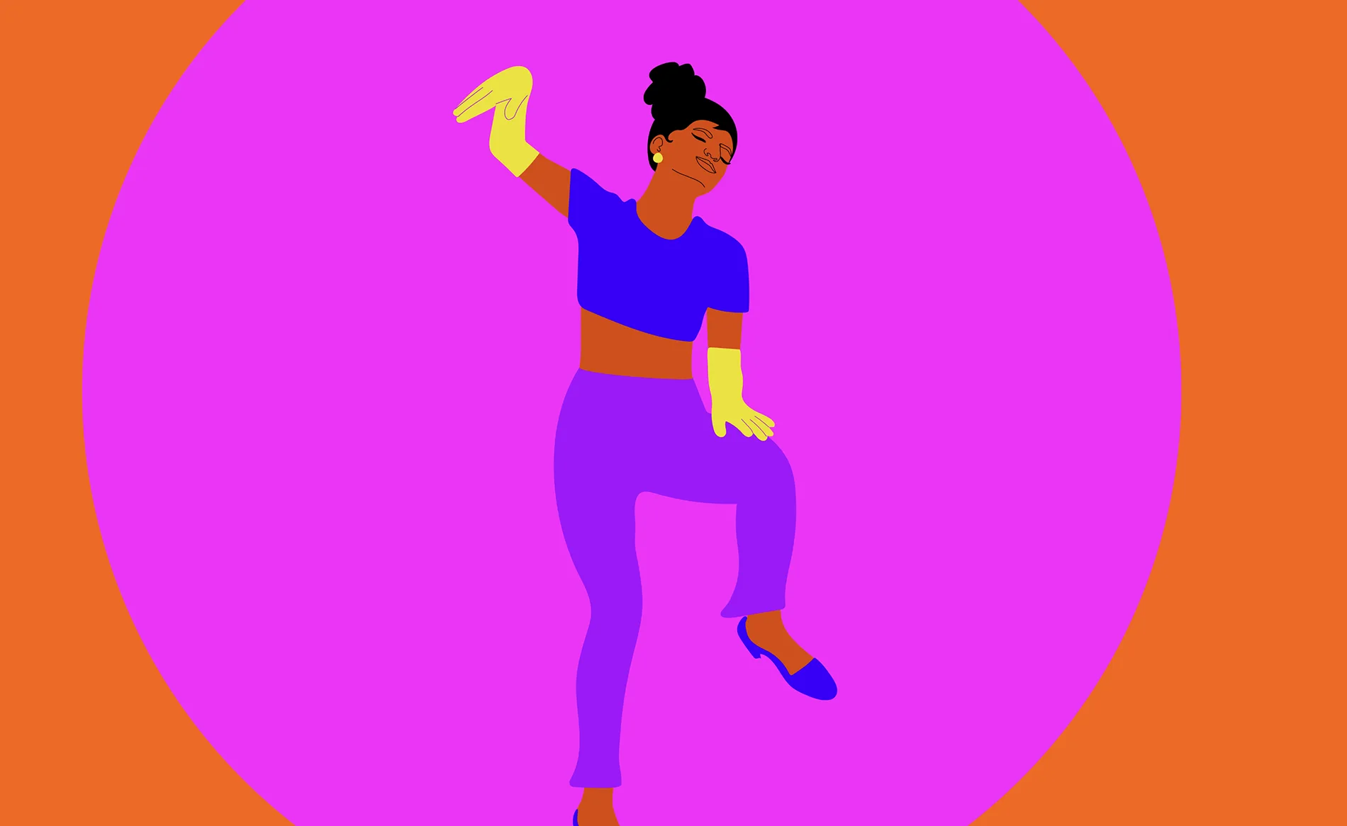
The Playful and dancing element
The playful and dancing element from the building’s columns was translated into the visual language, and the entire idea was to create an agile system that could be applied across the jazz club’s various channels, giving it a unique and dynamic “musical” expression. With such an architecturally distinctive location as the setting for the music, it made perfect sense to use this as the focal point for the new visual identity.
The playful and dancing element from the building’s columns was translated into the visual language, and the entire idea was to create an agile system that could be applied across the jazz club’s various channels, giving it a unique and dynamic “musical” expression. With such an architecturally distinctive location as the setting for the music, it made perfect sense to use this as the focal point for the new visual identity.
The Playful and dancing element
The playful and dancing element from the building’s columns was translated into the visual language, and the entire idea was to create an agile system that could be applied across the jazz club’s various channels, giving it a unique and dynamic “musical” expression. With such an architecturally distinctive location as the setting for the music, it made perfect sense to use this as the focal point for the new visual identity.
The playful and dancing element from the building’s columns was translated into the visual language, and the entire idea was to create an agile system that could be applied across the jazz club’s various channels, giving it a unique and dynamic “musical” expression. With such an architecturally distinctive location as the setting for the music, it made perfect sense to use this as the focal point for the new visual identity.
The playful and dancing element from the building’s columns was translated into the visual language, and the entire idea was to create an agile system that could be applied across the jazz club’s various channels, giving it a unique and dynamic “musical” expression. With such an architecturally distinctive location as the setting for the music, it made perfect sense to use this as the focal point for the new visual identity.
The Playful and dancing element
The playful and dancing element from the building’s columns was translated into the visual language, and the entire idea was to create an agile system that could be applied across the jazz club’s various channels, giving it a unique and dynamic “musical” expression. With such an architecturally distinctive location as the setting for the music, it made perfect sense to use this as the focal point for the new visual identity.
The playful and dancing element from the building’s columns was translated into the visual language, and the entire idea was to create an agile system that could be applied across the jazz club’s various channels, giving it a unique and dynamic “musical” expression. With such an architecturally distinctive location as the setting for the music, it made perfect sense to use this as the focal point for the new visual identity.
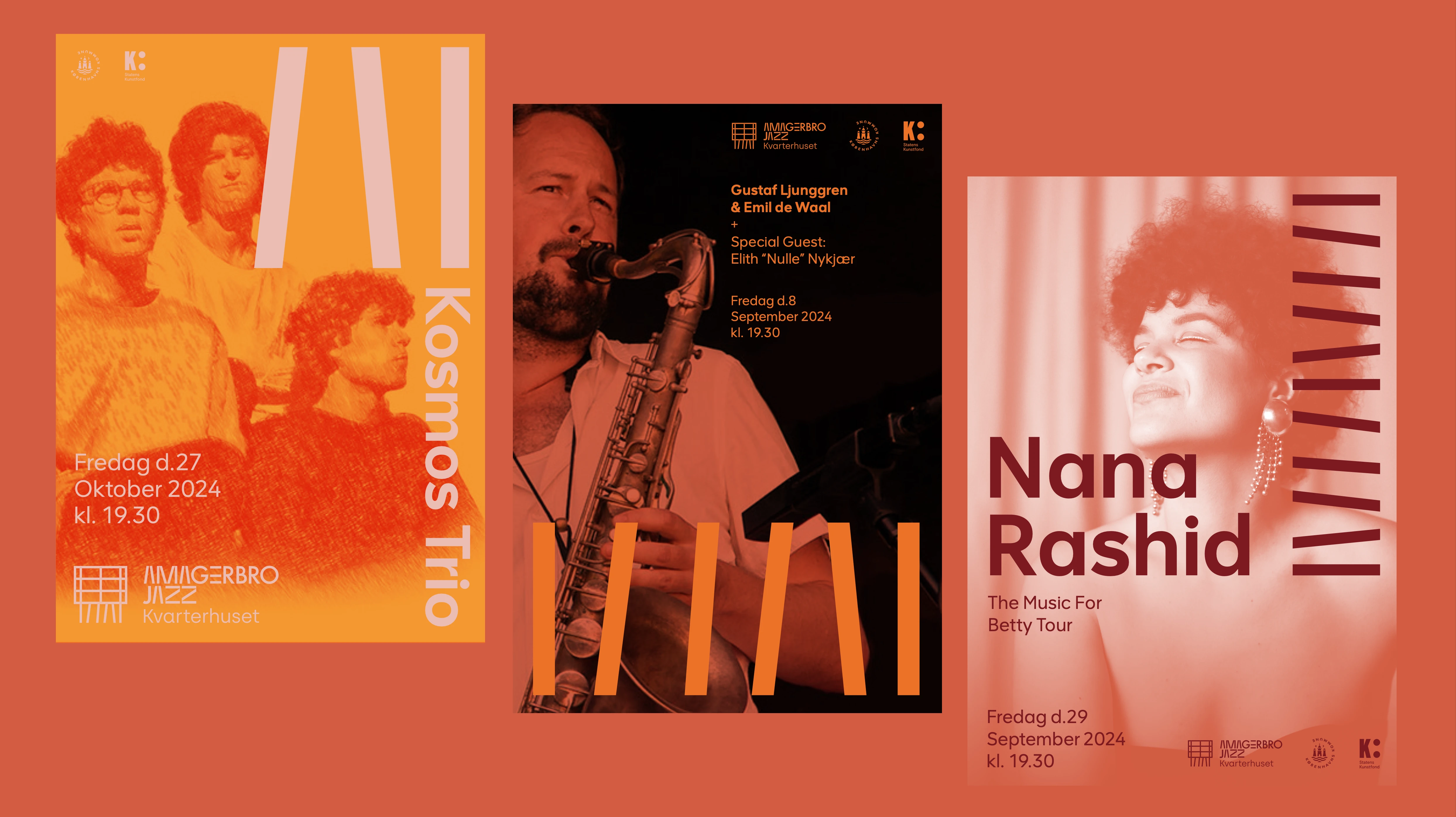
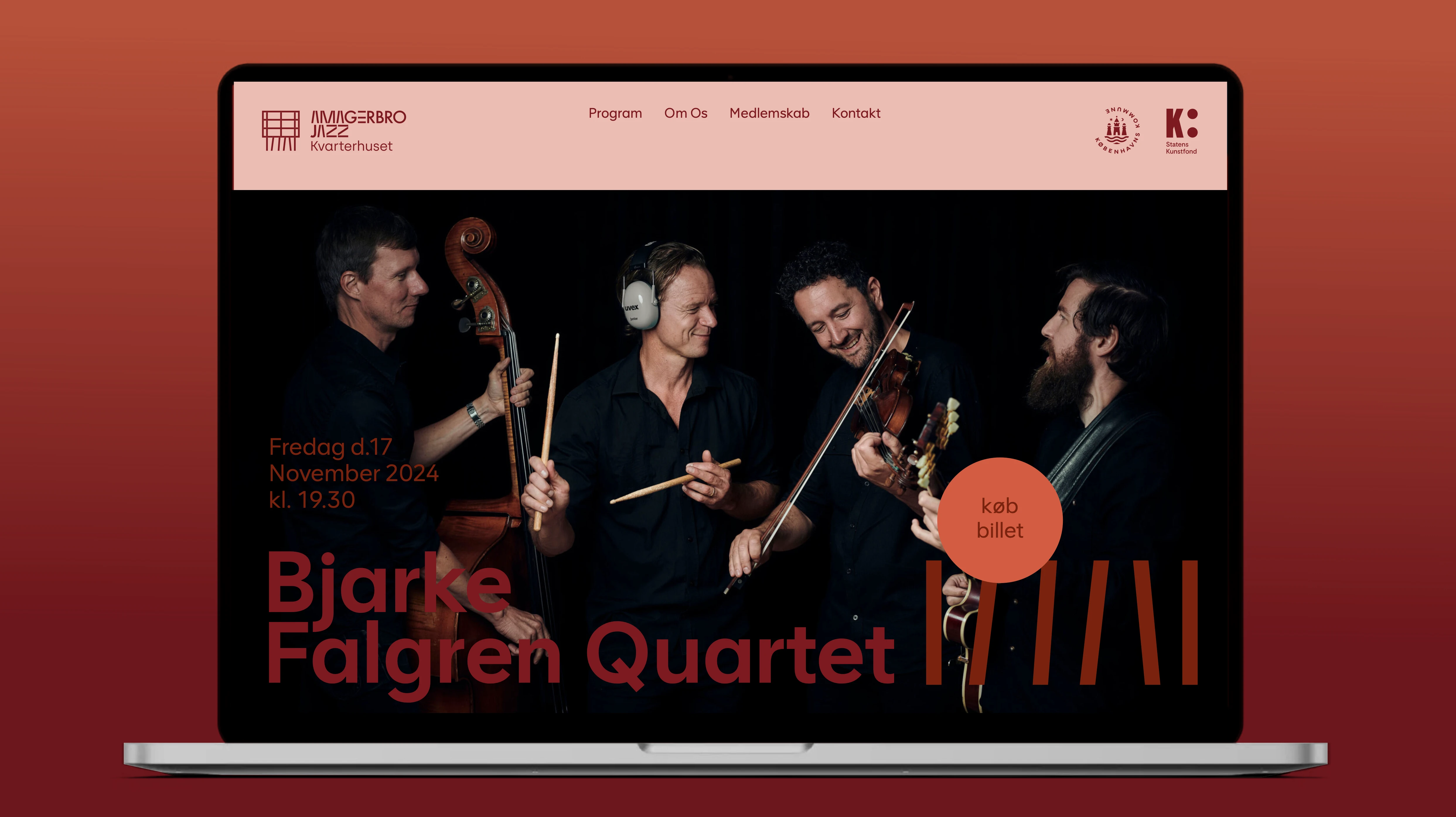
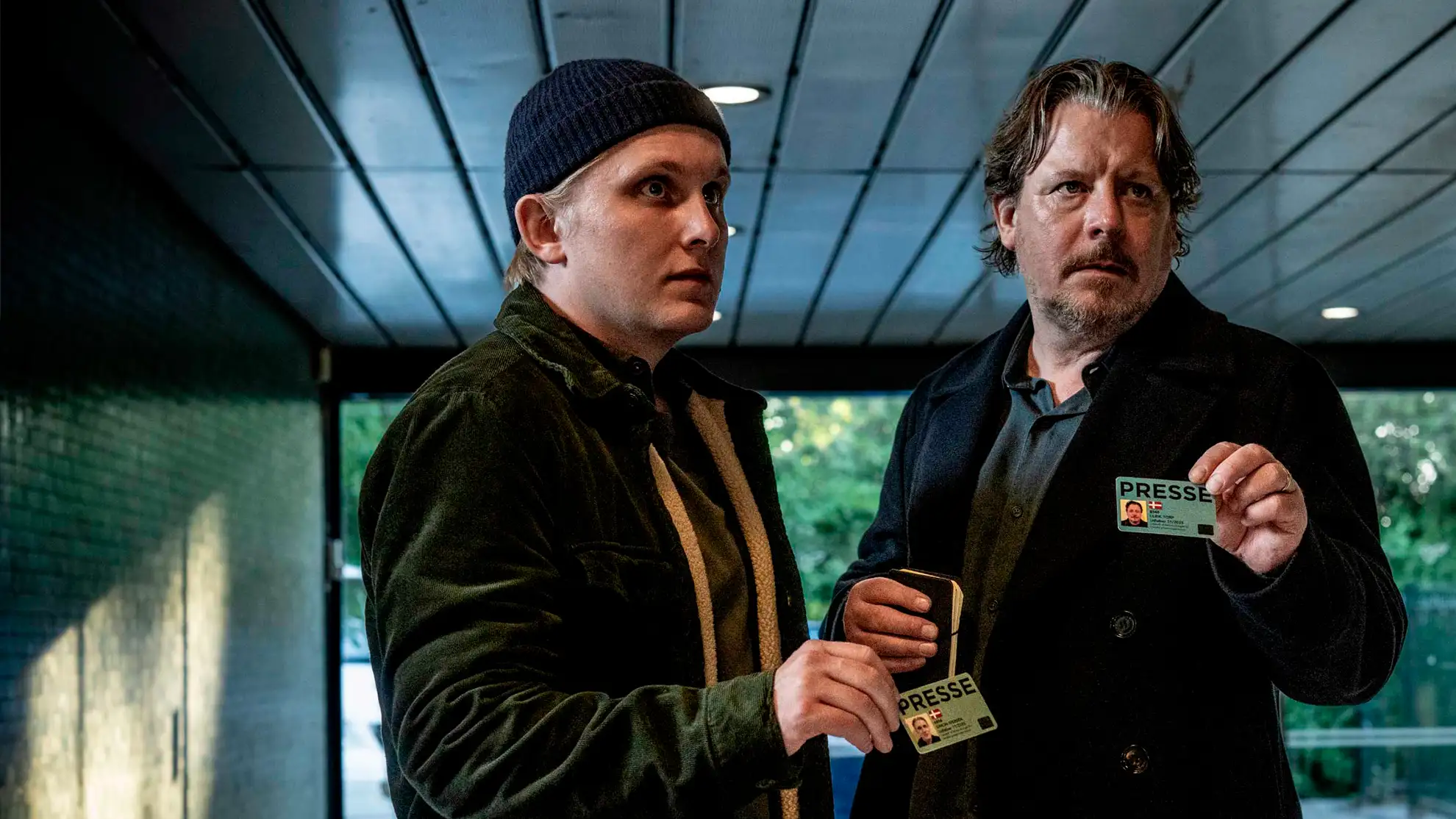
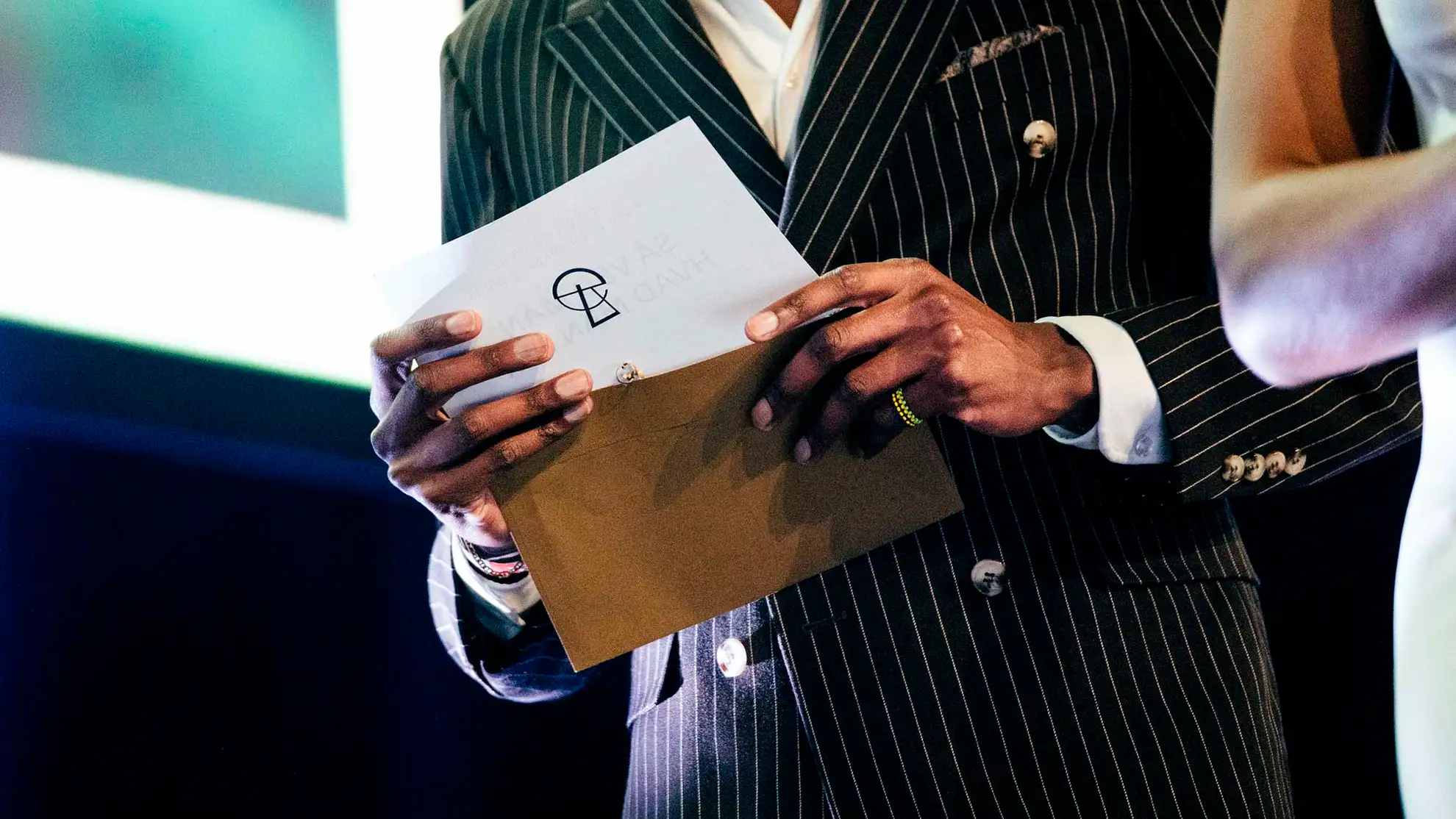
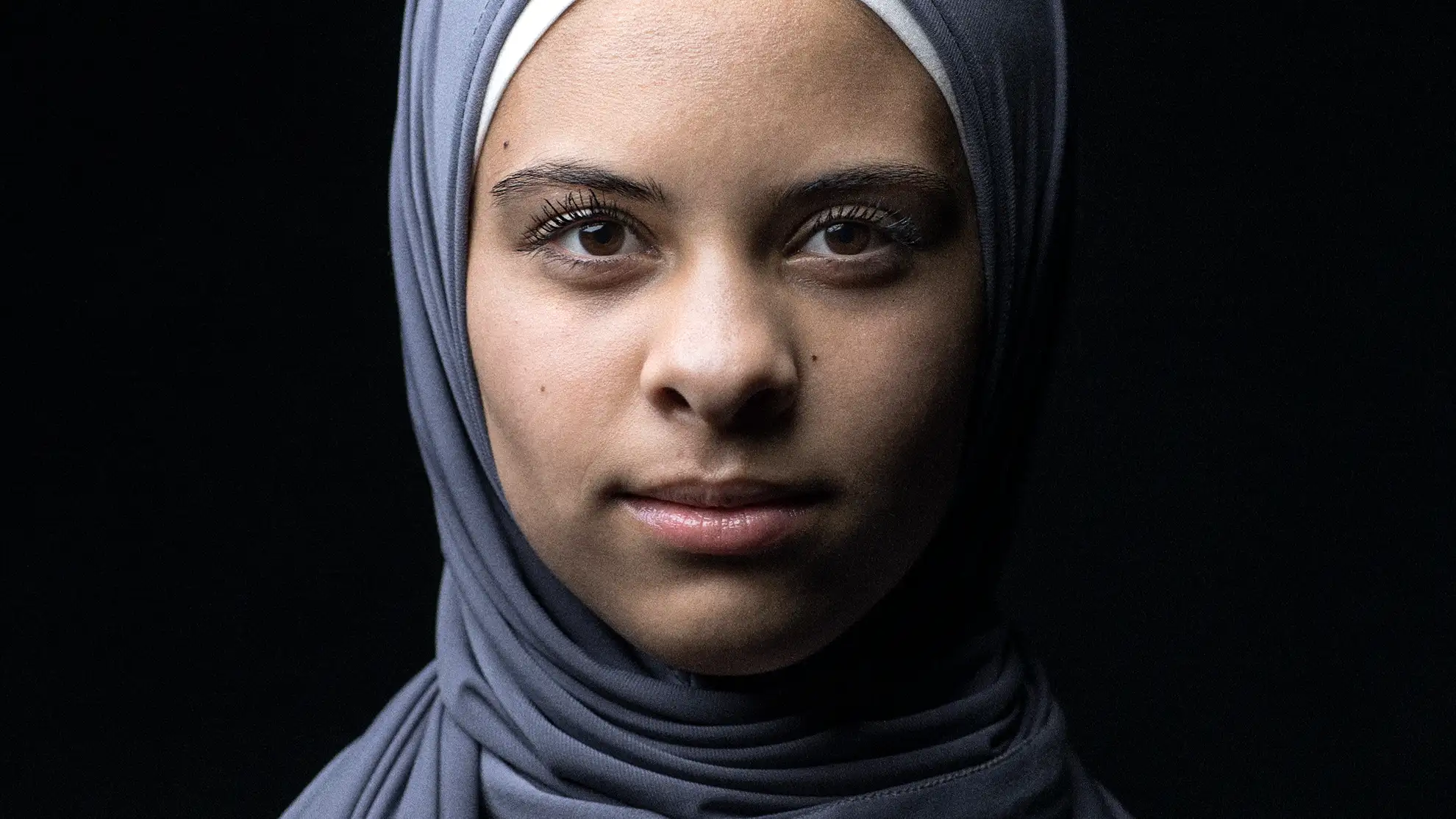
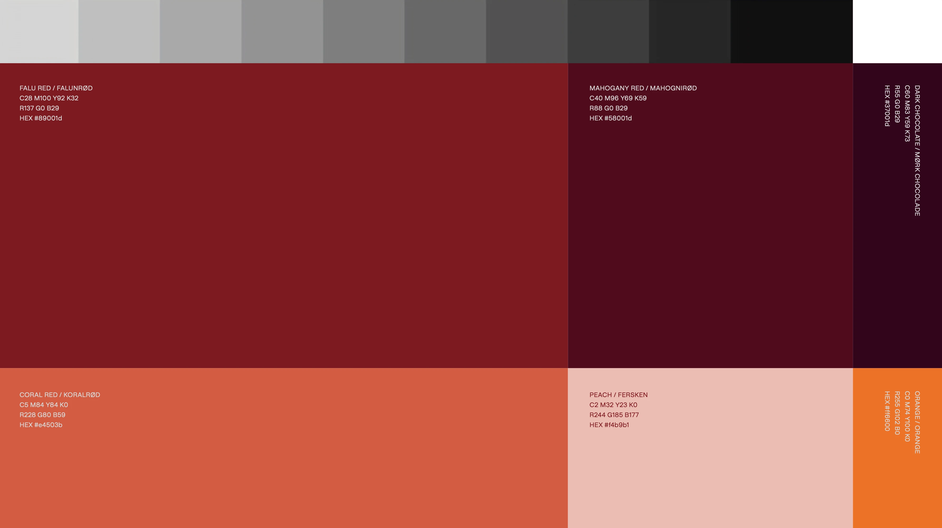
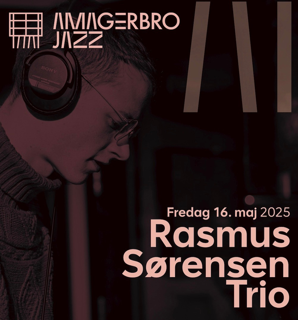
A calm, warm coherent visual identity
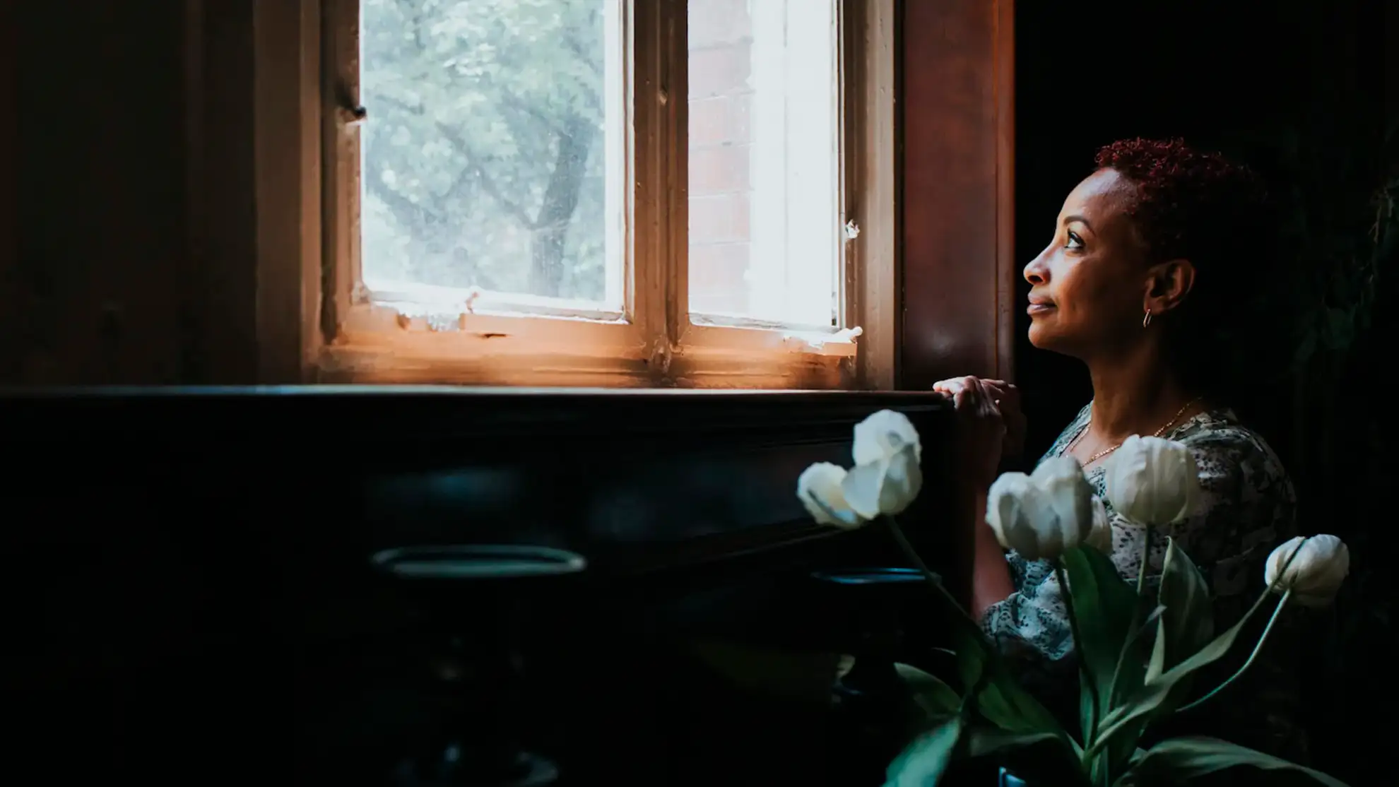
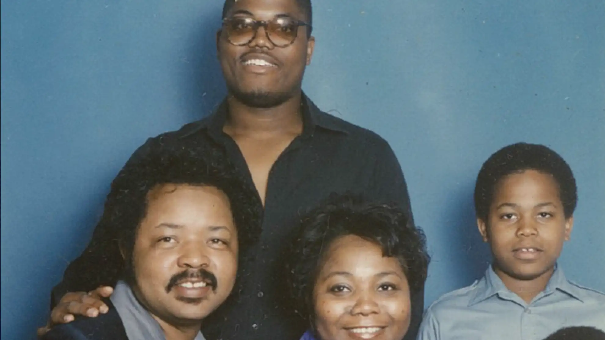
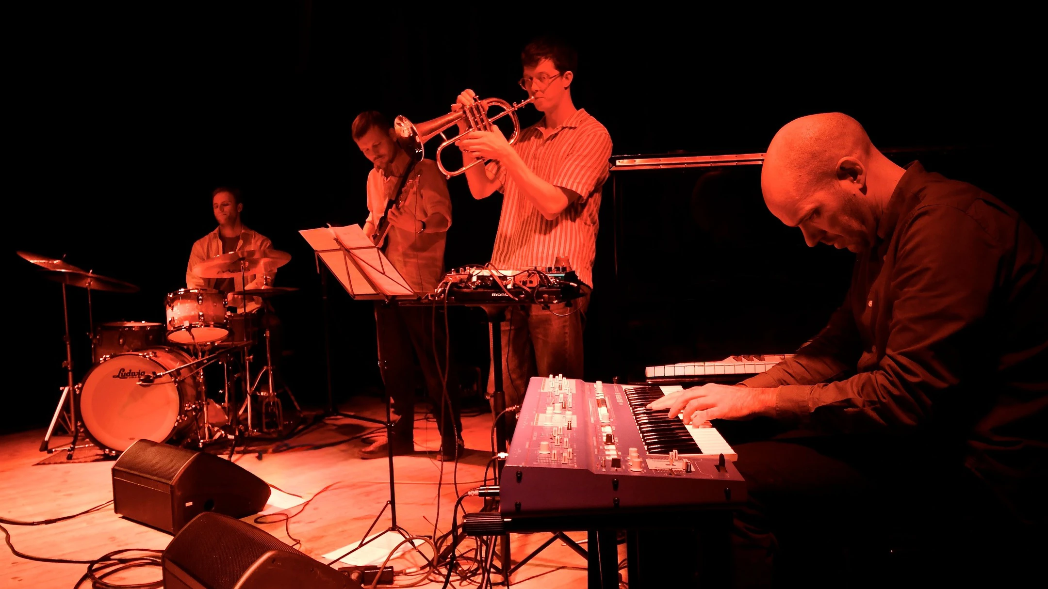
By adopting the simple and geometric AA Smart as the jazz club’s new typeface, and pairing it with a variety of color filters applied to their artist photos, a calm, cohesive, and instantly recognizable visual identity was established. This approach not only gave the club’s materials a polished and professional look but also provided a flexible system that they could continue to use and adapt across their website, social media channels, and other communications, ensuring a consistent and distinctive presence that truly reflects the spirit of the club.
By adopting the simple and geometric AA Smart as the jazz club’s new typeface, and pairing it with a variety of color filters applied to their artist photos, a calm, cohesive, and instantly recognizable visual identity was established. This approach not only gave the club’s materials a polished and professional look but also provided a flexible system that they could continue to use and adapt across their website, social media channels, and other communications, ensuring a consistent and distinctive presence that truly reflects the spirit of the club.
A calm, warm coherent visual identity
By adopting the simple and geometric AA Smart as the jazz club’s new typeface, and pairing it with a variety of color filters applied to their artist photos, a calm, cohesive, and instantly recognizable visual identity was established. This approach not only gave the club’s materials a polished and professional look but also provided a flexible system that they could continue to use and adapt across their website, social media channels, and other communications, ensuring a consistent and distinctive presence that truly reflects the spirit of the club.
By adopting the simple and geometric AA Smart as the jazz club’s new typeface, and pairing it with a variety of color filters applied to their artist photos, a calm, cohesive, and instantly recognizable visual identity was established. This approach not only gave the club’s materials a polished and professional look but also provided a flexible system that they could continue to use and adapt across their website, social media channels, and other communications, ensuring a consistent and distinctive presence that truly reflects the spirit of the club.
A calm, warm coherent visual identity
By adopting the simple and geometric AA Smart as the jazz club’s new typeface, and pairing it with a variety of color filters applied to their artist photos, a calm, cohesive, and instantly recognizable visual identity was established. This approach not only gave the club’s materials a polished and professional look but also provided a flexible system that they could continue to use and adapt across their website, social media channels, and other communications, ensuring a consistent and distinctive presence that truly reflects the spirit of the club.
By adopting the simple and geometric AA Smart as the jazz club’s new typeface, and pairing it with a variety of color filters applied to their artist photos, a calm, cohesive, and instantly recognizable visual identity was established. This approach not only gave the club’s materials a polished and professional look but also provided a flexible system that they could continue to use and adapt across their website, social media channels, and other communications, ensuring a consistent and distinctive presence that truly reflects the spirit of the club.
By adopting the simple and geometric AA Smart as the jazz club’s new typeface, and pairing it with a variety of color filters applied to their artist photos, a calm, cohesive, and instantly recognizable visual identity was established. This approach not only gave the club’s materials a polished and professional look but also provided a flexible system that they could continue to use and adapt across their website, social media channels, and other communications, ensuring a consistent and distinctive presence that truly reflects the spirit of the club.
A calm, warm coherent visual identity
By adopting the simple and geometric AA Smart as the jazz club’s new typeface, and pairing it with a variety of color filters applied to their artist photos, a calm, cohesive, and instantly recognizable visual identity was established. This approach not only gave the club’s materials a polished and professional look but also provided a flexible system that they could continue to use and adapt across their website, social media channels, and other communications, ensuring a consistent and distinctive presence that truly reflects the spirit of the club.
By adopting the simple and geometric AA Smart as the jazz club’s new typeface, and pairing it with a variety of color filters applied to their artist photos, a calm, cohesive, and instantly recognizable visual identity was established. This approach not only gave the club’s materials a polished and professional look but also provided a flexible system that they could continue to use and adapt across their website, social media channels, and other communications, ensuring a consistent and distinctive presence that truly reflects the spirit of the club.
Nothing short of brilliant! Amagerbro Jazz thanks you

Curious about starting a design or digital project with Granyon? Get in touch! Rest asure we are the nice guys. No spamming or self-absorbed attitudes.
Curious about starting a design or digital project with Granyon? Get in touch! You can rest asure: we are the nice guys. No spamming or self-absorbed attitudes.