FED UP by Sharanda Jones

Client
Sharanda Jones
Type
Services
Interaction design
Webflow
Website
Visual identity
WebGL
Recognitions
Honorable Mention - Awwwards

The story of Sharanda is one of inspiration and resilience. From a lifetime spent in prison to becoming a successful entrepreneur in Dallas, her journey is one of overcoming immense challenges and pursuing her passion for food. When tasked with creating a visual identity and new website for her brand, we wanted to capture the essence of Sharanda's vision - home-cooked meals made with love and a homely feeling.

Finding the balance
The name "FED UP" was a nod to her incredible story, playing on the two sides of being fed and fed up with the justice system. Through workshops and research, our team at Granyon collaborated with Sharanda to find the perfect balance for her new brand. The food truck design universe provided a wonderfully creative world to work within, and we were able to guide the creative direction towards a visual identity that reflects Sharanda's unique story and culinary style. Overall, the end result captures the warmth and authenticity that is at the heart of Sharanda's brand.
BAsed on history
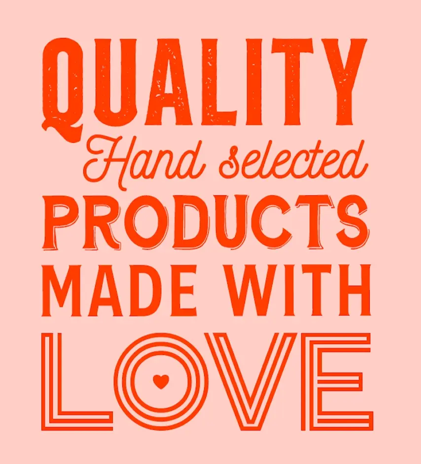
The inspiration for the new logo font draws from the classic styles seen on old US signs, evoking a sense of nostalgia and history. By using this style, the logo aims to convey a local and homey feeling, emphasizing Sharanda's passion for creating delicious, comforting meals that are made with love and a unique attitude. We wanted to create a design that immediately communicates the warmth and authenticity of her brand, with a timeless appeal that resonates with customers. The font choice reflects this sentiment and helps to establish a connection with customers, encouraging them to feel at home and welcome when enjoying Sharanda's food.
The new logo
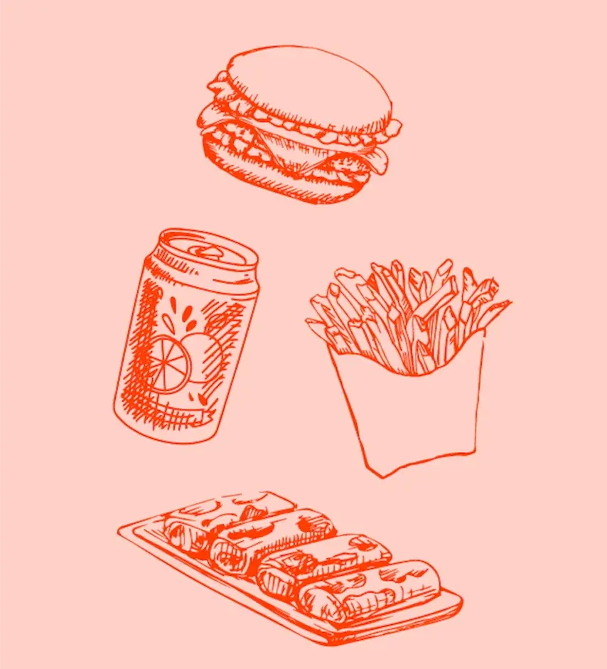
The new logo for Sharanda's brand FED UP was designed with versatility in mind, ensuring that it can be utilized across a range of different platforms and mediums. From the website and social media to burger wraps and even the food truck itself, the logo needs to work seamlessly in any situation. The final logo design features bold, clean lines that are easy to read and recognize, with a unique font that draws on vintage US sign styles to convey a sense of nostalgia and authenticity. The logo's color scheme, which features warm, earthy tones, further emphasizes the brand's emphasis on home-cooked meals made with love and care.
A visually appealing identity
By designing a logo that is both functional and visually appealing, we have created a strong visual identity that can effectively represent Sharanda's brand across all types of media. Whether customers encounter FED UP online, on the street, or in the restaurant, they will immediately recognize and connect with the brand's unique personality and message.
The Food Truck
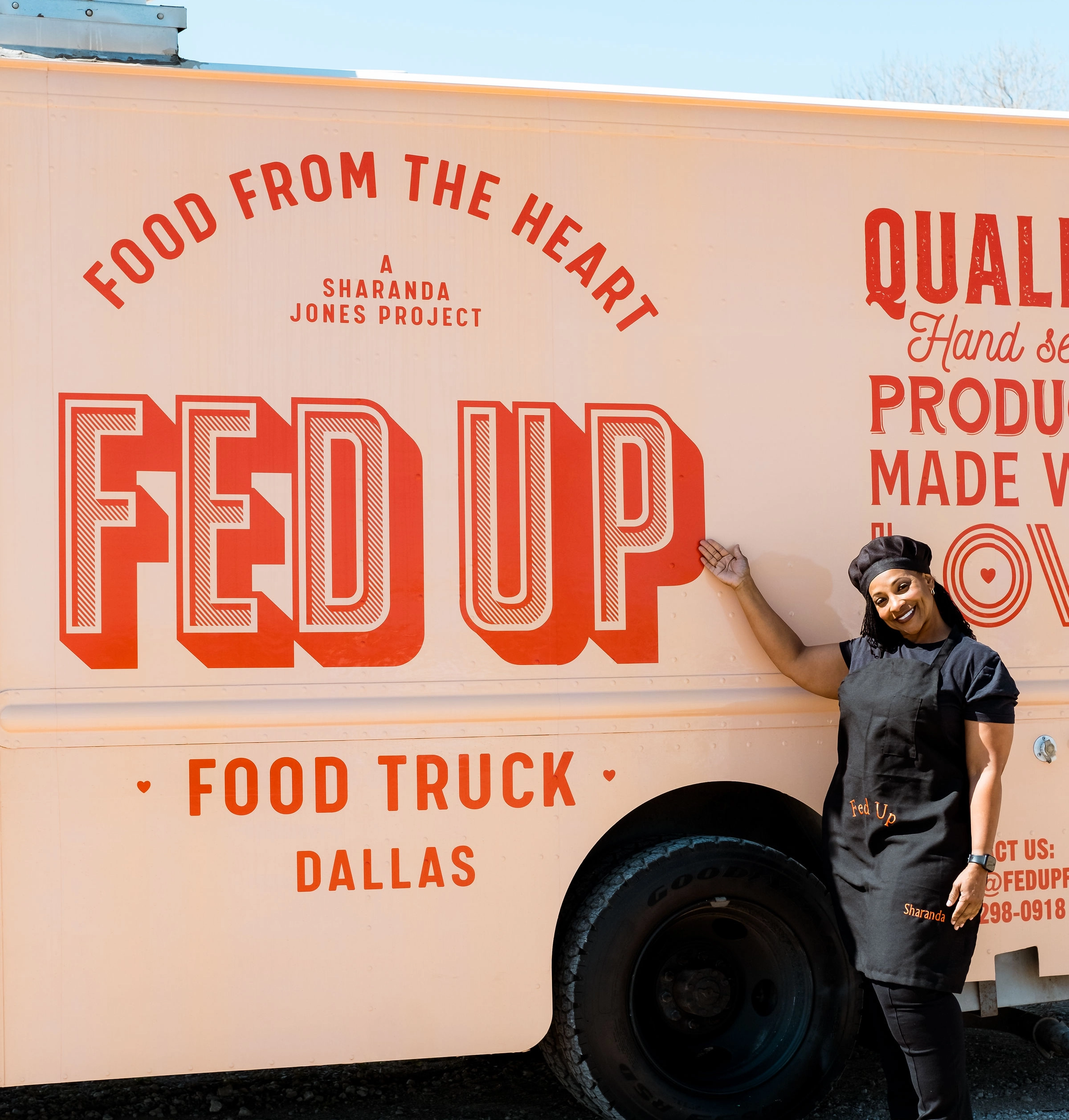
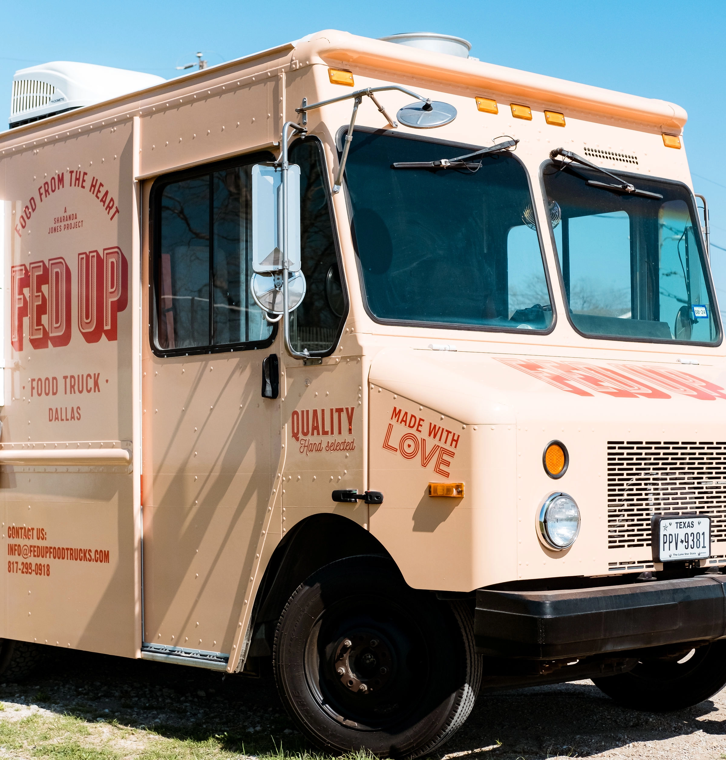
Designing the food truck for Sharanda's brand was a new challenge for the Granyon team. It was a significant responsibility to create a design that not only effectively represented the brand's visual identity but also ensured the truck was appealing from all sides. However, this task was also fun and inspiring for the team, as they were able to translate the brand's personality into a moving, eye-catching vehicle. The team worked closely with Sharanda to ensure the food truck design aligned with the overall visual identity of the brand.
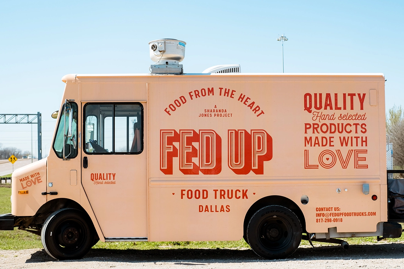
Thank you Sharanda and Brittany
The Granyon team was overwhelmed with pride upon receiving pictures of the truck adorned with our design from Brittany and Sharanda. It was a pivotal moment for us, realizing the tangible impact we had in providing Sharande with the optimal foundation for her business to flourish. We are deeply grateful for the opportunity to be a part of this project. Thank you!
A unique online experience
To enhance the FED UP Foodtruck brand, we developed an interactive concept that showcases the truck's new design as the centerpiece of the website. As customers scroll down the page, they are taken on a playful journey that tells the story behind the company. Using Webflow and WebGL technology, we've created a unique online experience that engages and excites customers. To ensure that customers can easily identify the FED UP Foodtruck, we've made the design a prominent feature of the website. The truck itself is even animated, moving down the page to reveal the menu by opening its hatch. Additionally, we've incorporated a dynamic map that Sharanda can update easily, allowing customers to track the truck's location in real-time.By highlighting the truck's mobility, we're emphasizing the unique experience of enjoying delicious burgers and rolls made with love on the streets of Dallas. Overall, our design aims to capture the essence of FED UP Foodtruck and convey its commitment to quality, flavor, and fun.
Your contribution to the Fed Up food truck has been absolutely transformative! Your skillful and heartfelt work in developing a brand identity for Sharanda didn't just give us a design - it provided a story and a soul that resonates with everyone who sees it. The pictures barely do justice to the impact your work has made. Grateful doesn't begin to cover it. Thank you to the Granyon team for being a pivotal part of this journey of hope and change and supporting Sharanda's dream!
Brittany K. Barnett, Attorney & Entrepreneur Driving Social Change, TED Speaker, Author, Aspen Institute Fellow
No items found.

Care to see more?

Here are a few more cases for you to explore.
GWO Global Safety & Training Awards 2021
Website
Graphic design
Logo
Print
Danish Film Academy
Graphic design
Strategy
Website
Copenhagen House of Food
Graphic design
Strategy
Website