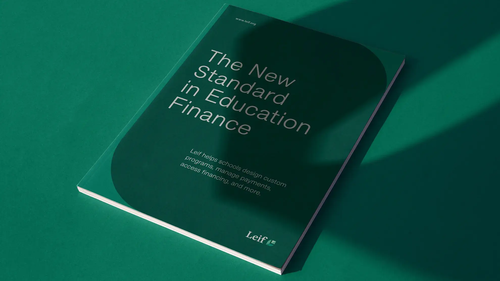
Nordic Harvest Brand & Website
Nordic Harvest has an ambition to become one of the largest vertical farms in Europe. They came to us with a wish to create a new, bold brand that changes our view of sustainable agriculture with higher quality and a better taste than conventionally grown foods.
Imagine plants on shelves as far as the eye can see.
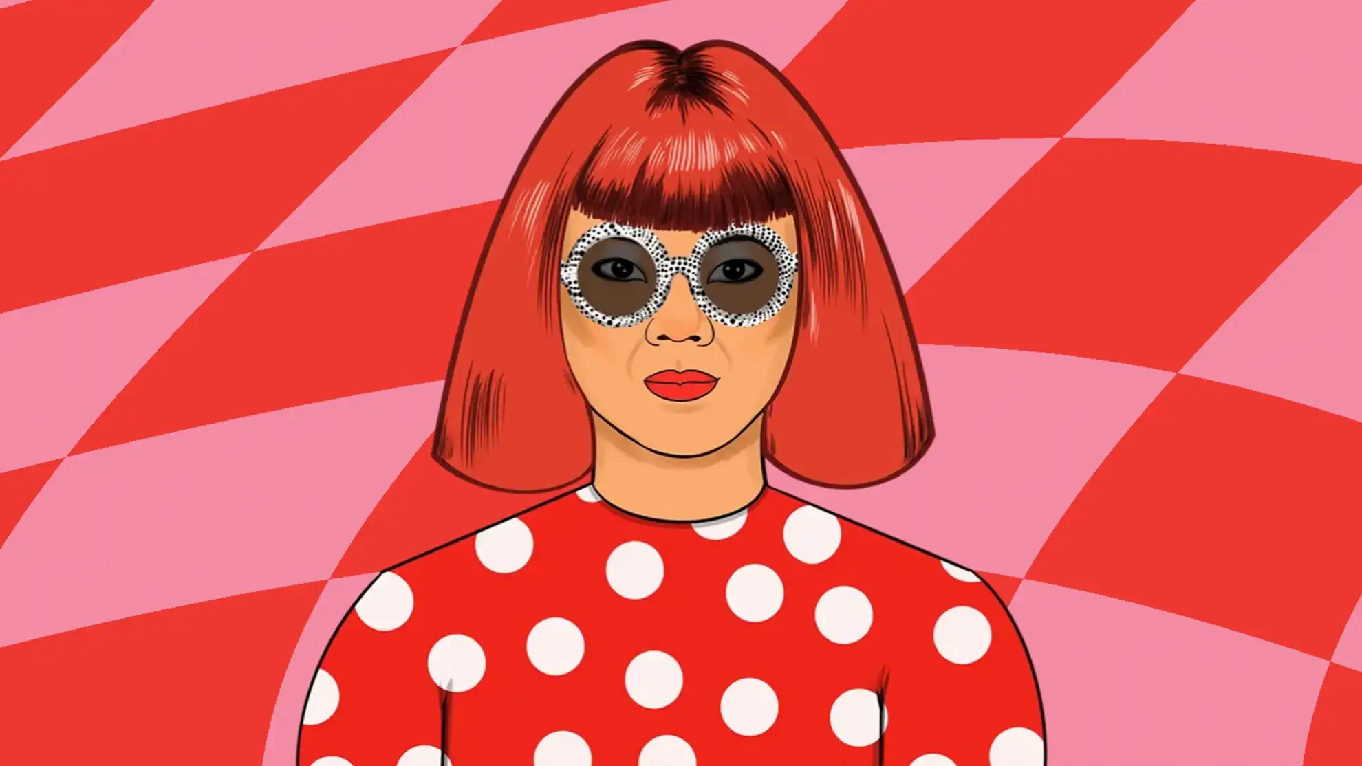
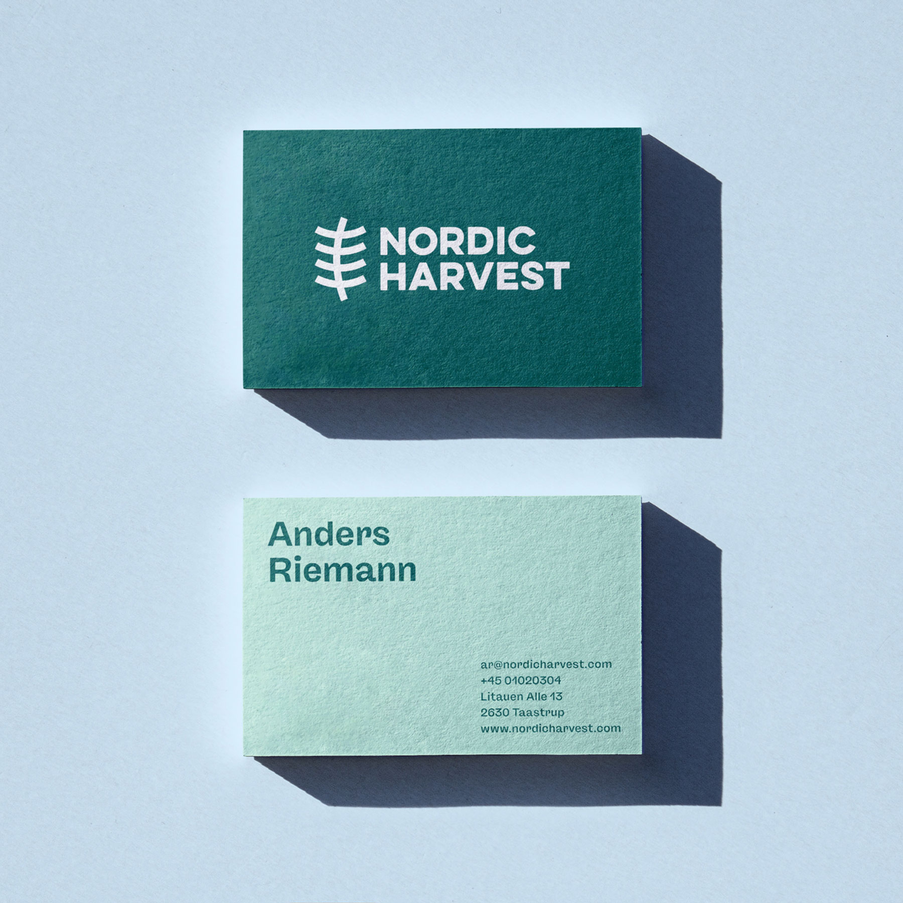
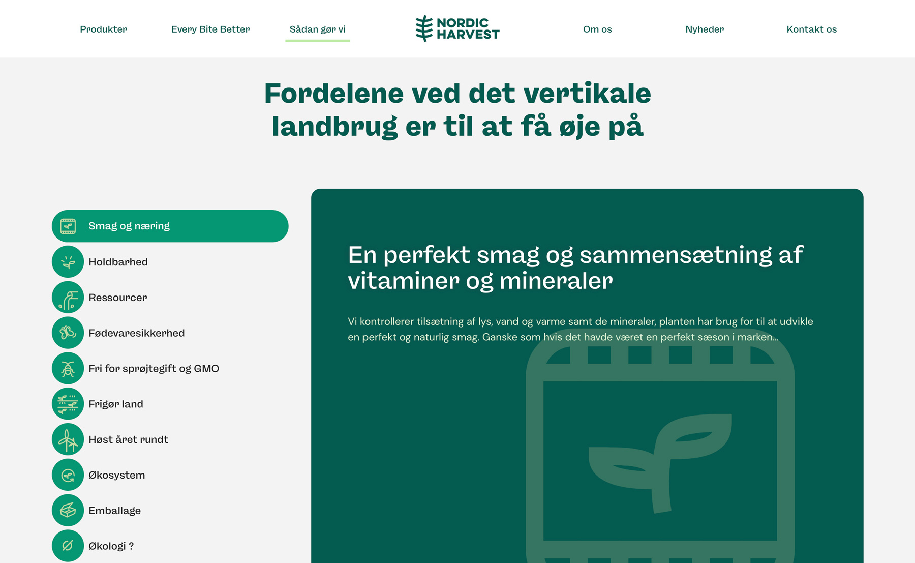
This was the overall ambition for the branding project where Granyon created the new visual identity, packaging, banners, and website. The visual identity had to reflect the courageous ideas and the passion for pushing traditional thinking.
The design team created the right balance between a new rebellious vision by choosing a rough stencil font, batches, and a simple logo style. We wanted to make sure that consumers can trust these new and sustainable products. With the identity and website, we wanted to state that Nordic Harvest products are healthy, tasteful products without chemicals or artificial fertilizers.

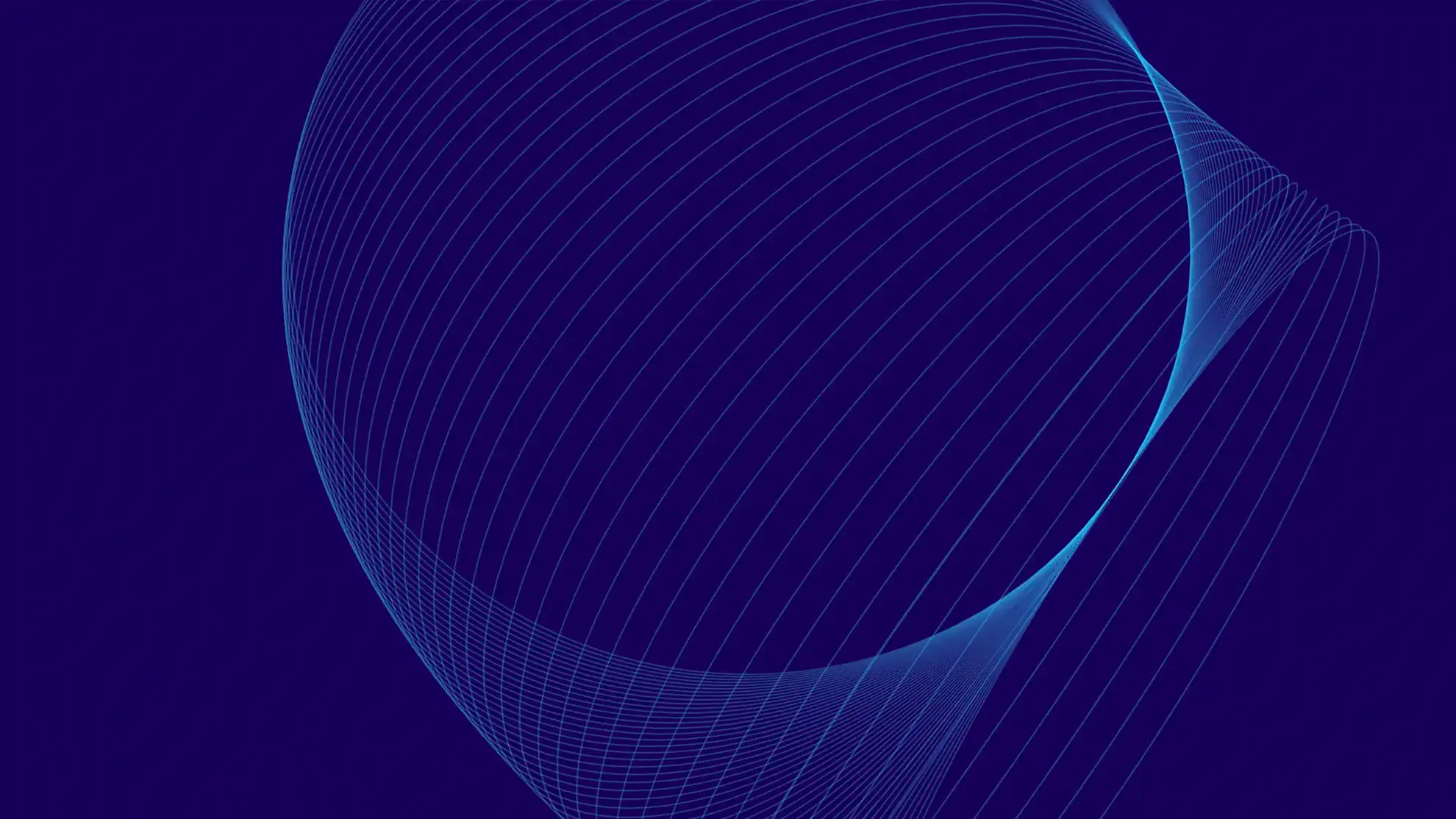
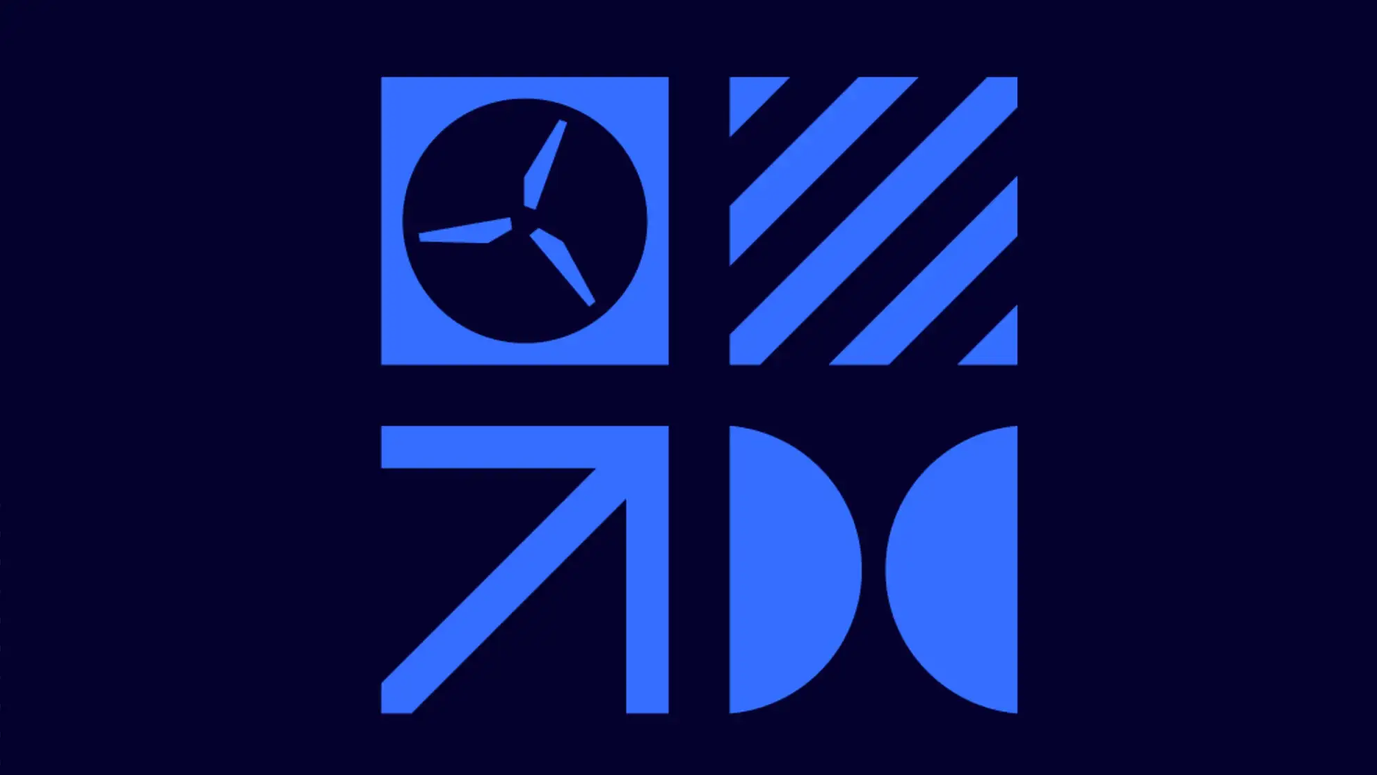
A logo inspired by trees, runes and vertical shelves
After workshops, discussions, and research, we ended up with a simple logo based on the inspiration in old Scandinavian runes, the shelves that characterize vertical farming, and the trees that Nordic Harvest has the vision to bring back instead of empty fields.
Care to see more logo cases? How we made the logo for Rumsans

A logo inspired by trees, runes and vertical shelves
A logo inspired by trees, runes and vertical shelves
After workshops, discussions, and research, we ended up with a simple logo based on the inspiration in old Scandinavian runes, the shelves that characterize vertical farming, and the trees that Nordic Harvest has the vision to bring back instead of empty fields.
Care to see more logo cases? How we made the logo for Rumsans
A logo inspired by trees, runes and vertical shelves
After workshops, discussions, and research, we ended up with a simple logo based on the inspiration in old Scandinavian runes, the shelves that characterize vertical farming, and the trees that Nordic Harvest has the vision to bring back instead of empty fields.
Care to see more logo cases? How we made the logo for Rumsans
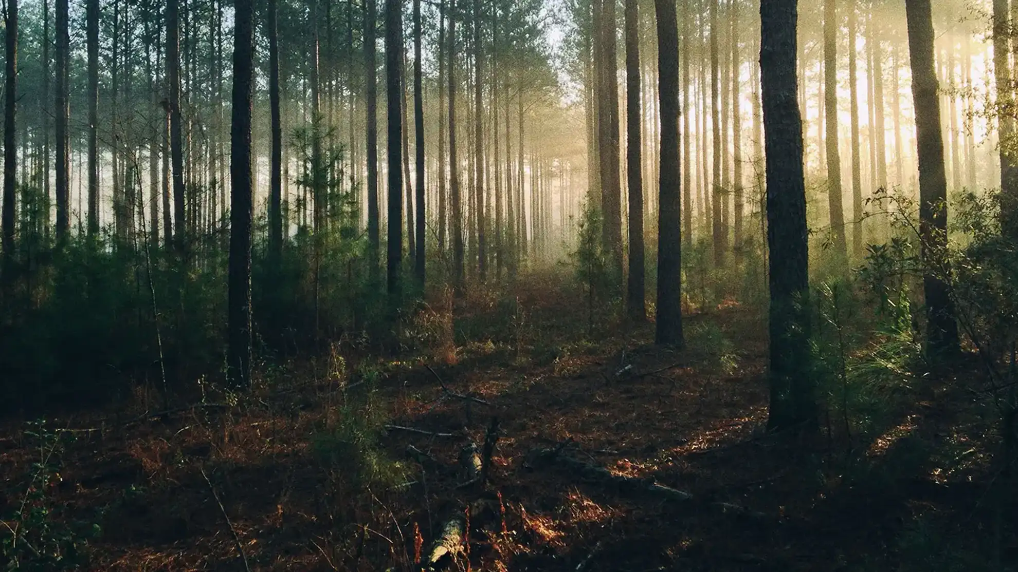
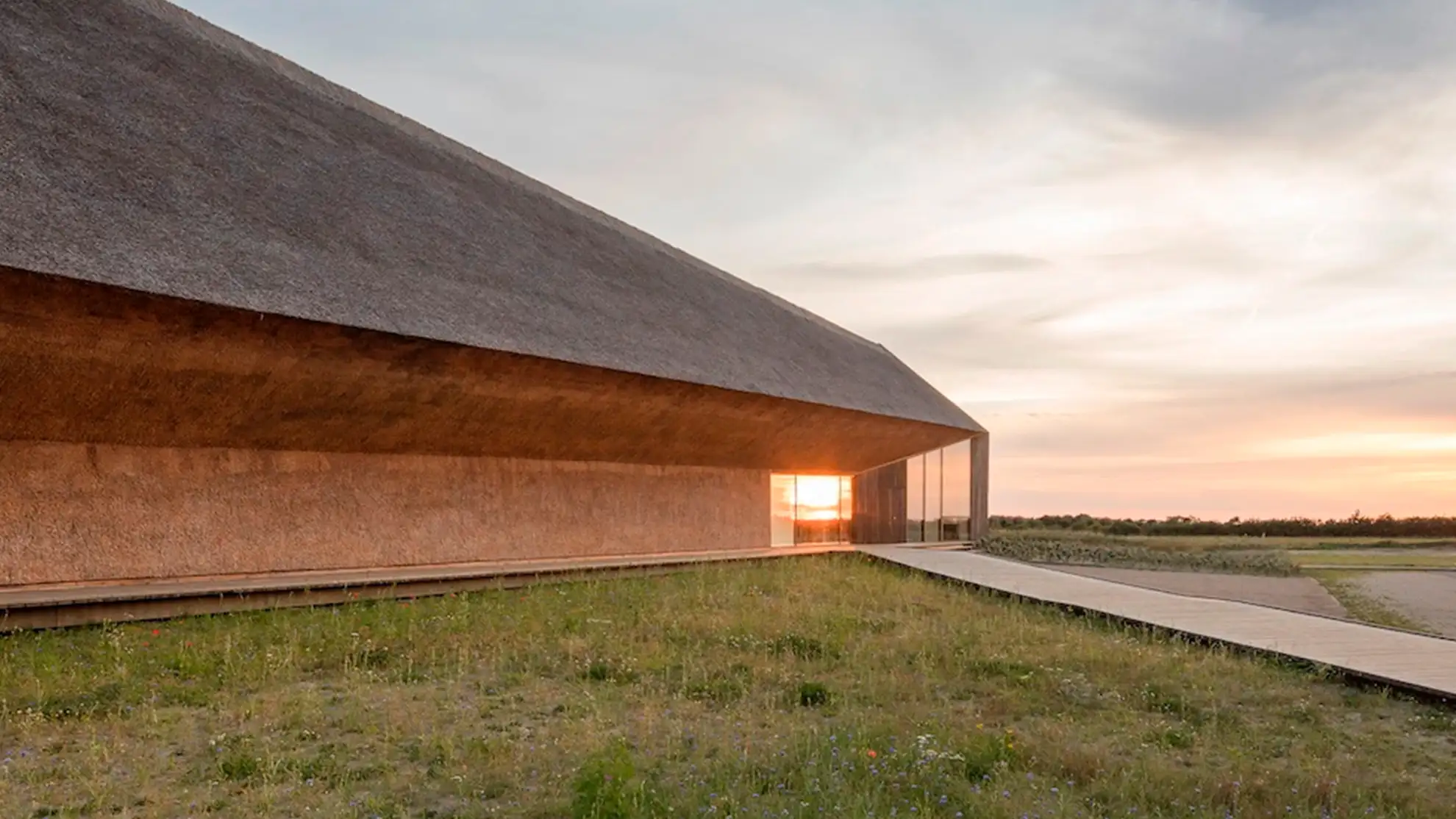
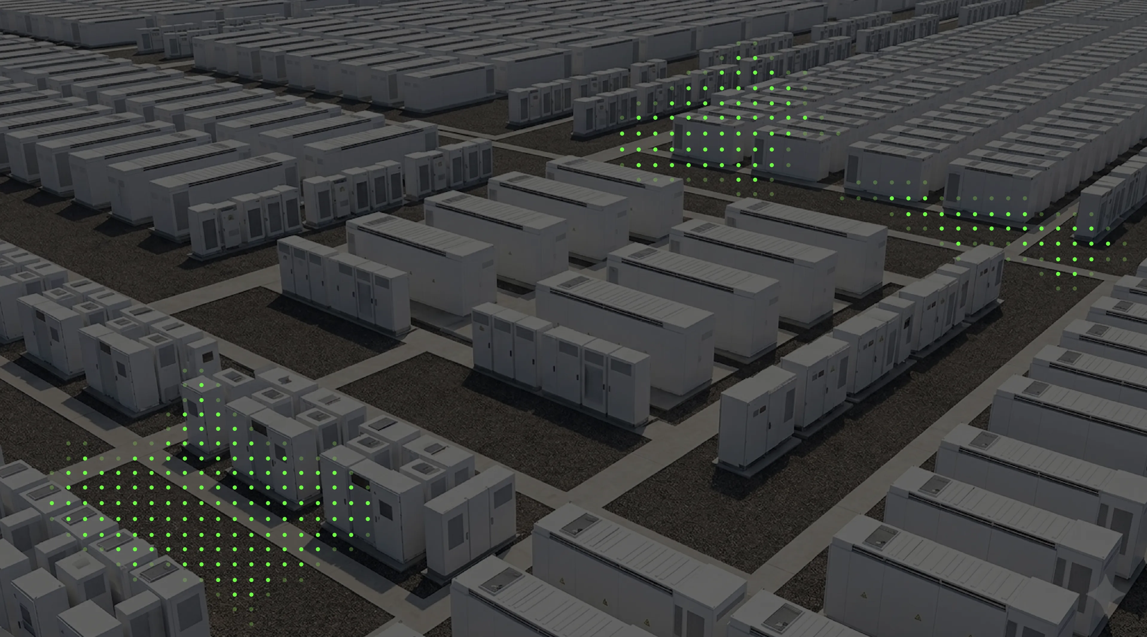
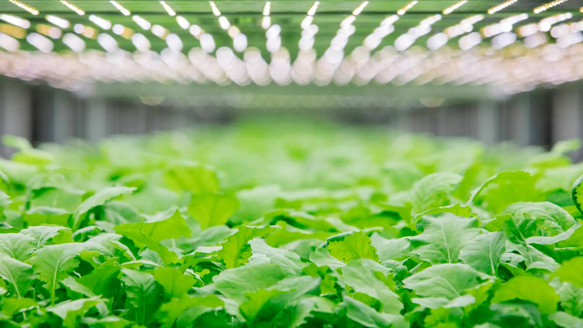
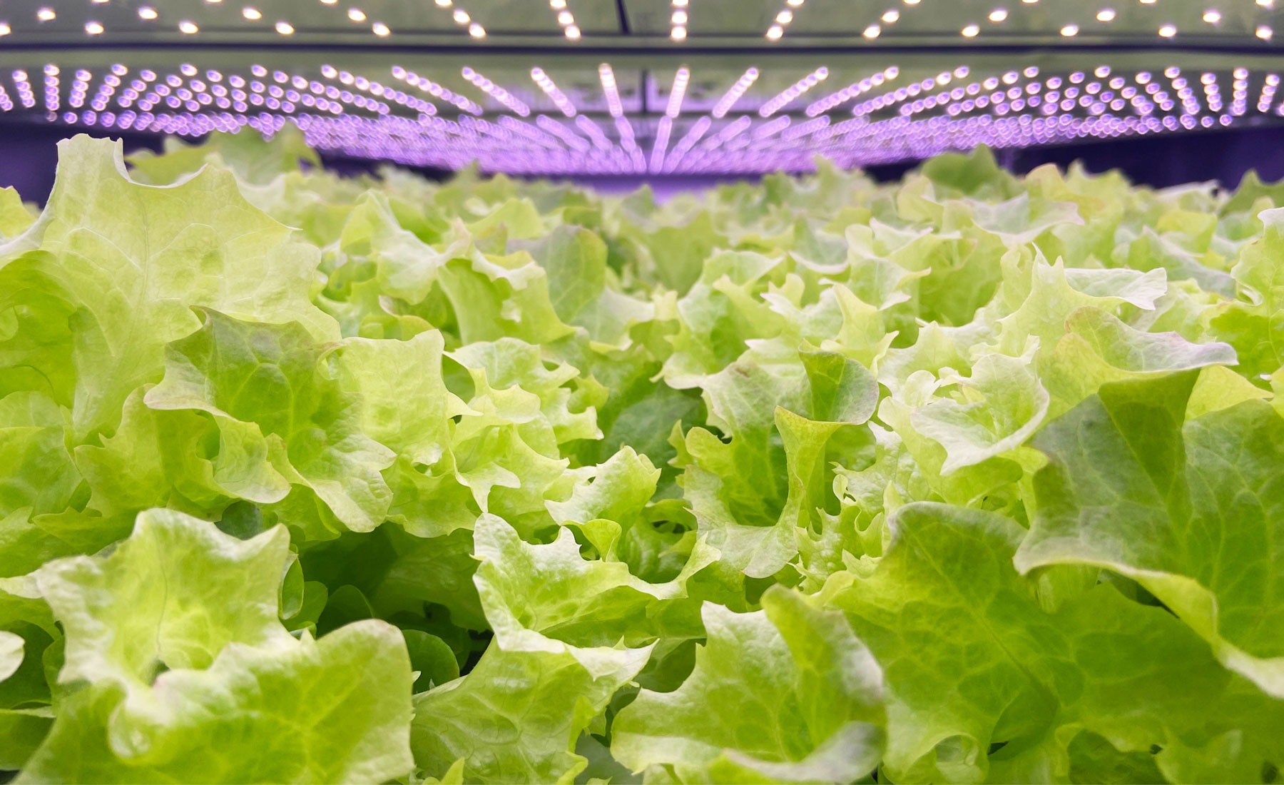
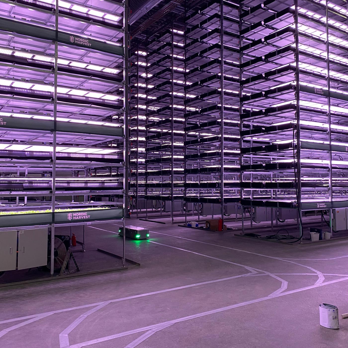
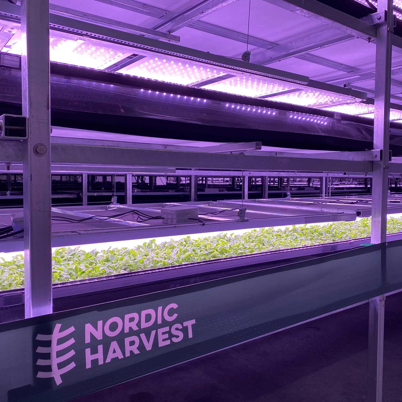
14 floors of sustainable taste and nutritions
Bassil, Ruccola, and spinach on 14 floors shelves, as far as the eye can see. Europe's biggest vertical farm is an impressive look into the future.
14 floors of sustainable taste and nutritions
Bassil, Ruccola, and spinach on 14 floors shelves, as far as the eye can see. Europe's biggest vertical farm is an impressive look into the future.
14 floors of sustainable taste and nutritions
Bassil, Ruccola, and spinach on 14 floors shelves, as far as the eye can see. Europe's biggest vertical farm is an impressive look into the future.
14 floors of sustainable taste and nutritions
Bassil, Ruccola, and spinach on 14 floors shelves, as far as the eye can see. Europe's biggest vertical farm is an impressive look into the future.
14 floors of sustainable taste and nutritions
Bassil, Ruccola, and spinach on 14 floors shelves, as far as the eye can see. Europe's biggest vertical farm is an impressive look into the future.
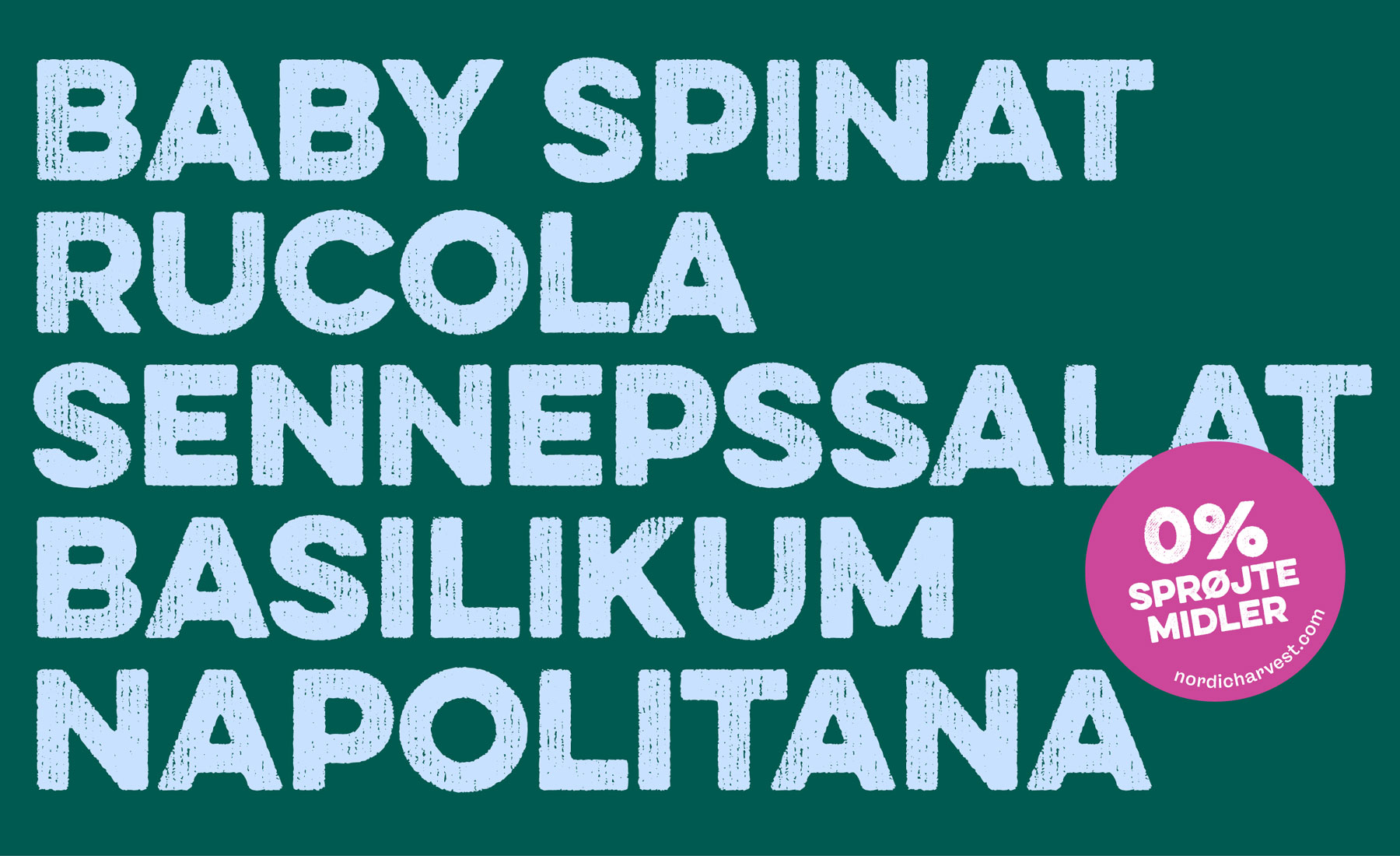
The Nordic Harvest products are now to be found in stores all over Denmark. Bassil, Ruccola, and spinach are some of the products that consumers can try, and in the future, many new and healthy salads and urbs will be a part of the impressive farming of tomorrow.
The Nordic Harvest products are now to be found in stores all over Denmark. Bassil, Ruccola, and spinach are some of the products that consumers can try, and in the future, many new and healthy salads and urbs will be a part of the impressive farming of tomorrow.
The Nordic Harvest products are now to be found in stores all over Denmark. Bassil, Ruccola, and spinach are some of the products that consumers can try, and in the future, many new and healthy salads and urbs will be a part of the impressive farming of tomorrow.
The Nordic Harvest products are now to be found in stores all over Denmark. Bassil, Ruccola, and spinach are some of the products that consumers can try, and in the future, many new and healthy salads and urbs will be a part of the impressive farming of tomorrow.
The Nordic Harvest products are now to be found in stores all over Denmark. Bassil, Ruccola, and spinach are some of the products that consumers can try, and in the future, many new and healthy salads and urbs will be a part of the impressive farming of tomorrow.
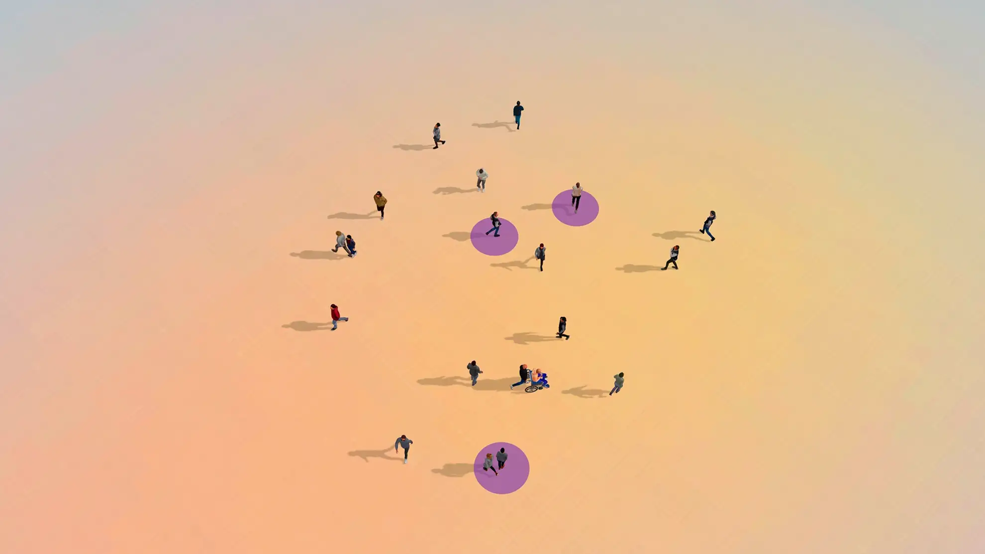
More than a company
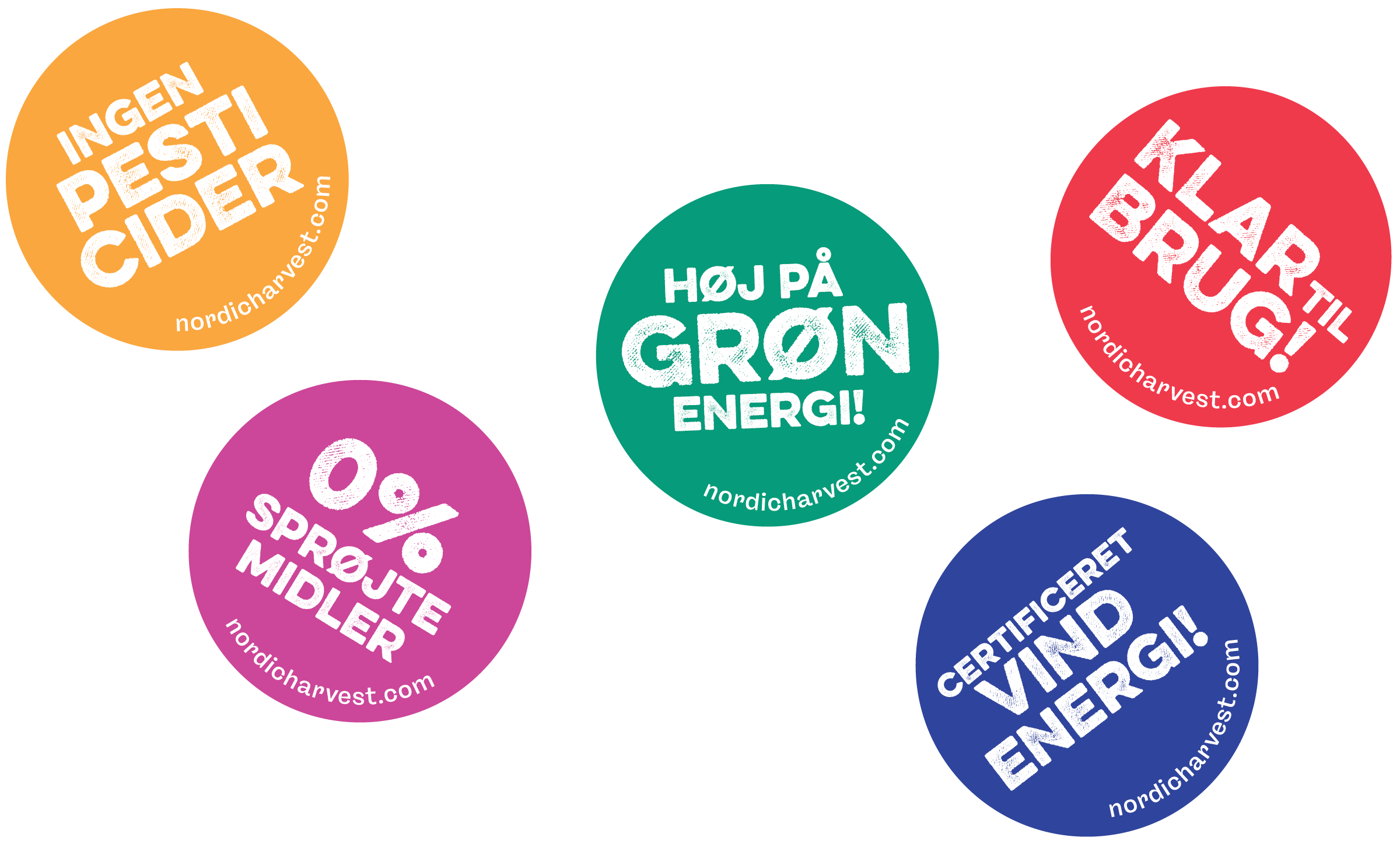
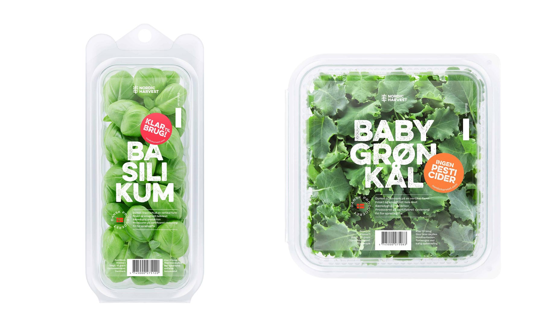
By adding batches in bright colors, we created a flexible communication tool to tell some positive facts about the products vertical farming. New sometimes takes getting used to, we wanted to provide them with easy access to humoristic and interesting info such as the fact that Nordic Harvest doesn't use artificial fertilizers, pesticides, or chemicals. Batches also provide the brand with an underground and rebellious feel showing that it is more than a company. It's a vision to change farming.
More than a company
By adding batches in bright colors, we created a flexible communication tool to tell some positive facts about the products vertical farming. New sometimes takes getting used to, we wanted to provide them with easy access to humoristic and interesting info such as the fact that Nordic Harvest doesn't use artificial fertilizers, pesticides, or chemicals. Batches also provide the brand with an underground and rebellious feel showing that it is more than a company. It's a vision to change farming.
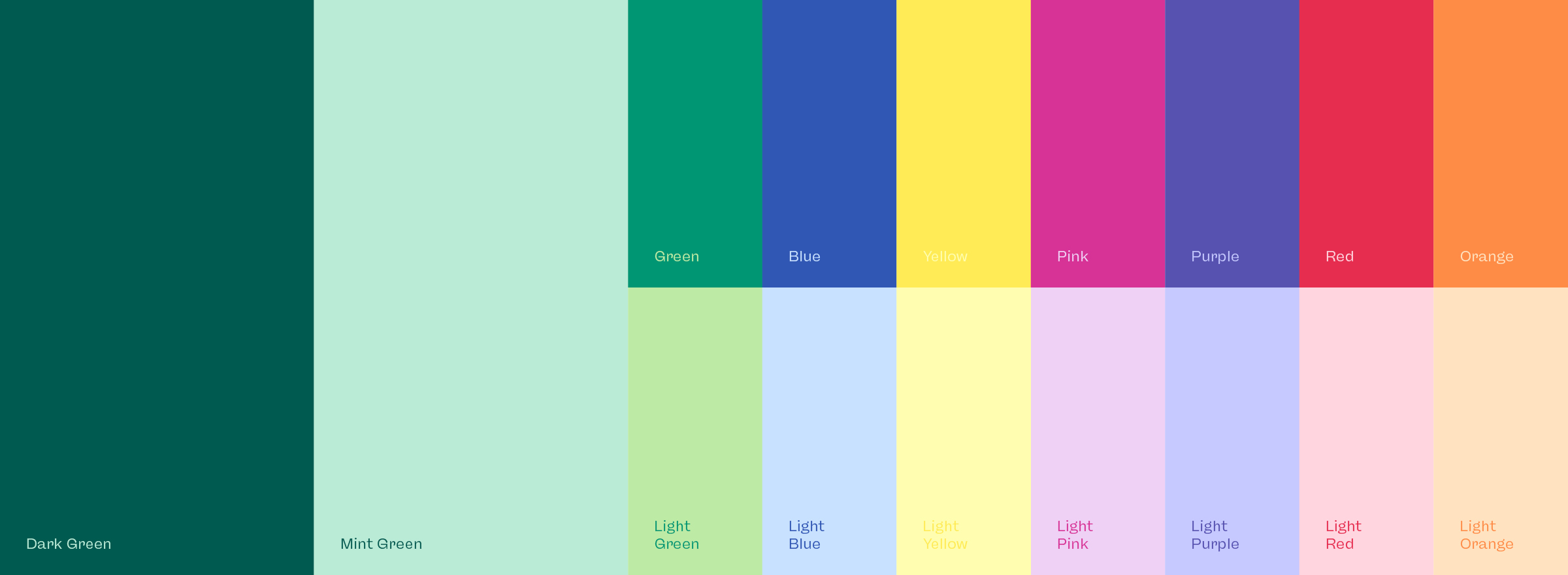
Bold and sustainable
Our choice of colors strengthens sustainability and also gives a bold expression. The target group needs to feel comfortable with the brand and products. But also feel they are a part of an entirely new way to handle some of the biggest challenges humanity has ever faced. Nordic harvest and its customers are a part of the solution by producing and buying sustainable climate-friendly food for a growing global population.
High on green energy
Bright colors and statements like "Made from wind energy." and "High on green energy." created a system to accompany the main content and communication. With the batches, we have the tools to give the brand a humorous and dynamic look n' feel while providing information customers might overlook.
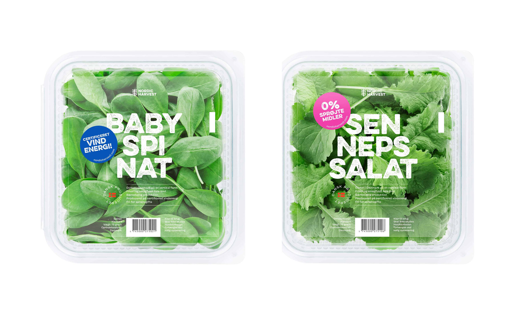
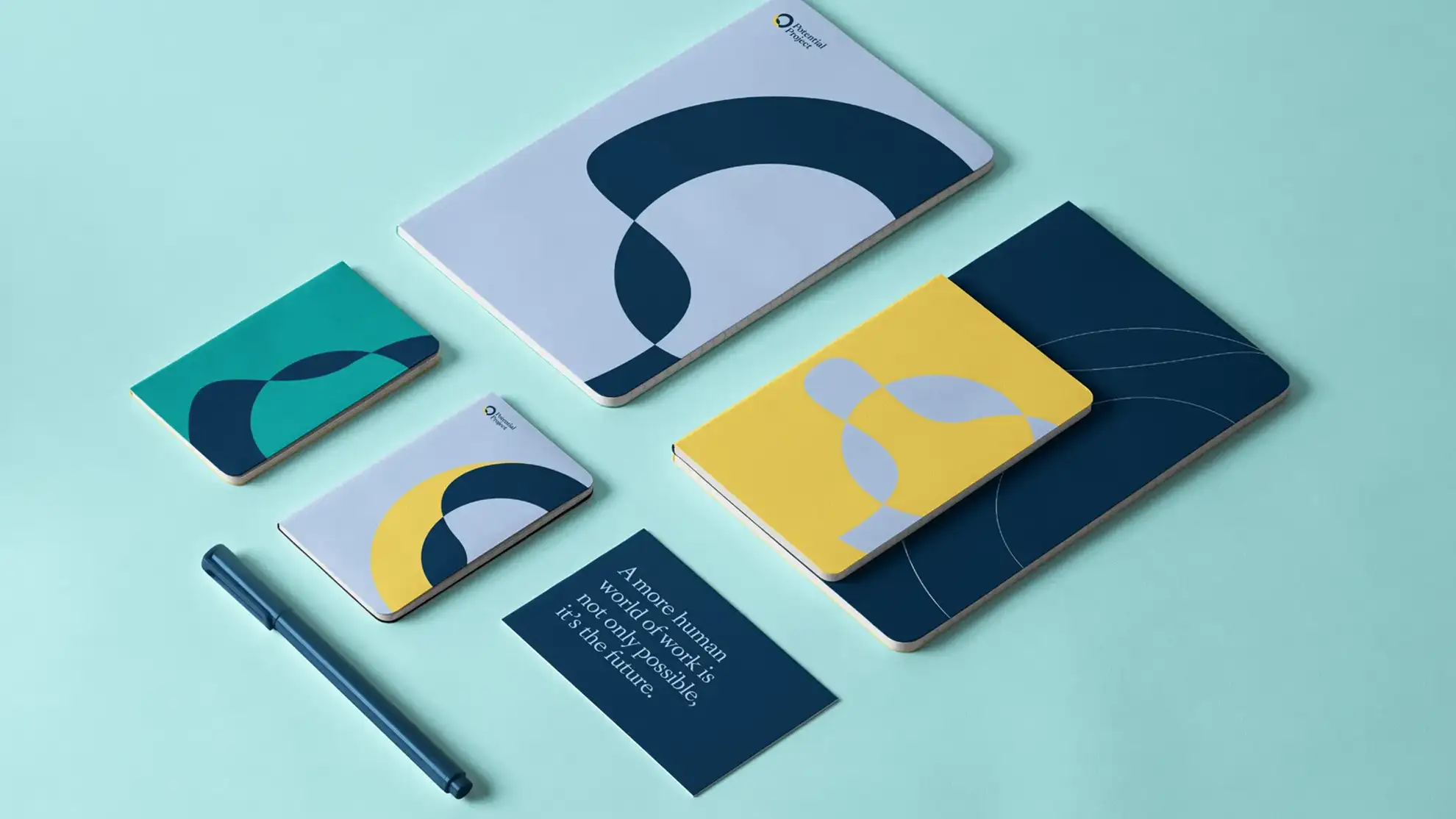
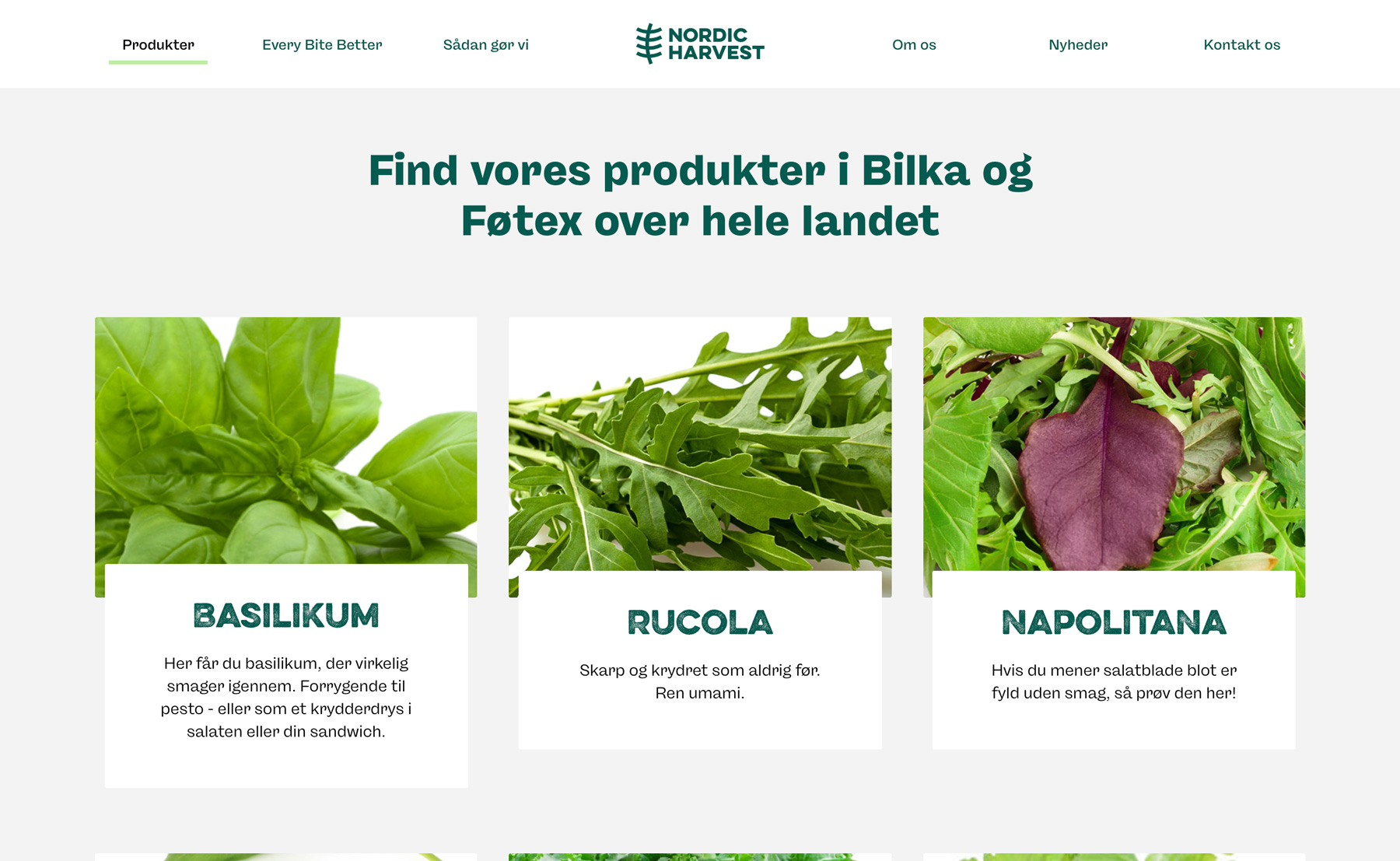
Standing out with bold and simple package design
The packages are what the customers see first. And with fierce competition, we needed to create a bold and still simple look both to stand out and to show that a new and sustainable player has entered the market representing a product you can make a difference buying.
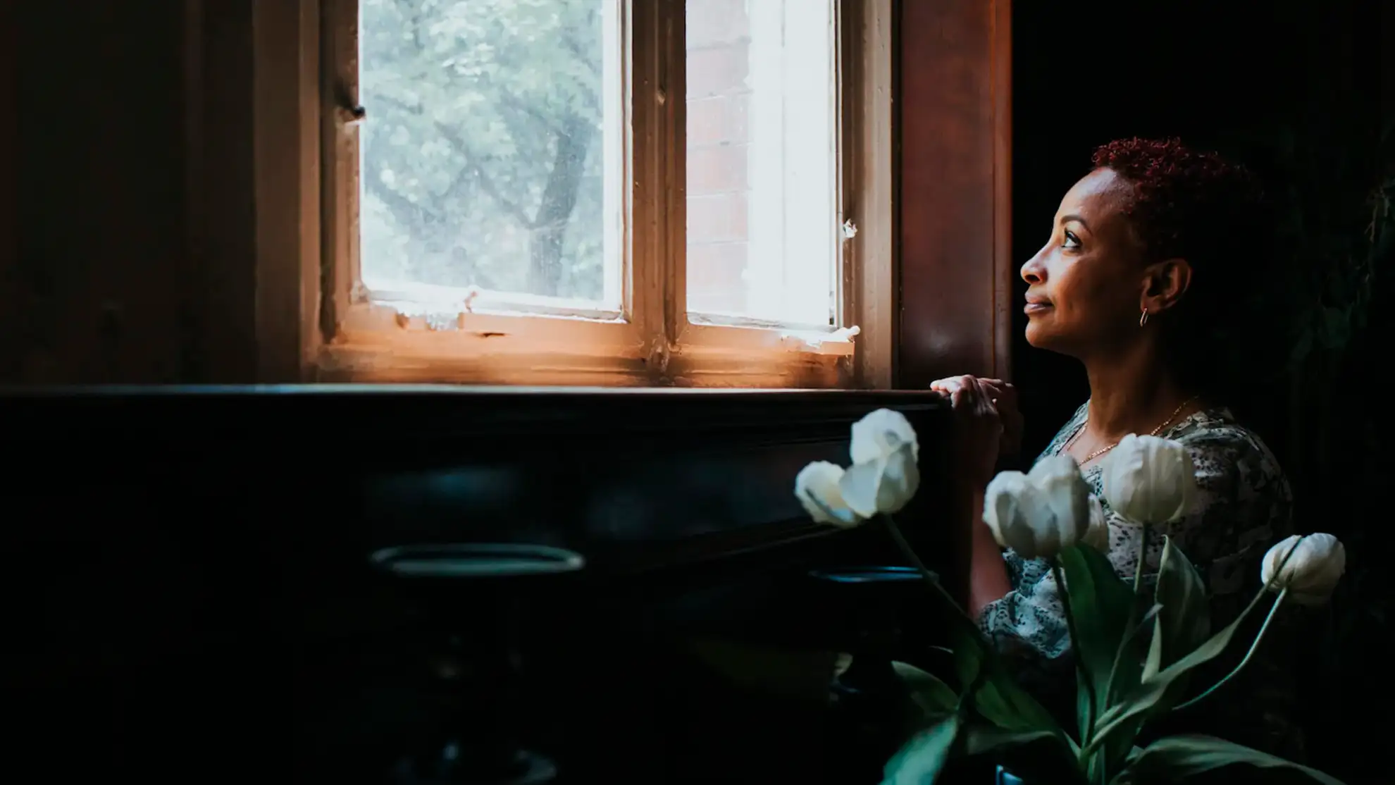
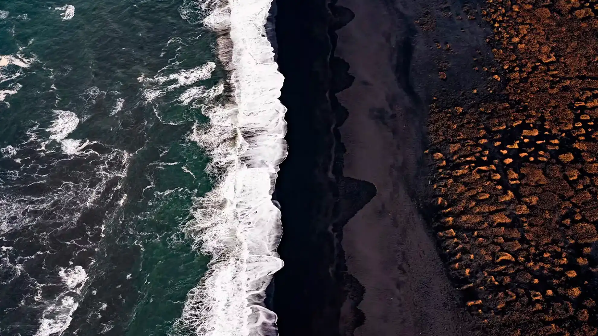
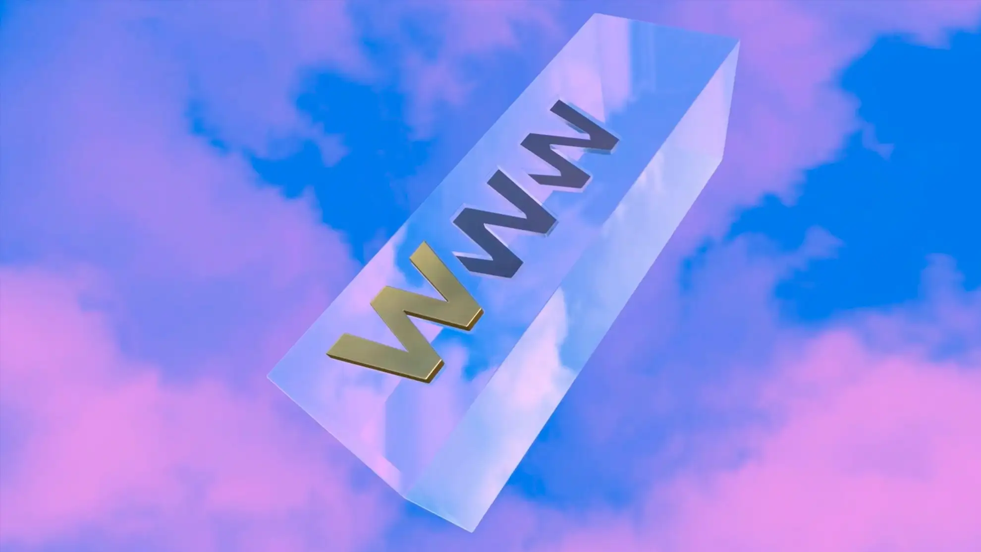
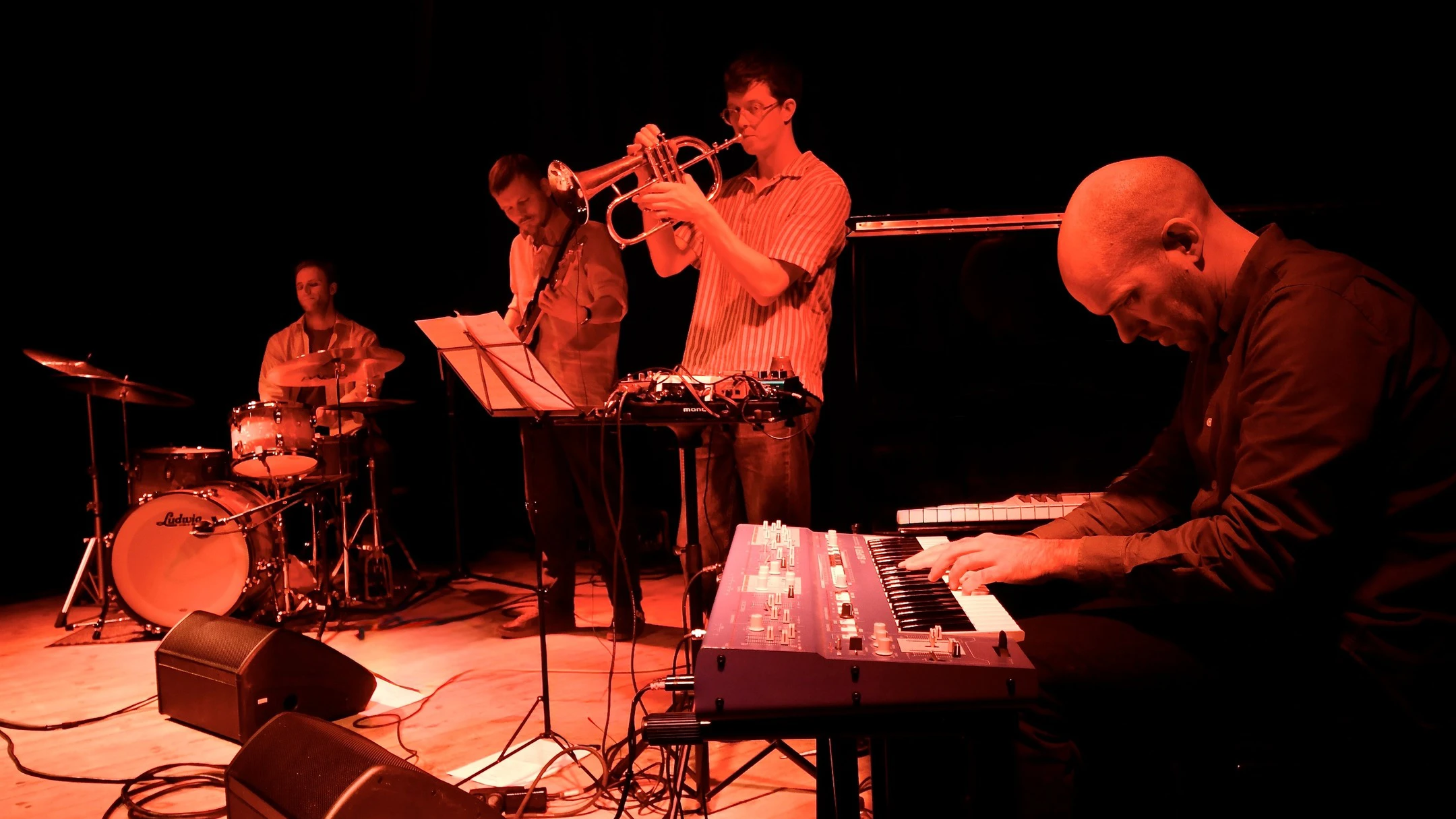
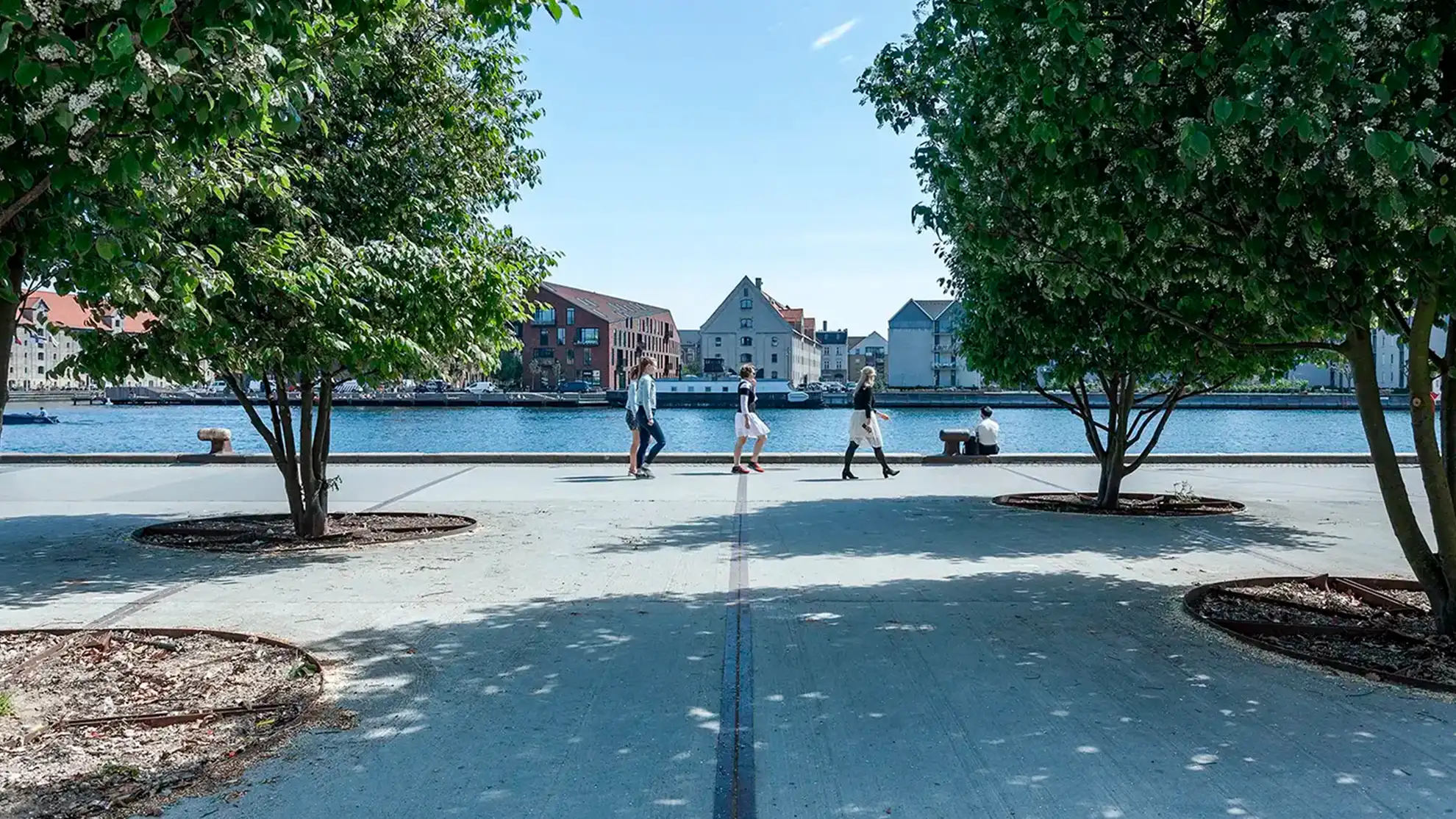
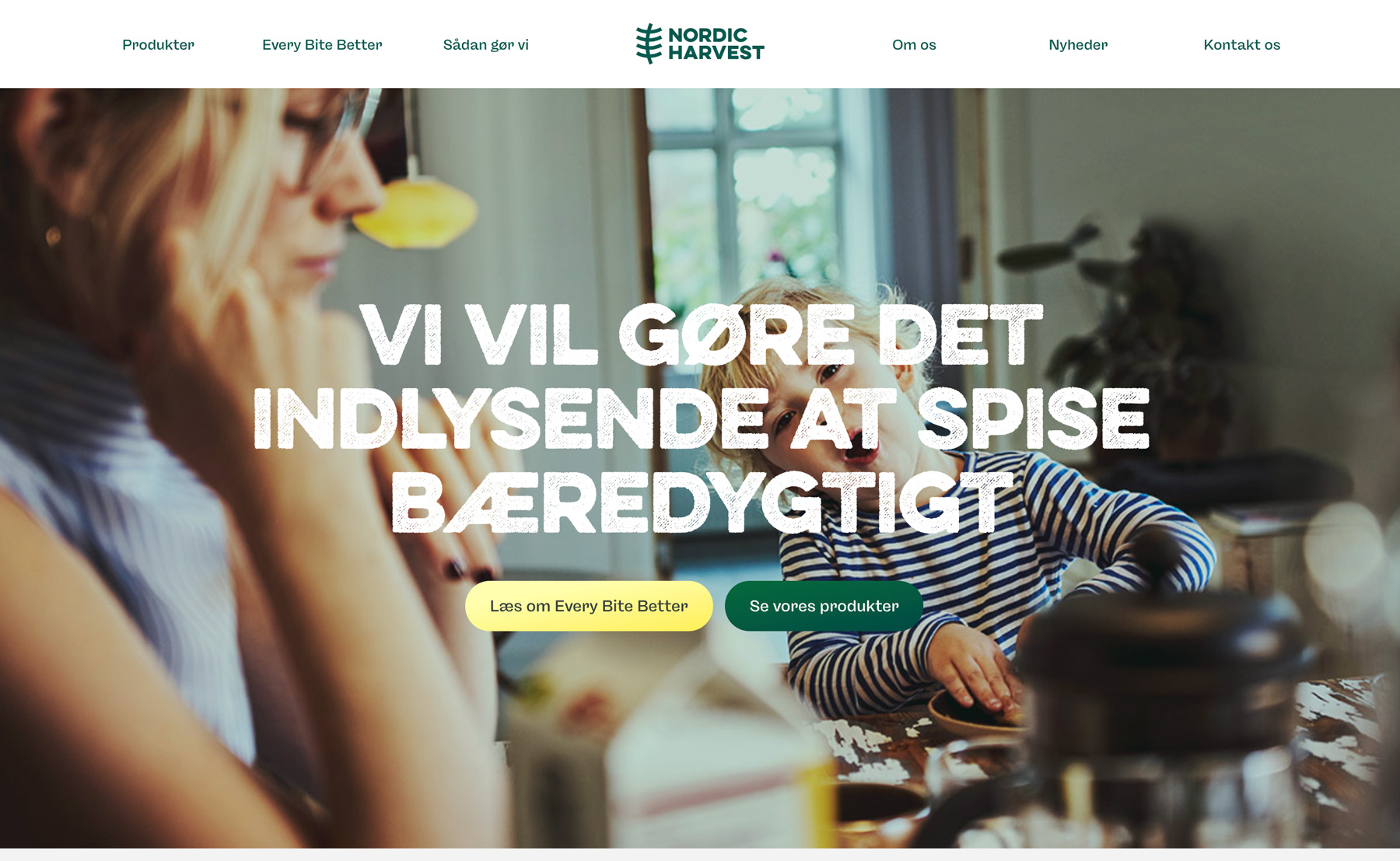
A Scandinavian experience
We aimed for a logical, clean, and Scandinavian experience based on the visual identity and the brand core story. We used film and images combined with subtle effects to introduce the magnitude of the production but still give it a human expression to describe the ideas and passion behind the project.
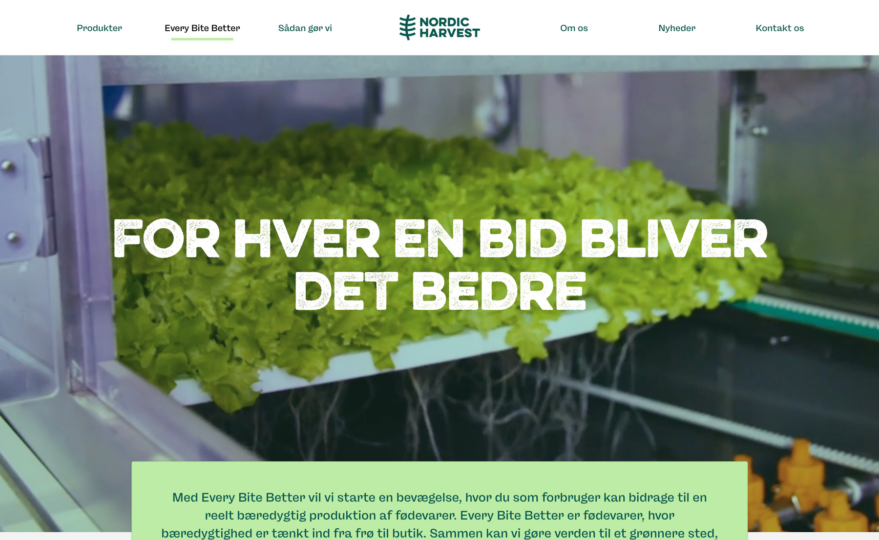
Every bite better
As a part of the branding process, we came up with the term "Every bite better" to show that it now just takes the right choice in the supermarket to make a difference. For each bite, you both get healthy food and a delicious experience while reducing CO2 emissions per unit of agricultural crop produced, a green transition that is highly needed.
A global recognition
Together with the PR company Kudos and DDG, the creation of the new brand lead to a nomination as "The SABRE Award for Superior Achievement in Brand-Building."
For more information about the project: reach out to Creative Director, Jesper Fagerlund
A global recognition
Together with the PR company Kudos and DDG, the creation of the new brand lead to a nomination as "The SABRE Award for Superior Achievement in Brand-Building."
For more information about the project: reach out to Creative Director, Jesper Fagerlund
A global recognition
A global recognition
Together with the PR company Kudos and DDG, the creation of the new brand lead to a nomination as "The SABRE Award for Superior Achievement in Brand-Building."
For more information about the project: reach out to Creative Director, Jesper Fagerlund
Together with the PR company Kudos and DDG, the creation of the new brand lead to a nomination as "The SABRE Award for Superior Achievement in Brand-Building."
For more information about the project: reach out to Creative Director, Jesper Fagerlund
A global recognition
Together with the PR company Kudos and DDG, the creation of the new brand lead to a nomination as "The SABRE Award for Superior Achievement in Brand-Building."
For more information about the project: reach out to Creative Director, Jesper Fagerlund
Curious about starting a design or digital project with Granyon? Get in touch! Rest asure we are the nice guys. No spamming or self-absorbed attitudes.
Curious about starting a design or digital project with Granyon? Get in touch! You can rest asure: we are the nice guys. No spamming or self-absorbed attitudes.